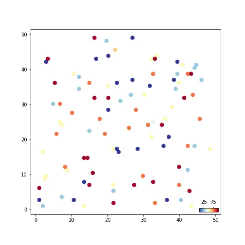
我正在尝试创建一个图表,其中图例位于绘图中的右下角。
import numpy as np
import matplotlib.pyplot as plt
np.random.seed(23)

df = pd.DataFrame()
df['x'] = np.random.randint(1, 50, 100)
df['y'] = np.random.randint(1, 50, 100)
df['c'] = [1,2,3,4,5] * 20

# 1 is blue 5 is red
fig, ax = plt.subplots(figsize=(7,7))
hexbins = ax.hexbin(df['x'], df['y'], C=df['c'],
                 bins=20, gridsize=50, cmap=cm.get_cmap('RdYlBu_r'))

# legend
plt.legend(handles=[mpatches.Patch(color='#A70022', label='1'),
                    mpatches.Patch(color='#303297', label='5')],
                    loc='lower right', edgecolor='black', framealpha=1)

# colorscale
cb = fig.colorbar(hexbins, ax=ax)
cb.set_label('Color Scale')

我可以创建自定义图例,但我不知道如何更改图例以显示cmap渐变。或者我可以创建一个色条,但是我不知道如何将其放置在绘图的侧面而不是图形内部。有没有办法在图例中获得渐变比例尺?
cbar.set_ticks([1, 5]); cbar.set_ticklabels(['below', 'above'])为图例制作自定义标签,但是有没有办法将刻度值更改为颜色条范围的百分位数?例如,如果我想要“below”和“above”刻度在cbar范围的第25和第75百分位数中呢? - Ethancolorbar有一个tick参数,您可以使用set_xticklabels进行标记。 - busybearhexbins.get_clim返回最小和最大值。 - busybear