Matplotlib:为柱形图分配不同的填充图案

9

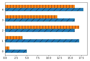
我有一个数据框,对于每个索引,我需要绘制两个条形图(对应两个系列)。下面的代码输出如下:

import pandas as pd
import numpy as np
import matplotlib.pyplot as plt

df = pd.DataFrame(np.random.randint(0,20,size=(5, 2)), columns=list('AB'))
fig, ax = plt.subplots()
ax = df.sort_values('B', ascending=True).plot.barh(rot=0,ax=ax,hatch="/")
plt.show()

enter image description here

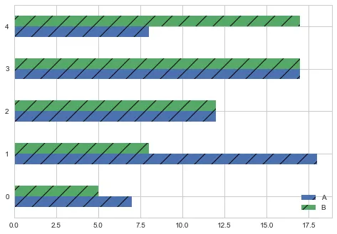
我希望为每个条形图分配单独的填充图案。如果A有'/'填充,则B应该有'|'。我需要在代码中进行哪些修改?

3个回答

11
你可以将这两个条形图分别绘制:
import numpy as np
import pandas as pd

from matplotlib import pyplot as plt

df = pd.DataFrame(np.random.randint(0, 20, size=(5, 2)), columns=list('AB'))
fig, ax = plt.subplots()

ax.barh(np.arange(0, len(df)), df['A'], height=0.3, hatch='/')
ax.barh(np.arange(0.3, len(df) + 0.3), df['B'], height=0.3, hatch='|')

enter image description here


7
这个 Matplotlib 示例 提供了一种解决方案。但我不是很喜欢它,因为它旨在为每个柱设置不同的 hatch。
但在大多数情况下,按照每个“类别”设置特定的 hatch 更为相关。您可以通过单独绘制带有 hatch 的柱来实现,也可以在绘制后设置 hatch。在我的看法中,后者更加灵活,因此这是我的方法:
df = pd.DataFrame(np.random.randint(0,20,size=(5, 2)), columns=list('AB'))
fig, ax = plt.subplots()
ax = df.sort_values('B', ascending=True).plot.barh(rot=0,ax=ax)
# get all bars in the plot
bars = ax.patches
patterns = ['/', '|']  # set hatch patterns in the correct order
hatches = []  # list for hatches in the order of the bars
for h in patterns:  # loop over patterns to create bar-ordered hatches
    for i in range(int(len(bars) / len(patterns))):
        hatches.append(h)
for bar, hatch in zip(bars, hatches):  # loop over bars and hatches to set hatches in correct order
    bar.set_hatch(hatch)
# generate legend. this is important to set explicitly, otherwise no hatches will be shown!
ax.legend()
plt.show()

这种解决方案相对于单独绘制每个条形图的优点有:
  • 可以拥有任意数量的条形图
  • 适用于所有可能的堆叠和/或未堆叠的条形图组合
  • 适用于pandas绘图接口
主要缺点是额外的LOC,特别是仅绘制少量条形图时。但将其打包成一个函数/模块并重复使用可以解决这个问题. :)

3
最初的回答:这里有一个测试可以帮助你。
import numpy as np
import matplotlib.pyplot as plt

df = pd.DataFrame(np.random.randint(0,20,size=(5, 2)), columns=list('AB'))

plt.hist(df['A'], color = 'blue',
            edgecolor = 'red', hatch = '/' , label = 'df.A',orientation = 'horizontal',
            histtype = 'bar')
plt.hist(df['B'],color = 'YELLOW',
            edgecolor = 'GREEN', hatch = 'O' , label = 'df.B',orientation = 'horizontal',
            histtype = 'bar')
plt.legend()
plt.show()

网页内容由stack overflow 提供, 点击上面的
可以查看英文原文,
原文链接