从元组列表创建Python柱形图

3

一个非常基础的问题:

我需要从一个元组列表中绘制柱状图。其中第一个元素是名称 (用于 x 轴分类),第二个元素是浮点数类型 (用于 y 轴)。我还想按降序排列条形,添加趋势线。以下是一些示例代码:

In [20]: popularity_data
Out[20]: 
[('Unknown', 10.0),
 (u'Drew E.', 240.0),
 (u'Anthony P.', 240.0),
 (u'Thomas H.', 220.0),
 (u'Ranae J.', 150.0),
 (u'Robert T.', 120.0),
 (u'Li Yan M.', 80.0),
 (u'Raph D.', 210.0)]
3个回答

11

如果您有一个元组列表,您可以尝试以下代码来获得您想要的结果。

import numpy as np
import matplotlib.pyplot as plt
popularity_data = [('Unknown', 10.0),
     (u'Drew E.', 240.0),
     (u'Anthony P.', 240.0),
     (u'Thomas H.', 220.0),
     (u'Ranae J.', 150.0),
     (u'Robert T.', 120.0),
     (u'Li Yan M.', 80.0),
     (u'Raph D.', 210.0)]

# sort in-place from highest to lowest
popularity_data.sort(key=lambda x: x[1], reverse=True) 

# save the names and their respective scores separately
# reverse the tuples to go from most frequent to least frequent 
people = zip(*popularity_data)[0]
score = zip(*popularity_data)[1]
x_pos = np.arange(len(people)) 

# calculate slope and intercept for the linear trend line
slope, intercept = np.polyfit(x_pos, score, 1)
trendline = intercept + (slope * x_pos)

plt.plot(x_pos, trendline, color='red', linestyle='--')    
plt.bar(x_pos, score,align='center')
plt.xticks(x_pos, people) 
plt.ylabel('Popularity Score')
plt.show()
这将为您提供像下面这样的情节,尽管在不使用时间序列时,在条形图上绘制趋势线是没有意义的。

Bar plot of popularity_data

参考资料:

1
为了使其与Python3兼容,您应该将people = zip(*popularity_data)[0]替换为people = list(zip(*popularity_data))[0]。实际上,在Python 3中,zip返回一个可迭代对象而不是列表。 - Pierre S.

0
你应该使用字典,这样更易于使用。以下代码可以帮助你按降序排列条形图:
popularity_data =  {
    'Unknown': 10.0,
    u'Drew E.': 240.0,
    u'Anthony P.': 240.0,
    u'Thomas H.': 220.0,
    u'Ranae J.': 150.0,
    u'Robert T.': 120.0,
    u'Li Yan M.': 80.0,
    u'Raph D.': 210.0
}

for y in reversed(sorted(popularity_data.values())):
    k = popularity_data.keys()[popularity_data.values().index(y)]
    print k + ':', y
    del popularity_data[k]

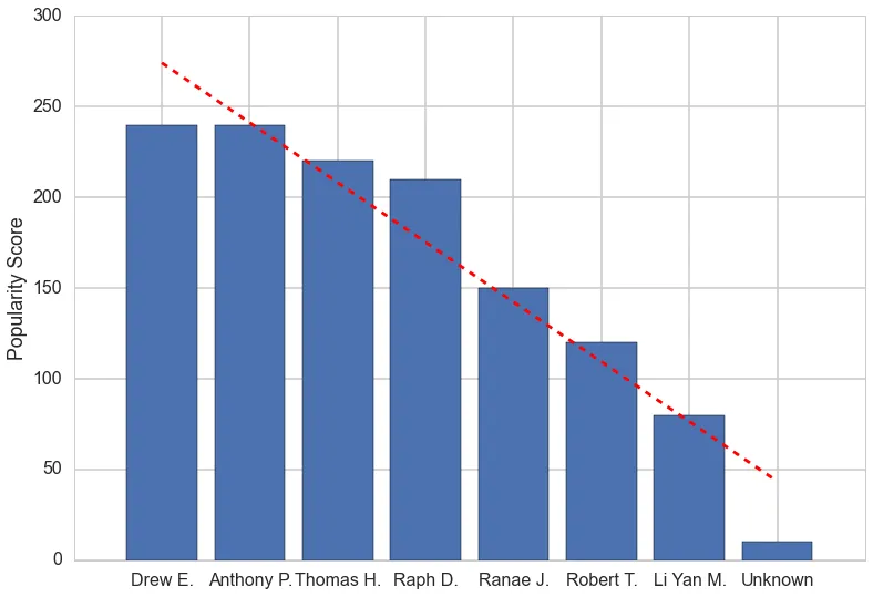
你可以像 Aleksander S 建议的那样使用 matplotlib 添加趋势线。

此外,如果你喜欢,也可以将它存储在元组列表中,就像最初的方式一样:

popularity_data =  {
    'Unknown': 10.0,
    u'Drew E.': 240.0,
    u'Anthony P.': 240.0,
    u'Thomas H.': 220.0,
    u'Ranae J.': 150.0,
    u'Robert T.': 120.0,
    u'Li Yan M.': 80.0,
    u'Raph D.': 210.0
}

descending = []
for y in reversed(sorted(popularity_data.values())):
    k = popularity_data.keys()[popularity_data.values().index(y)]
    descending.append(tuple([k, y]))
    del popularity_data[k]

print descending

-3

你可以使用ASCII字符来表示条形图,或者你可以查看matplotlib...


网页内容由stack overflow 提供, 点击上面的
可以查看英文原文,
原文链接