我正在尝试使一个图形曲线更加平滑,但由于x轴的值是日期,因此我很难做到这一点。我们假设有以下数据框:
import matplotlib.pyplot as plt
import numpy as np
import pandas as pd
%matplotlib inline

startDate = '2015-05-15'
endDate = '2015-12-5'
index = pd.date_range(startDate, endDate)
data = np.random.normal(0, 1, size=len(index))
cols = ['value']

df = pd.DataFrame(data, index=index, columns=cols)
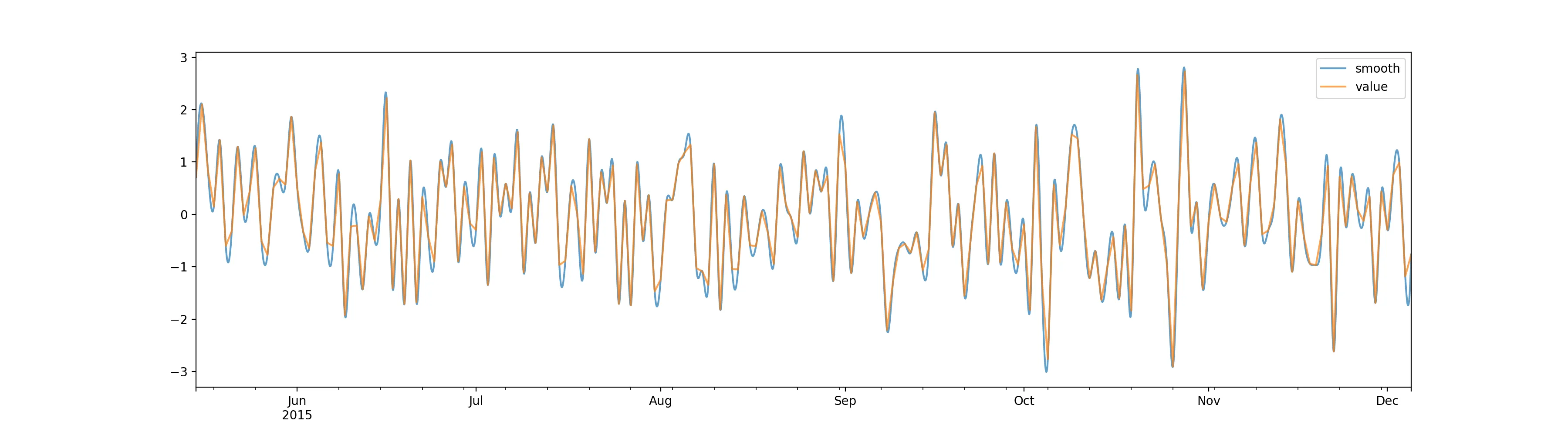
然后我们绘制数据。
fig, axs = plt.subplots(1,1, figsize=(18,5))
x = df.index
y = df.value
axs.plot(x, y)
fig.show()
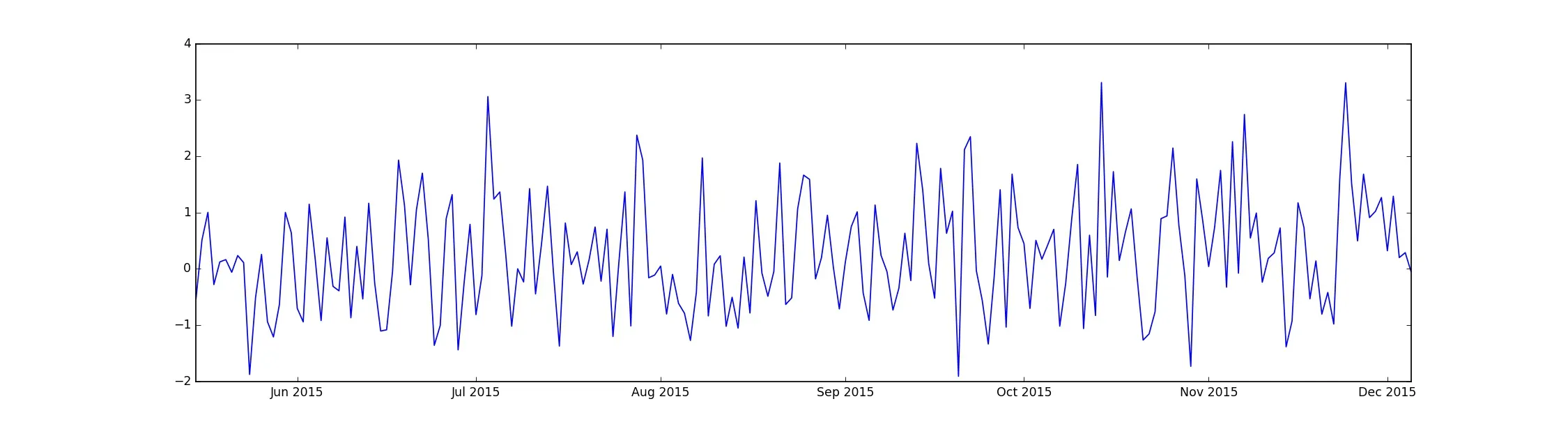
我们得到:
现在要平滑这条线,已经有了一些有用的stackoverflow问题,例如:
但我似乎无法让某些代码针对我的示例工作,有什么建议吗?