以下是使用matplotlib生成绘图的Python脚本。
#!/usr/bin/python

import matplotlib.pyplot as plt
import time
import numpy as np
from scipy.interpolate import spline

# Local variables
x = []
y = []

# Open the data file for reading lines
datafile = open('testdata1.txt', 'r')
sepfile = datafile.read().split('\n')
datafile.close()

# Create a canvas to place the subgraphs
canvas = plt.figure()
rect = canvas.patch
rect.set_facecolor('white')

# Iterate through the lines and parse them
for datapair in sepfile:
    if datapair:
        xypair = datapair.split(' ')
        x.append(int(xypair[1]))
        y.append(int(xypair[3]))

# Define the matrix of 1x1 to place subplots
# Placing the plot1 on 1x1 matrix, at pos 1
sp1 = canvas.add_subplot(1,1,1, axisbg='w')
sp1.plot(x, y, 'red', linewidth=2)

# Colorcode the tick tabs
sp1.tick_params(axis='x', colors='red')
sp1.tick_params(axis='y', colors='red')

# Colorcode the spine of the graph
sp1.spines['bottom'].set_color('r')
sp1.spines['top'].set_color('r')
sp1.spines['left'].set_color('r')
sp1.spines['right'].set_color('r')

# Put the title and labels
sp1.set_title('matplotlib example 1', color='red')
sp1.set_xlabel('matplot x label', color='red')
sp1.set_ylabel('matplot y label', color='red')

# Show the plot/image
plt.tight_layout()
plt.grid(alpha=0.8)
plt.savefig("example6.eps")
plt.show()
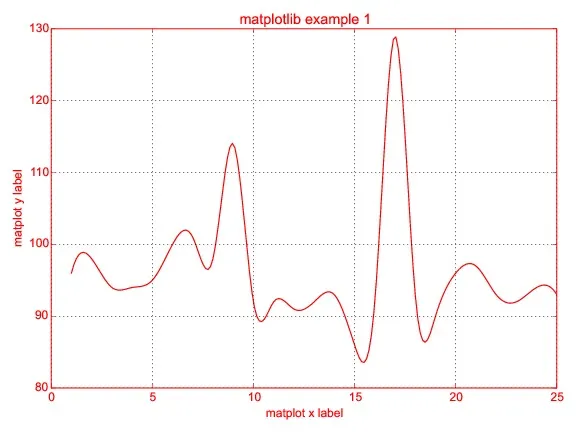
它生成了这个图形:
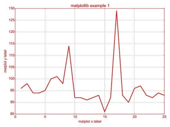
我试图生成一个平滑的图形而不是线条,但未能实现结果。我尝试遵循这个视频: https://www.youtube.com/watch?v=uSB8UBrbMfk
请问有人可以建议我如何更改吗?