如何在ggplot2图形的右侧放置一个变换比例尺?

19

我正在制作一个显示湖泊水位随时间变化的图表。下面附上一个简单的示例。我希望在绘图的右侧添加一个刻度(刻度线和注释),以显示海拔高度,但我知道 ggplot2 不允许使用两个不同的刻度尺(请参见具有 2 个 y 轴的绘图,一个 y 轴在左侧,另一个 y 轴在右侧)。但因为这是相同比例尺的转换,所以是否有一种方法可以实现呢?我更喜欢继续使用 ggplot2,而不是回归到 plot() 函数。

library(ggplot2)
LakeLevels<-data.frame(Day=c(1:365),Elevation=sin(seq(0,2*pi,2*pi/364))*10+100)
p <- ggplot(data=LakeLevels) + geom_line(aes(x=Day,y=Elevation)) + 
  scale_y_continuous(name="Elevation (m)",limits=c(75,125)) 
p

4
毫无疑问,一会儿就会有人提出一些建议。与此同时,这是给你的一份加分,因为你发布了你的第一个问题,并包含了代码和数据的可重现示例。欢迎来到 Stack Overflow。 - SlowLearner
2
我记不清与这个想法相关的讨论是否超越了kohske所做的初步工作。 - joran
4个回答

16
你应该查看这个链接:http://rpubs.com/kohske/dual_axis_in_ggplot2。我已经为你的示例适应了那里提供的代码。这个修复似乎非常“hacky”,但它让你完成了其中一部分。唯一剩下的就是弄清如何将文本添加到图形的右轴。
    library(ggplot2)
    library(gtable)
    library(grid)
    LakeLevels<-data.frame(Day=c(1:365),Elevation=sin(seq(0,2*pi,2*pi/364))*10+100)
    p1 <- ggplot(data=LakeLevels) + geom_line(aes(x=Day,y=Elevation)) + 
          scale_y_continuous(name="Elevation (m)",limits=c(75,125))

    p2<-ggplot(data=LakeLevels)+geom_line(aes(x=Day, y=Elevation))+
        scale_y_continuous(name="Elevation (ft)", limits=c(75,125),           
        breaks=c(80,90,100,110,120),
                 labels=c("262", "295", "328", "361", "394"))

    #extract gtable
    g1<-ggplot_gtable(ggplot_build(p1))
    g2<-ggplot_gtable(ggplot_build(p2))

    #overlap the panel of the 2nd plot on that of the 1st plot

    pp<-c(subset(g1$layout, name=="panel", se=t:r))
    g<-gtable_add_grob(g1, g2$grobs[[which(g2$layout$name=="panel")]], pp$t, pp$l, pp$b, 
                       pp$l)

   ia <- which(g2$layout$name == "axis-l")
   ga <- g2$grobs[[ia]]
   ax <- ga$children[[2]]
   ax$widths <- rev(ax$widths)
   ax$grobs <- rev(ax$grobs)
   ax$grobs[[1]]$x <- ax$grobs[[1]]$x - unit(1, "npc") + unit(0.15, "cm")
   g <- gtable_add_cols(g, g2$widths[g2$layout[ia, ]$l], length(g$widths) - 1)
   g <- gtable_add_grob(g, ax, pp$t, length(g$widths) - 1, pp$b)

   # draw it
   grid.draw(g)

enter image description here


谢谢!这正是我在寻找的(正如你所提到的,最好还有一个轴标签)。这是我第一次看到ggplot_gtable()函数的示例,它看起来非常强大,可以进行自定义。希望这个功能能够在ggplot的下一个版本中发布。 - Bomhof
Walter,看起来这种通用方法在使用ggplot2 2.1.0时已经失效了 - 你能否解释一下?请参见https://dev59.com/F5Xfa4cB1Zd3GeqPlNsQ - Thomas
@Thomas,基于@Walter的解决方案,并使用cowplot包中的代码的解决方案在这里 - Sandy Muspratt

5
我可能已经找到了一个解决方案来放置轴标题,借鉴了Nate Pope的答案中的一些想法,可以在此处找到:
ggplot2:在图形顶部添加二次转换的x轴
还有一个关于访问gtable中grobs的讨论在这里: https://groups.google.com/forum/m/#!topic/ggplot2-dev/AVHHcYqc5uU

最后,我只是添加了以下行:

g <- gtable_add_grob(g, g2$grob[[7]], pp$t, length(g$widths), pp$b)

在调用grid.draw(g)之前,似乎解决了问题。
据我所知,它将y轴标题g2$grob[[7]]放置在最外侧的右侧。这可能不是最好的解决方案,但对我有效。
最后,找到一种旋转坐标轴标题的方法会很好。
敬礼,
Tim

4
这个问题已经得到解答,但将次要轴和辅助比例尺添加到ggplot对象的右侧是一个常见的问题。我想在下面报告一下自己对此问题的微调,基于本主题中以及其他几个主题中给出的各种答案的几个元素(请参阅以下参考文献的部分清单),因为我需要大量生成双Y轴图,所以我编写了一个功能ggplot_dual_axis()。以下是可能感兴趣的特点:
1. 代码显示左y轴和右y轴的网格线(虽然这很简单,但这是我做出的主要贡献) 2. 代码打印并嵌入欧元符号到pdf中(我在这里看到的东西:Plotting Euro Symbol € in ggplot2?) 3. 代码试图避免重复打印某些元素(“尝试”意味着我对其完全成功表示怀疑)
未回答的问题: 1. 是否有一种方法可以修改ggplot_dual_axis()函数,以便在没有geom元素的情况下删除其中一个geom_line()geom_point()等而不会引发错误。伪代码类似于if has(geom_line) ... 2. 如何通过关键字而不是索引调用g2$grobs[[7]]?这就是它返回的内容:text[axis.title.y.text.232]我对该问题的兴趣源于尝试通过应用类似技巧来捕获网格线而失败。我认为网格线在g2$grobs[[4]]中的某个地方隐藏,但我不确定如何访问它们。
编辑。我自己回答的问题:如何增加右侧的图表边距,其中“欧元”标签位于此处?答案是:theme(plot.margin = unit(c(1,3,0.5,0.8), "lines")),例如,将起到作用。
请指出任何明显的问题或建议改进。现在看一下代码:希望对某人有用。正如我所说的,我不声称原创性,它是其他人已经显示的东西的组合。
##' function named ggplot_dual_axis()
##' Takes 2 ggplot plots and makes a dual y-axis plot
##' function takes 2 compulsory arguments and 1 optional argument
##' arg lhs is the ggplot whose y-axis is to be displayed on the left
##' arg rhs is the ggplot whose y-axis is to be displayed on the right
##' arg 'axis.title.y.rhs' takes value "rotate" to rotate right y-axis label
##' The function does as little as possible, namely:
##'  # display the lhs plot without minor grid lines and with a
##'  transparent background to allow grid lines to show
##'  # display the rhs plot without minor grid lines and with a
##'  secondary y axis, a rotated axis label, without minor grid lines
##'  # justify the y-axis label by setting 'hjust = 0' in 'axis.text.y'
##'  # rotate the right plot 'axis.title.y' by 270 degrees, for symmetry
##'  # rotation can be turned off with 'axis.title.y.rhs' option
##'  

ggplot_dual_axis <- function(lhs, rhs, axis.title.y.rhs = "rotate") {
  # 1. Fix the right y-axis label justification
    rhs <- rhs + theme(axis.text.y = element_text(hjust = 0))
  # 2. Rotate the right y-axis label by 270 degrees by default
    if (missing(axis.title.y.rhs) | 
        axis.title.y.rhs %in% c("rotate", "rotated")) {
        rhs <- rhs + theme(axis.title.y = element_text(angle = 270)) 
    }
  # 3a. Use only major grid lines for the left axis
    lhs <- lhs + theme(panel.grid.minor = element_blank())
  # 3b. Use only major grid lines for the right axis
  #     force transparency of the backgrounds to allow grid lines to show
    rhs <- rhs + theme(panel.grid.minor = element_blank(), 
        panel.background = element_rect(fill = "transparent", colour = NA), 
        plot.background = element_rect(fill = "transparent", colour = NA))
# Process gtable objects
  # 4. Extract gtable
    library("gtable") # loads the grid package
    g1 <- ggplot_gtable(ggplot_build(lhs))
    g2 <- ggplot_gtable(ggplot_build(rhs))
  # 5. Overlap the panel of the rhs plot on that of the lhs plot
    pp <- c(subset(g1$layout, name == "panel", se = t:r))
    g <- gtable_add_grob(g1, 
        g2$grobs[[which(g2$layout$name == "panel")]], pp$t, pp$l, pp$b, pp$l)
  # Tweak axis position and labels
    ia <- which(g2$layout$name == "axis-l")
    ga <- g2$grobs[[ia]]
    ax <- ga$children[["axis"]]  # ga$children[[2]]
    ax$widths <- rev(ax$widths)
    ax$grobs <- rev(ax$grobs)
    ax$grobs[[1]]$x <- ax$grobs[[1]]$x - unit(1, "npc") + unit(0.15, "cm")
    g <- gtable_add_cols(g, g2$widths[g2$layout[ia, ]$l], length(g$widths) - 1)
    g <- gtable_add_grob(g, ax, pp$t, length(g$widths) - 1, pp$b)
    g <- gtable_add_grob(g, g2$grobs[[7]], pp$t, length(g$widths), pp$b)
  # Display plot with arrangeGrob wrapper arrangeGrob(g)
    library("gridExtra")
    grid.newpage()
    return(arrangeGrob(g))
}

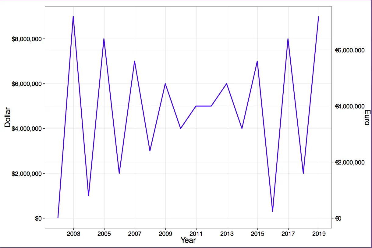
以下是一些虚假数据和两个图表,这些图表的单位是美元和欧元。如果有一个包可以让您制作一个图表并将其包裹在一个双y轴图中,那不是很酷吗?例如:ggplot_dual_axis_er(ggplot_object, currency = c("dollar", "euro")),它会自动为您获取汇率! :-)

# Set directory:
if(.Platform$OS.type == "windows"){
  setwd("c:/R/plots")
} else { 
  setwd("~/R/plots")
}

# Load libraries
library("ggplot2")
library("scales")

# Create euro currency symbol in plot labels, simple version
# avoids loading multiple libraries
# avoids problems with rounding of small numbers, e.g. .0001
labels_euro <- function(x) {# no rounding
paste0("€", format(x, big.mark = ",", decimal.mark = ".", trim = TRUE,
    scientific = FALSE))
} 

labels_dollar <- function(x) {# no rounding: overwrites dollar() of library scales
paste0("$", format(x, big.mark = ",", decimal.mark = ".", trim = TRUE,
    scientific = FALSE))
} 

# Create data
df <- data.frame(
  Year = as.Date(c("2001", "2002", "2003", "2004", "2005", "2006", "2007", "2008", "2009", "2010", "2011", "2012", "2013", "2014", "2015", "2016", "2017", "2018"),
    "%Y"), 
  Dollar = c(0, 9000000, 1000000, 8000000, 2000000, 7000000, 3000000, 6000000, 4000000, 5000000, 5000000, 6000000, 4000000, 7000000, 300000, 8000000, 2000000, 9000000))
# set Euro/Dollar exchange rate at 0.8 euros = 1 dollar
df <- cbind(df, Euro = 0.8 * df$Dollar)
# Left y-axis
p1 <- ggplot(data = df, aes(x = Year, y = Dollar)) + 
    geom_line(linestyle = "blank") + # manually remove the line
    theme_bw(20) +                   # make sure font sizes match in both plots
    scale_x_date(labels = date_format("%Y"), breaks = date_breaks("2 years")) + 
    scale_y_continuous(labels = labels_dollar, 
        breaks = seq(from = 0, to = 8000000, by = 2000000))
# Right y-axis
p2 <- ggplot(data = df, aes(x = Year, y = Euro)) + 
    geom_line(color = "blue", linestyle = "dotted", size = 1) + 
    xlab(NULL) +                     # manually remove the label
    theme_bw(20) +                   # make sure font sizes match in both plots
    scale_x_date(labels = date_format("%Y"), breaks = date_breaks("2 years")) +
    scale_y_continuous(labels = labels_euro, 
        breaks = seq(from = 0, to = 7000000, by = 2000000))

# Combine left y-axis with right y-axis
p <- ggplot_dual_axis(lhs = p1, rhs = p2)
p

# Save to PDF
pdf("ggplot-dual-axis-function-test.pdf", 
  encoding = "ISOLatin9.enc", width = 12, height = 8)
p
dev.off()

embedFonts(file = "ggplot-dual-axis-function-test.pdf", 
           outfile = "ggplot-dual-axis-function-test-embedded.pdf")

输入图像描述

参考文献列表:

  1. 在ggplot中显示两个平行坐标轴(R)
  2. 在多面板图中为ggplot2设置双y轴
  3. 如何在ggplot2的右侧放置一个变换比例尺?
  4. 使用grid.arrange保留图形比例
  5. 在ggplot中对齐图形的风险
  6. https://github.com/kohske/ggplot2

我设法让图表在facet_wrap中重叠,但到目前为止我还无法在图表上获取轴。有什么想法吗? 获取绘图的更改是:g <- gtable_add_grob(g1, g2$grobs[grep("panel",g2$layout$name)], pp$t, pp$l, pp$b, pp$l) - Jan Stanstrup
你看过这些吗?http://stackoverflow.com/questions/27750737/dismantling-a-ggplot-with-grid-and-gtable,https://dev59.com/-obca4cB1Zd3GeqPXZCE - PatrickT
1
不用了,谢谢。但我不认为很快就能真正理解这是如何工作的。无论如何,在一些试验和错误后,我设法把一些东西组合在一起(也可以不使用facets):https://gist.github.com/stanstrup/cfcc8badd8ca4453c8bb 唯一的问题是,如果没有在facets中“绘制网格”,则轴仍然被制作到最右侧。例如,如果您在3x3网格中有7个图形,则最后两个位置没有图形。但是轴将一直制作到右侧。我想这不太容易修复,我可以手动修复它。再次感谢这个好例子。 - Jan Stanstrup
啊,还有一件事。如果所有图都有单独的y轴,则不起作用。 - Jan Stanstrup
您可能需要单独提出一个问题,使用“ggplot2”和“gtable”标签,并提供问题和期望结果的MWE和屏幕截图。 - PatrickT
好的,谢谢您的建议。我已经完成了:https://dev59.com/oIrda4cB1Zd3GeqPOZg0 - Jan Stanstrup

2
为了旋转轴标题,将以下内容添加到p2图中:
p2 <- p2 + theme(axis.title.y=element_text(angle=270))

网页内容由stack overflow 提供, 点击上面的
可以查看英文原文,
原文链接