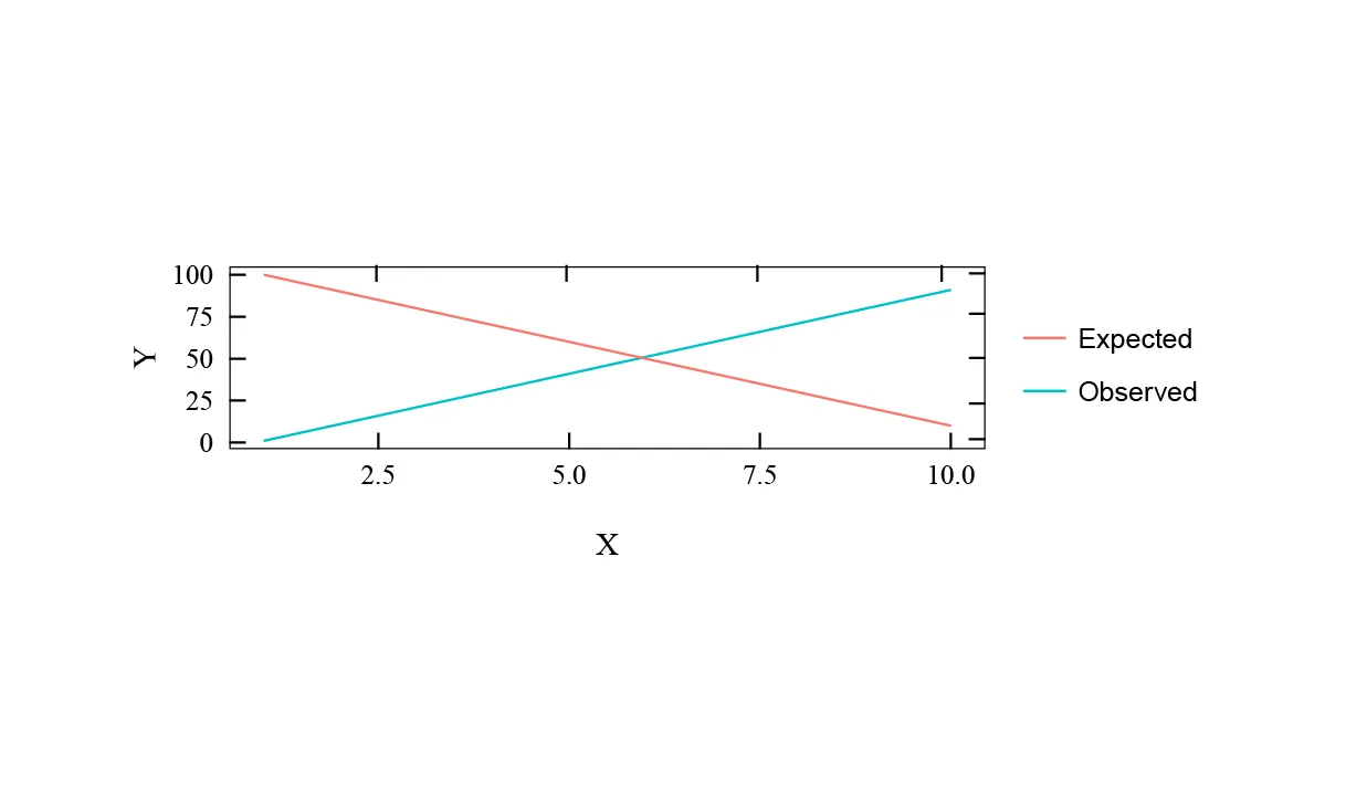
如何在 ggplot2 图形的顶部和右侧添加刻度线?我正在尝试符合图形的标准格式,而且已经有了一个较长的主题。
以下是使用任意数据示例:
library (ggplot2)
library (gridExtra)

x <- seq(1,10,1)
y <- seq(1,100,10)
y2 <- seq(100,1,-10)
df <- data.frame(x,y,y2)

theme_new <-  function(base_size = 12){theme(
  plot.title = element_text (vjust = 3, size = 16,family="serif"), # plot title attrib.
  plot.margin = unit (c(8, 4, 8, 4), "lines"), # plot margins
  panel.border = element_rect (colour = "black", fill = F), # axis colour = black
  panel.grid.major = element_blank (), # remove major grid
  panel.grid.minor = element_blank (), # remove minor grid
  panel.background = element_rect (fill = "white"), # background colour
  legend.background = element_rect (fill = "white"), # background colour
  #legend.justification=c(0, 0), # lock point for legend
  #legend.position = c(0, 1), # put the legend INSIDE the plot area, use = "none" to turn off
  legend.key = element_blank (), # switch off the rectangle around symbols in the legend
  legend.title = element_blank (), # switch off the legend title
  legend.text = element_text (size = 12), # sets the attributes of the legend text
  axis.title.x = element_text (vjust = -2, size = 14,family="serif"), # change the axis title
  axis.title.y = element_text (vjust = 1, angle = 90, size = 14,family="serif"), # change the axis title
  axis.text.x = element_text (size = 12, vjust = -0.25, colour = "black",family="serif"),# change the axis label font attributes
  axis.text.y = element_text (size = 12, hjust = 1, colour = "black",family="serif"), # change the axis label font attributes
  axis.ticks = element_line (colour = "black", size = 0.5), # sets the thickness and colour of axis ticks
  axis.ticks.length = unit(-0.25 , "cm"), # -ve length = inside ticks
  axis.ticks.margin = unit(0.5, "cm") # margin between the ticks and the text
)}

ggplot() +
        geom_line(data=df, aes(x=x, y=y, color='Observed')) +
        geom_line(data=df, aes(x=x, y=y2, color='Expected')) +
        labs(x="X", y="Y") +
        theme_new()
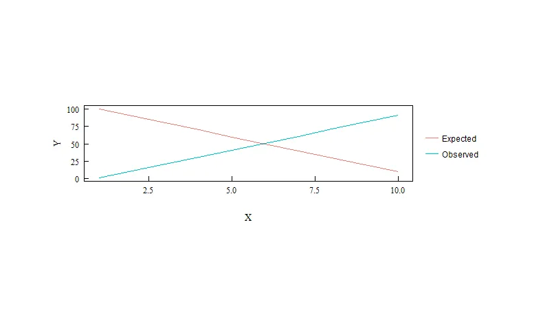
这里有一个示例图像: