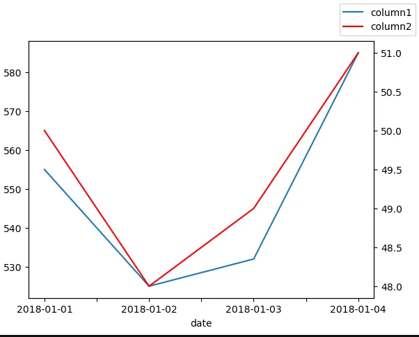
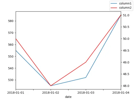
第二个y轴时间序列

71

使用数据框

df = pd.DataFrame({
    "date" : ["2018-01-01", "2018-01-02", "2018-01-03", "2018-01-04"],
    "column1" : [555,525,532,585],
    "column2" : [50,48,49,51]
})

我们可以使用seaborn绘制图表,例如使用sns.tsplot(data=df.column1, color="g")来绘制column1的时间序列。

如何在seaborn中绘制两个y轴的时间序列?
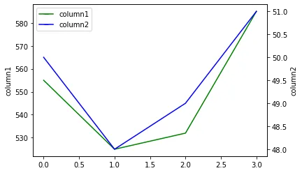

3
我建议不要在普通时间序列中使用 tsplot。例如,请参考昨天的 问题 - ImportanceOfBeingErnest
正如所说,人们认为应该使用tsplot来绘制他们的时间相关数据,但它实际上从未被设计用于此目的。 - ImportanceOfBeingErnest
2
另请参见 seaborn 作者的 此评论 - ImportanceOfBeingErnest
3个回答

119
由于seaborn是建立在matplotlib之上的,你可以利用它的强大功能:
import matplotlib.pyplot as plt
sns.lineplot(data=df.column1, color="g")
ax2 = plt.twinx()
sns.lineplot(data=df.column2, color="b", ax=ax2)

enter image description here


18
这似乎是一个解决方案,但传说与第二个出现的情况不一致。 - Bastian Ebeling

77

我建议使用普通的折线图。你可以通过ax.twinx()获得一个双坐标轴。

import pandas as pd
import matplotlib.pyplot as plt

df = pd.DataFrame({"date": ["2018-01-01", "2018-01-02", "2018-01-03", "2018-01-04"],
                   "column1": [555,525,532,585], 
                   "column2": [50,48,49,51]})

ax = df.plot(x="date", y="column1", legend=False)
ax2 = ax.twinx()
df.plot(x="date", y="column2", ax=ax2, legend=False, color="r")
ax.figure.legend()
plt.show()

在此输入图片描述


20
OP指定了一个seaborn的解决方案。 - flashliquid
15
是的,但是当有人想要“使用seaborn”时,90%的情况下他们并没有意识到seaborn只是一个漂亮但不完整的matplotlib接口,并且pandas包装的方式同样适用。还需要注意的是,在撰写本回答时,seaborn没有lineplot函数。 - ImportanceOfBeingErnest
很棒的解决方案。在使用pandassecondary_y参数时,我遇到了绘制单个图例和将图例移动到图外的问题。 - trianta2

5
您可以尝试以下代码,基于@Andrey Sobolev的解决方案,但它还将生成完整的图例。
from matplotlib.lines import Line2D
    
g = sb.lineplot(data=df.column1, color="g")
sb.lineplot(data=df.column2, color="b", ax=g.axes.twinx())
g.legend(handles=[Line2D([], [], marker='_', color="g", label='column1'), Line2D([], [], marker='_', color="b", label='column2')])

output


我们如何更改y轴的名称? - user19562955

网页内容由stack overflow 提供, 点击上面的
可以查看英文原文,
原文链接