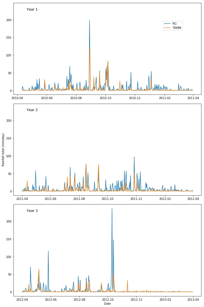
我认为我了解matplotlib中twiny/x函数,但我真的很难弄清如何在subplot上下文中使用此函数。我有一个线性图像这样显示降雨数据:
由此代码生成:
fig,ax = plt.subplots(3, figsize=(10,15),sharey=True)

ax[0].plot(YEAR1['pcp_1D_tot'], label='RG')
ax[0].plot(YEAR1['ppt_1D'], label='TRMM')
ax[0].set_title('Year 1',x=0.1,y=0.9)

ax[1].plot(YEAR2['pcp_1D_tot'], label='RG')
ax[1].plot(YEAR2['ppt_1D'], label='TRMM')
ax[1].set_title('Year 2',x=0.1,y=0.9)
ax[1].set_ylabel('Rainfall total (mm/day)')

ax[2].plot(YEAR3['pcp_1D_tot'], label='RG')
ax[2].plot(YEAR3['ppt_1D'], label='TRMM')
ax[2].set_title('Year 3',x=0.1,y=0.9)
ax[2].set_xlabel('Date')

fig.legend(loc=(0.8,0.9))
fig.tight_layout()
plt.show()
但我还有关于洪水大小的数据要添加,分为1、2、3级,存储在名为“例如”的列中。
YEAR1['Size']
我想将它们作为散点图绘制在线图的顶部,以显示它们相对于降雨量的发生率,因此我认为需要在右侧添加另一个y轴,但我非常不清楚如何做到这一点。
有人能帮忙吗?
**###########更新############### **
由于下面的贡献,我设法制作了以下内容,这正是我所希望的:
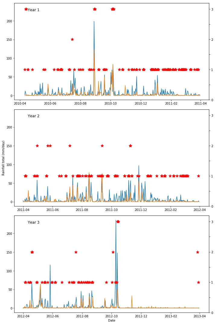
x = YEAR1m.index #### these are referring to other data that has been filtered
y = YEAR2m.index
z = YEAR3m.index

fig,ax = plt.subplots(3, figsize=(10,15),sharey=True)

ax[0].plot(YEAR1['pcp_1D_tot'], label='RG')
ax[0].plot(YEAR1['ppt_1D'], label='TRMM')
ax[0].set_title('Year 1',x=0.1,y=0.9)
ax0 = ax[0].twinx()
ax0.scatter(x, YEAR1m['Size'], marker='*', color='r',s=100)
ax0.set_ylim([0,3.2])
ax0.set_yticklabels(['0',' ','1',' ','2',' ','3'])


ax[1].plot(YEAR2['pcp_1D_tot'], label='RG')
ax[1].plot(YEAR2['ppt_1D'], label='TRMM')
ax[1].set_title('Year 2',x=0.1,y=0.9)
ax[1].set_ylabel('Rainfall total (mm/day)')
ax1 = ax[1].twinx()
ax1.scatter(y, YEAR2m['Size'], marker='*', color='r',s=100)
ax1.set_ylim([0,3.2])
ax1.set_yticklabels(['0',' ','1',' ','2',' ','3'])


ax[2].plot(YEAR3['pcp_1D_tot'], label='RG')
ax[2].plot(YEAR3['ppt_1D'], label='TRMM')
ax[2].set_title('Year 3',x=0.1,y=0.9)
ax[2].set_xlabel('Date')
ax2 = ax[2].twinx()
ax2.scatter(z, YEAR3m['Size'], marker='*', color='r',s=100)
ax2.set_ylim([0,3.2])
ax2.set_yticklabels(['0',' ','1',' ','2',' ','3'])


# fig.legend(loc=(0.8,0.9))
fig.tight_layout()
plt.show()