我有两组线性相关的值。因此,我只需要一个带有第二个 y 轴并且刻度正确的图表。
最优雅的方法是什么?
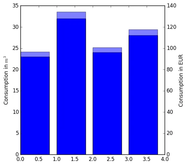
只绘制两个条形图会导致重叠:
import numpy as np
import matplotlib.pyplot as plt

x = np.arange(4)
y2 = np.array([23, 32, 24, 28])
y1 = 4.2 * y2

fig = plt.figure(1, figsize=(6,6))

ax = fig.add_subplot(111)
ax.bar(x, y2)
ax.set_ylabel('Consumption in $m^3$')
ax2 = ax.twinx()
ax2.bar(x, y1, alpha=0.5)
ax2.set_ylabel('Consumption in EUR')

plt.savefig('watercomsumption.png', format='png', bbox_inches="tight")
非常感谢! :-)
编辑:
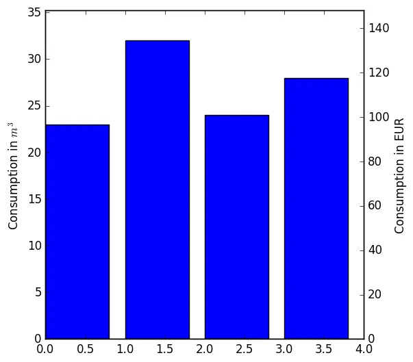
我可能没有表达清楚。我想制作一个单独的图表,就像下面这样。但是有没有更优雅的方法来调用两次柱形图函数并使用alpha=0隐藏它?
import numpy as np
import matplotlib.pyplot as plt

x = np.arange(4)
y2 = np.array([23, 32, 24, 28])
y1 = 4.2 * y2

y2max = np.max(y2) * 1.1

fig = plt.figure(1, figsize=(6,6))

ax = fig.add_subplot(111)
ax.bar(x, y2)
ax.set_ylabel('Consumption in $m^3$')
ax2 = ax.twinx()

ax2.bar(x, y1, alpha=0)
ax2.set_ylabel('Consumption in EUR')

ax.set_ylim(ymax=y2max)
ax2.set_ylim(ymax=4.2*y2max)

plt.savefig('watercomsumption.png', format='png', bbox_inches="tight")

bar函数,并且仅修改ylims参数即可。 - Suever