我有一个如下的pandas数据框:
然后
而
现在我想将它们放在一个具有两个y轴的图表中,使用twinx()。
结果如下: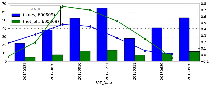 我的问题是:
>>> df
                   sales  net_pft  sales_gr  net_pft_gr
STK_ID RPT_Date
600809 20120331  22.1401   4.9253    0.1824     -0.0268
       20120630  38.1565   7.8684    0.3181      0.1947
       20120930  52.5098  12.4338    0.4735      0.7573
       20121231  64.7876  13.2731    0.4435      0.7005
       20130331  27.9517   7.5182    0.2625      0.5264
       20130630  40.6460   9.8572    0.0652      0.2528
       20130930  53.0501  11.8605    0.0103     -0.0461
然后
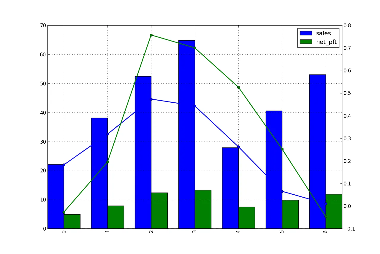
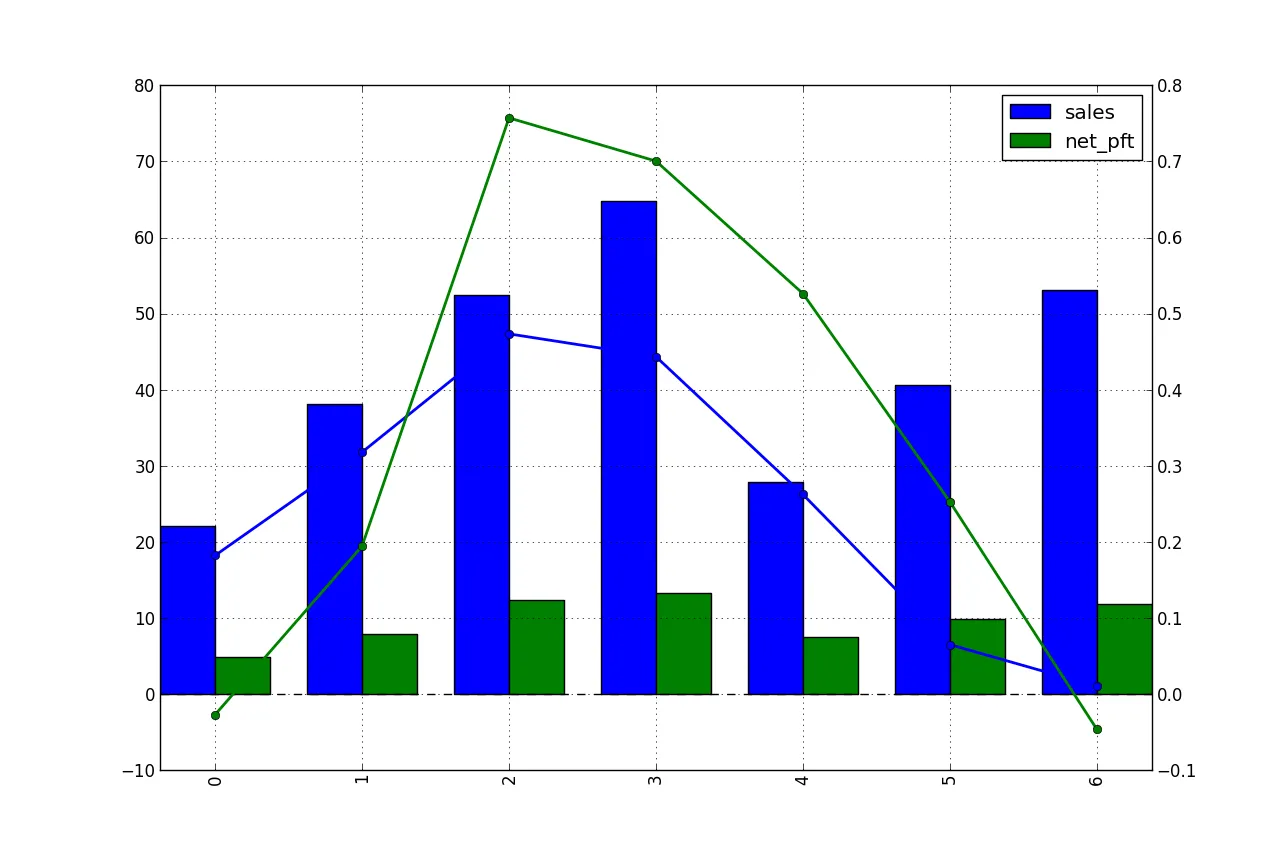
df[['sales','net_pft']].unstack('STK_ID').plot(kind='bar', use_index=True)创建柱状图。而
df[['sales_gr','net_pft_gr']].plot(kind='line', use_index=True)创建折线图:现在我想将它们放在一个具有两个y轴的图表中,使用twinx()。
import matplotlib.pyplot as plt
fig = plt.figure()
ax = df[['sales','net_pft']].unstack('STK_ID').plot(kind='bar', use_index=True)
ax2 = ax.twinx()
ax2.plot(df[['sales_gr','net_pft_gr']].values, linestyle='-', marker='o', linewidth=2.0)
结果如下:
我的问题是:
- 如何将线条移动以与相同x轴刻度对齐?
- 如何让左右y轴刻度对齐在同一条线上?