这个建议适用于任何类型的索引值(字符串、日期或整数),只要它们是唯一的。
简短回答:
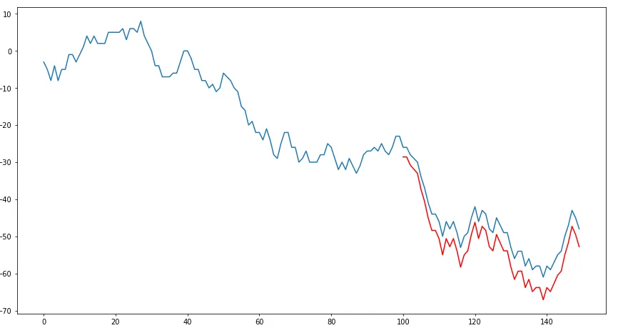
创建一个最长序列的pandas数据帧,该数据帧将具有索引。从该系列中获取最后50个索引值,并将其与新数据帧中的预测值相关联。您的两个数据帧长度不同,因此您需要merge它们在一起,以获得两个等长的系列。使用这种方法,您的前100个预测值将为空,但是您的数据将具有相关联的索引,以便您可以将其与test1系列进行绘图。
细节:
由于您没有分享可重现的数据集,我制作了一些随机数据,应该与您的数据集结构相匹配。下面的第一个代码段将复制您的情况,并使两个数组test1和**predictions1**可用于建议的解决方案。
import pandas as pd
import numpy as np
import matplotlib.pyplot as plt
np.random.seed(123456)
rows = 150
df = pd.DataFrame(np.random.randint(-4,5,size=(rows, 1)), columns=['test1'])
datelist = pd.date_range(pd.datetime(2017, 1, 1).strftime('%Y-%m-%d'), periods=rows).tolist()
df['dates'] = datelist
df = df.set_index(['dates'])
df.index = pd.to_datetime(df.index)
df['test1'] = df['test1'].cumsum()
test1 = df['test1'].values
predicionts1 = df['test1'].tail(50).values
predictions1 = predicionts1*1.1
import matplotlib.pyplot as plt
plt.figure(figsize=(15,8))
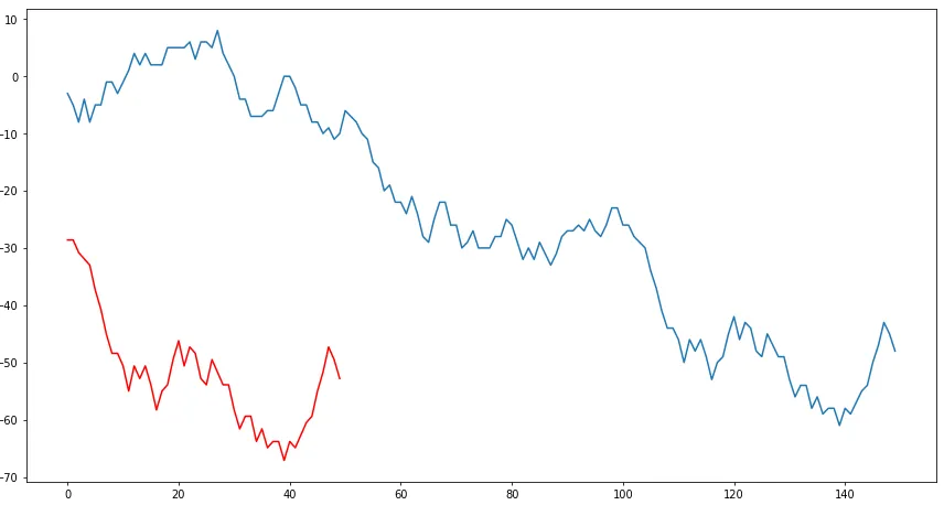
plt.plot(test1)
plt.plot(predictions1, color = 'red')
plt.show()
以下代码片段将在test1上叠加predictions1:
df_new = pd.DataFrame(test1)
df_new.columns = ['test1']
new_index = df_new['test1'].tail(len(predictions1)).index
new_series = pd.DataFrame(index = new_index, data = predictions1)
df_new = pd.merge(df_new, new_series, how = 'left', left_index=True, right_index=True)
df_new.columns = ['test1', 'predictions1']
import matplotlib.pyplot as plt
plt.figure(figsize=(15,8))
plt.plot(df_new['test1'])
plt.plot(df_new['predictions1'], color = 'red')
plt.show()
 很明显这并不是我想要实现的,因为我希望红色曲线在末尾叠加在蓝色曲线上。请帮忙解决。
predictions1将绘制在test1右侧。 - DavidGpyplot.plot()函数的文档。如果您只是对如何处理Python有问题,那么您应该能够理解它。第一个参数是X轴,第二个参数是Y轴。 - IMCoins