如何在matplotlib的pandas柱状图上添加一条线?

5

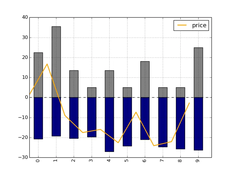
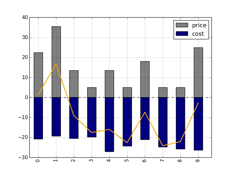
您好,我已经成功添加了柱状图中的一条线,但位置不正确。我想使点位于每个柱子的正中间。有人可以帮忙吗?

>>> df
   price       cost        net
0   22.5 -20.737486   1.364360
1   35.5 -19.285862  16.695847
2   13.5 -20.456378  -9.016052
3    5.0 -19.643776 -17.539636
4   13.5 -27.015138 -15.964597
5    5.0 -24.267836 -22.618819
6   18.0 -21.096404  -7.357684
7    5.0 -24.691966 -24.116106
8    5.0 -25.755958 -22.080329
9   25.0 -26.352161  -2.781588

fig = plt.figure()
df[['price','cost']].plot(kind = 'bar',stacked = True,color = ['grey','navy'])
df['net'].plot('o',color = 'orange',linewidth=2.0,use_index = True)

enter image description here


3
你能提供一个完整可运行的 SSCCE 吗? - Ffisegydd
你能展示一下你正在使用的所有matplotlib脚本吗? - Taha
@Ffisegydd 我已经编辑完成,现在您可以看到 SSCCE。 - lsheng
我很期待了解df的本质。我经常使用matplotlib,但只使用numpy数组。如果您使用不同类型的表格,展示至少实例化命令将会很有帮助。 - Taha
1
深入研究后发现,这是pandas中的一个bug。我已经在https://github.com/pydata/pandas/issues/7262上创建了一个问题。 - tacaswell
显示剩余3条评论
1个回答

10

更新:这个问题将在即将发布的0.14版本中得到修复(你上面的代码将正常工作),对于旧版本的Pandas,可以使用下面我的解决方法。


你所遇到的问题是,在条形图上看到的x轴标签与matplotlib实际使用的底层坐标并不完全对应。
例如,在matplotlib的默认bar绘图中,第一个矩形(标记为0的第一根柱)将绘制在横坐标0到0.8之间(柱宽为0.8)。因此,如果你想要在其中心绘制一个点或线,则其x坐标应该是0.4,而不是 0!

为了解决您的问题,您可以执行以下操作:

In [3]: ax = df[['price','cost']].plot(kind = 'bar',stacked = True,color = ['grey','navy'])

In [4]: ax.get_children()[3]
Out[4]: <matplotlib.patches.Rectangle at 0x16f2aba8>

In [5]: ax.get_children()[3].get_width()
Out[5]: 0.5

In [6]: ax.get_children()[3].get_bbox()
Out[6]: Bbox('array([[  0.25,   0.  ],\n       [  0.75,  22.5 ]])')

In [7]: plt.plot(df.index+0.5, df['net'],color = 'orange',linewidth=2.0)

我使用 ax.get_children()[3].get_width().get_bbox() 来检查绘图中条形图的实际宽度和坐标,因为 Pandas 似乎不使用 Matplotlib 的默认值(0.5 的值实际上来自于 0.25(从 y 轴到第一根条的偏移量)+ 0.5/2(宽度的一半))。

所以我实际上将 df['net'].plot(use_index = True) 更改为 plt.plot(df.index + 0.5, df['net'])

这给了我:

enter image description here


抱歉,(现已删除)评论是错误的,正确的关键字参数是 alignax.bar(locs, vals, align='center') 将在 locs 中心放置条形图。 - tacaswell
@joris 非常感谢,实际上我的 df.index 由字符串组成,而不是数字。所以我有点担心这个 df.index + o.5 是否有效。等我联系到电脑后再试一下,干杯! - lsheng
@joris 没问题,np.arange(len(df)) + 0.5可以使用,非常好!非常感谢! - lsheng
@joris 我发现“net”(橙色线)的图例没有被打印出来。如果我这样做:plt.legend(loc='lower left'),新的图例仍然只包括价格和成本.. 橙色线不存在。 - lsheng
1
你需要在绘制线条的代码行中添加 label="net",然后执行 plt.legend() 命令重新绘制图例。 - joris
显示剩余2条评论

网页内容由stack overflow 提供, 点击上面的
可以查看英文原文,
原文链接