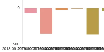
df(Pandas DataFrame)有两列:Date(作为datetime64)和Amount(作为float)。
我使用条形图将Amount列的值绘制在时间轴上:
sns.barplot(x="Date", y="Amount", data=df)
plt.show()
然而,日期标签非常混乱(见图片)。在Pandas中处理它的一种优雅方式是什么?我正在考虑从标签中删除月份和年份,或将标签旋转90度。如何执行这些操作,或者是否有更好的选择?谢谢。
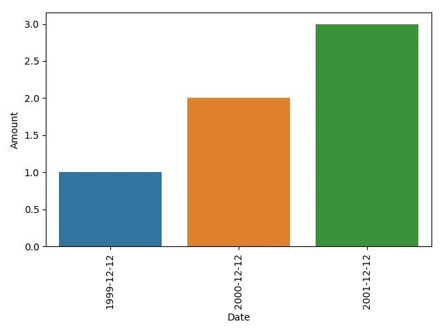
这会自动调整SNS图的日期X轴,因此在大多数情况下您不必手动进行调整:
sns_plot.get_figure().autofmt_xdate()
import seaborn as sns
import matplotlib.pyplot as plt

# dummy data:
df = pd.DataFrame({'Date':pd.to_datetime(['1999-12-12', '2000-12-12', '2001-12-12']),'Amount':[1,2,3]})

sns.barplot(x="Date", y="Amount", data=df)
# use the original locations of your xticks, and only the date for your label
# rotate the labels 90 degrees using the rotation argument
plt.xticks(plt.xticks()[0], df.Date.dt.date, rotation=90)
plt.tight_layout()
plt.show()
如果你有大量的日期需要标记,而且希望在更稀疏的时间间隔内进行标记,那么另一个解决方案是:
最初的回答:
import pandas as pd
import seaborn as sns
import matplotlib.pyplot as plt
import matplotlib.dates as mdates

# dummy data:
df = pd.DataFrame({'Date':pd.to_datetime(['1999-12-12', '2000-12-12', '2001-12-12',
                                          '2002-12-12', '2003-12-12', '2004-12-12',
                                          '2005-12-12','2006-12-12', '2007-12-12', '2008-12-12']),
                                          'Amount':[1,2,3,4,5,6,7,8,9,10]})

fig, ax = plt.subplots()
sns.barplot(x="Date", y="Amount", data=df, ax=ax)

# set the frequency for labelling the xaxis
freq = int(2)

# set the xlabels as the datetime data for the given labelling frequency,
# also use only the date for the label
ax.set_xticklabels(df.iloc[::freq].Date.dt.date)
# set the xticks at the same frequency as the xlabels
xtix = ax.get_xticks()
ax.set_xticks(xtix[::freq])
# nicer label format for dates
fig.autofmt_xdate()

plt.tight_layout()
plt.show()
同时,考虑使用seaborn默认的绘图设置,并将日期放在y轴上以便阅读,但这更多是个人偏好。
import pandas as pd
import seaborn as sns
import matplotlib.pyplot as plt
import matplotlib.dates as mdates

# set the seaborn asthetics
sns.set()

# dummy data:
df = pd.DataFrame({'Date':pd.to_datetime(['1999-12-12', '2000-12-12', '2001-12-12',
                                          '2002-12-12', '2003-12-12', '2004-12-12',
                                          '2005-12-12','2006-12-12', '2007-12-12', '2008-12-12']),
                                          'Amount':[1,2,3,4,5,6,7,8,9,10]})

fig, ax = plt.subplots()
# plot with a horizontal orientation
sns.barplot(y="Date", x="Amount", data=df, ax=ax, orient='h')

# set the frequency for labelling the yaxis
freq = int(2)

# set the ylabels as the datetime data for the given labelling frequency,
# also use only the date for the label
ax.set_yticklabels(df.iloc[::freq].Date.dt.date)
# set the yticks at the same frequency as the ylabels
ytix = ax.get_yticks()
ax.set_yticks(ytix[::freq])

plt.tight_layout()
plt.show()
strftime映射到您的df行)。 - 0xdd