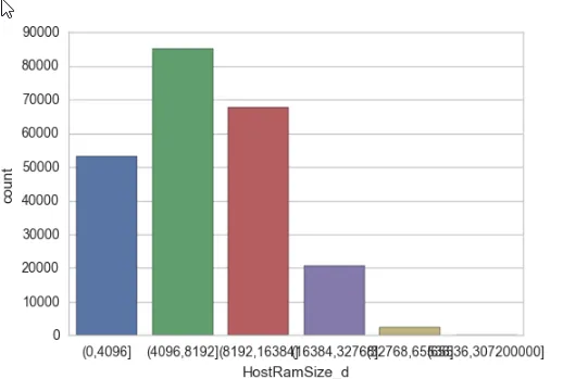
关于情节
sns.countplot(x="HostRamSize",data=df)
我得到了以下带有混合x轴标签的图表,我该如何避免这种情况?我应该改变图表的大小来解决这个问题吗?
关于情节
sns.countplot(x="HostRamSize",data=df)
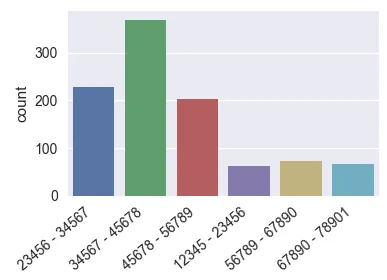
有一个这样的系列ds
import pandas as pd
import seaborn as sns
import matplotlib.pyplot as plt
import numpy as np; np.random.seed(136)

l = "1234567890123"
categories = [ l[i:i+5]+" - "+l[i+1:i+6] for i in range(6)]
x = np.random.choice(categories, size=1000,
            p=np.diff(np.array([0,0.7,2.8,6.5,8.5,9.3,10])/10.))
ds = pd.Series({"Column" : x})
有几种选项可以使轴标签更易读。
plt.figure(figsize=(8,4)) # this creates a figure 8 inch wide, 4 inch high
sns.countplot(x="Column", data=ds)
plt.show()
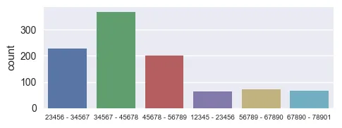
ax = sns.countplot(x="Column", data=ds)

ax.set_xticklabels(ax.get_xticklabels(), rotation=40, ha="right")
plt.tight_layout()
plt.show()
ax = sns.countplot(x="Column", data=ds)

ax.set_xticklabels(ax.get_xticklabels(), fontsize=7)
plt.tight_layout()
plt.show()
当然,任何这些组合都可以同样有效。
可以使用rcParams全局设置图形大小和xlabel字体大小。
plt.rcParams["figure.figsize"] = (8, 4)
plt.rcParams["xtick.labelsize"] = 7
将其放在Jupyter笔记本的顶部可能很有用,以便这些设置适用于生成的任何图形。不幸的是,使用rcParams无法旋转xticklabels。
我想值得注意的是,相同的策略自然也适用于seaborn条形图、matplotlib条形图或pandas.bar。
ax = sns.catplot(y="Dataset", x="Size (bytes)", hue="Implementation", data=pdData, height=6, kind="bar", palette="muted", legend=False) - PlsWorkfor axes in ax.axes.flat: axes.set_xticklabels(axes.get_xticklabels(), rotation=65, horizontalalignment='right') 解决方案在此处描述:https://www.drawingfromdata.com/how-to-rotate-axis-labels-in-seaborn-and-matplotlib - PlsWorkimport matplotlib.pyplot as plt
plt.figure(figsize=(10,5))
chart = sns.countplot(x="HostRamSize",data=df)
plt.xticks(
rotation=45,
horizontalalignment='right',
fontweight='light',
fontsize='x-large'
)
您可以参考此链接以获得更多类似的修改: Drawing from Data
ax.set_xticklabels(ax.get_xticklabels(), fontsize=7)方法。谢谢! - shadow_devfig.autofmt_xdate()。此函数将自动对齐和旋转标签。我不知道对你来说是否可行,但是可能将图形旋转可能是一种解决方案(而不是在 x= 上绘制,在 y= 上绘制),这样:
sns.countplot(y="HostRamSize",data=df)
plt.figure(figsize=(15,10)) #adjust the size of plot
ax=sns.countplot(x=df['Location'],data=df,hue='label',palette='mako')

ax.set_xticklabels(ax.get_xticklabels(), rotation=40, ha="right")  #it will rotate text on x axis

plt.tight_layout()
plt.show()
你可以尝试这段代码,并根据你的需求更改大小和旋转。
ax=参数的函数),而非图形级别函数。请参见图形级别与轴级别函数。有关图形级别绘图,请参见如何在 seaborn catplot 中旋转 xticklabels。 - Trenton McKinney