我正在尝试使用pandas库的
我尝试了stackoverflow上的解决方案建议使用
我还尝试了使用
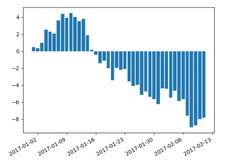
series和'pandas.tseries.index.DatetimeIndex'来绘制图表,但是x轴标签重叠在一起,即使使用了几个提供的解决方案,也无法使它们变得好看。我尝试了stackoverflow上的解决方案建议使用
autofmt_xdate,但是并没有帮助。我还尝试了使用
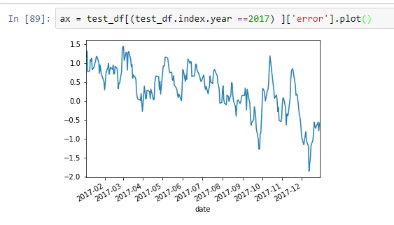
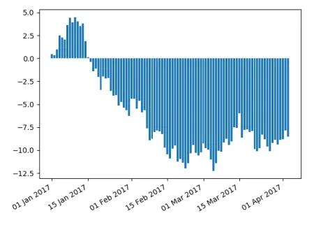
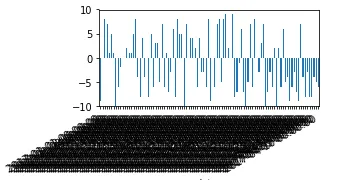
plt.tight_layout()的建议,但是没有效果。ax = test_df[(test_df.index.year ==2017) ]['error'].plot(kind="bar")
ax.figure.autofmt_xdate()
#plt.tight_layout()
print(type(test_df[(test_df.index.year ==2017) ]['error'].index))
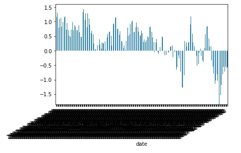
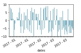
更新:使用条形图会出现问题。常规的时间序列图能够展示良好管理的标签。
subplots = True时,每组打印一个图似乎无法正常工作。 - Nick_Z0