我有两个数据向量,并将它们放入pyplot.scatter()中。现在我想要在这些数据上面画一个线性拟合。我该怎么做?我尝试使用scikitlearn和np.polyfit()。
如何在Python中的散点图上添加一条线?
82
- goldisfine
8个回答
148
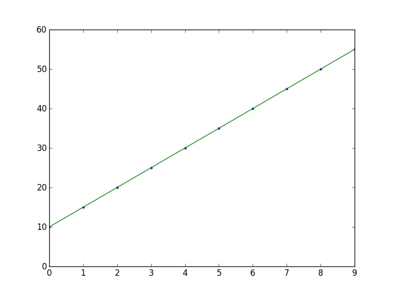
import numpy as np
from numpy.polynomial.polynomial import polyfit
import matplotlib.pyplot as plt

# Sample data
x = np.arange(10)
y = 5 * x + 10

# Fit with polyfit
b, m = polyfit(x, y, 1)

plt.plot(x, y, '.')
plt.plot(x, b + m * x, '-')
plt.show()
- Greg Whittier
2
36
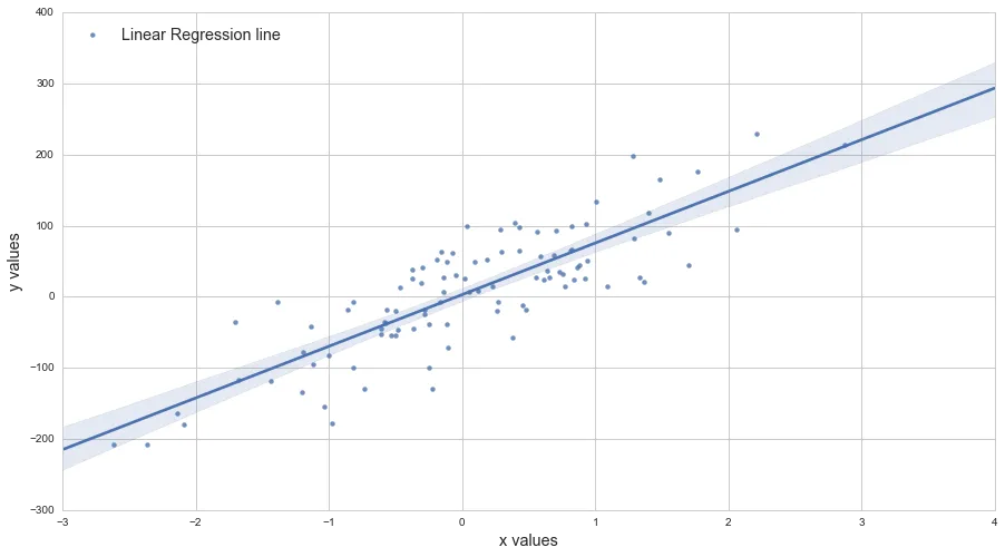
我偏爱scikits.statsmodels。这里有一个例子:
import statsmodels.api as sm
import numpy as np
import matplotlib.pyplot as plt

X = np.random.rand(100)
Y = X + np.random.rand(100)*0.1

results = sm.OLS(Y,sm.add_constant(X)).fit()

print(results.summary())

plt.scatter(X,Y)

X_plot = np.linspace(0,1,100)
plt.plot(X_plot, X_plot * results.params[1] + results.params[0])

plt.show()
唯一棘手的部分是 sm.add_constant(X),它会在X中添加一个值为1的列来得到拦截项。
     Summary of Regression Results
=======================================
| Dependent Variable:            ['y']|
| Model:                           OLS|
| Method:                Least Squares|
| Date:               Sat, 28 Sep 2013|
| Time:                       09:22:59|
| # obs:                         100.0|
| Df residuals:                   98.0|
| Df model:                        1.0|
==============================================================================
|                   coefficient     std. error    t-statistic          prob. |
------------------------------------------------------------------------------
| x1                      1.007       0.008466       118.9032         0.0000 |
| const                 0.05165       0.005138        10.0515         0.0000 |
==============================================================================
|                          Models stats                      Residual stats  |
------------------------------------------------------------------------------
| R-squared:                     0.9931   Durbin-Watson:              1.484  |
| Adjusted R-squared:            0.9930   Omnibus:                    12.16  |
| F-statistic:                1.414e+04   Prob(Omnibus):           0.002294  |
| Prob (F-statistic):        9.137e-108   JB:                        0.6818  |
| Log likelihood:                 223.8   Prob(JB):                  0.7111  |
| AIC criterion:                 -443.7   Skew:                     -0.2064  |
| BIC criterion:                 -438.5   Kurtosis:                   2.048  |
------------------------------------------------------------------------------

- pcoving
3
4我的身材看起来不同了;线条放错位置了;在这些点的上方。 - capybaralet
4@David: 参数数组的顺序错了。尝试使用以下方式:plt.plot(X_plot, X_plot * results.params[1] + results.params[0])。或者更好的方法是:plt.plot(X,results.fittedvalues),因为第一个公式假定y是x的线性关系,在这里确实是正确的,但并非总是如此。 - Ian
你创建的线性空间不一定会落在[0, 1]之间。 - undefined
28
- 1''
2
1嗨,我的x和y值是使用
numpy.asarray从列表转换而来的数组。当我添加这行代码时,我的散点图上出现了多条线,而不是一条。可能的原因是什么? - artre1@artre 感谢您提出这个问题。如果
x 没有排序或存在重复的值,可能会发生这种情况。我已经编辑了答案。 - 1''13
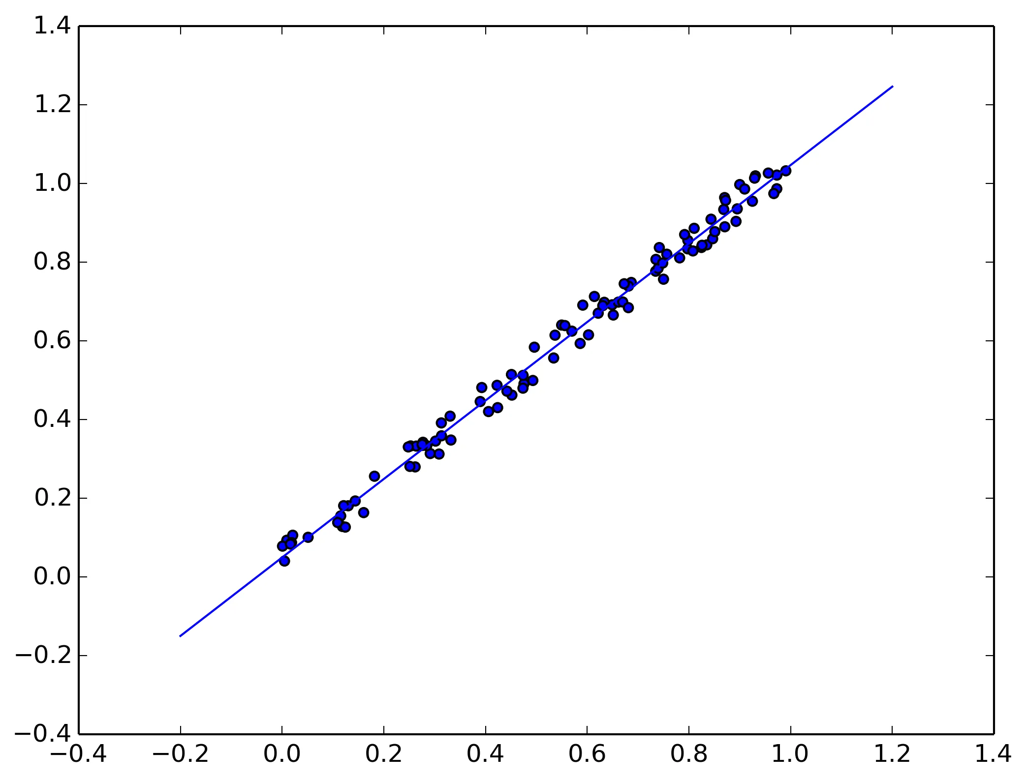
另一种方法是使用 axes.get_xlim():
import matplotlib.pyplot as plt
import numpy as np

def scatter_plot_with_correlation_line(x, y, graph_filepath):
    '''
    https://dev59.com/mmIk5IYBdhLWcg3wrvy4#34571821
    x does not have to be ordered.
    '''
    # Create scatter plot
    plt.scatter(x, y)

    # Add correlation line
    axes = plt.gca()
    m, b = np.polyfit(x, y, 1)
    X_plot = np.linspace(axes.get_xlim()[0],axes.get_xlim()[1],100)
    plt.plot(X_plot, m*X_plot + b, '-')

    # Save figure
    plt.savefig(graph_filepath, dpi=300, format='png', bbox_inches='tight')

def main():
    # Data
    x = np.random.rand(100)
    y = x + np.random.rand(100)*0.1

    # Plot
    scatter_plot_with_correlation_line(x, y, 'scatter_plot.png')

if __name__ == "__main__":
    main()
    #cProfile.run('main()') # if you want to do some profiling
- Franck Dernoncourt
9
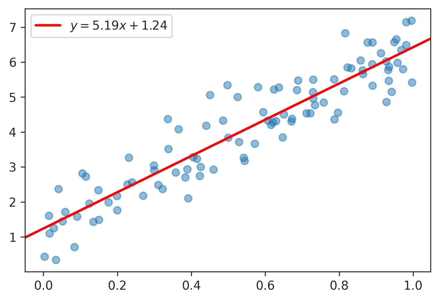
matplotlib 3.3 新特性
使用新的plt.axline绘制直线,公式为y = m*x + b,其中m为斜率,b为截距:
plt.axline(xy1=(0, b), slope=m)
使用 plt.axline 的示例与 np.polyfit :
import numpy as np
import matplotlib.pyplot as plt

# generate random vectors
rng = np.random.default_rng(0)
x = rng.random(100)
y = 5*x + rng.rayleigh(1, x.shape)
plt.scatter(x, y, alpha=0.5)

# compute slope m and intercept b
m, b = np.polyfit(x, y, deg=1)

# plot fitted y = m*x + b
plt.axline(xy1=(0, b), slope=m, color='r', label=f'$y = {m:.2f}x {b:+.2f}$')

plt.legend()
plt.show()
在这里,方程式是一个图例条目,但如果您想沿着线绘制方程式,请参见如何旋转注释以匹配线条。
- tdy
3
plt.plot(X_plot, X_plot*results.params[0] + results.params[1])
对比
plt.plot(X_plot, X_plot*results.params[1] + results.params[0])
- Sébastien
2
你可以使用Adarsh Menon的教程,链接如下:https://towardsdatascience.com/linear-regression-in-6-lines-of-python-5e1d0cd05b8d。这是我发现的最简单的方法,基本上看起来像这样:
import numpy as np
import matplotlib.pyplot as plt  # To visualize
import pandas as pd  # To read data
from sklearn.linear_model import LinearRegression
data = pd.read_csv('data.csv')  # load data set
X = data.iloc[:, 0].values.reshape(-1, 1)  # values converts it into a numpy array
Y = data.iloc[:, 1].values.reshape(-1, 1)  # -1 means that calculate the dimension of rows, but have 1 column
linear_regressor = LinearRegression()  # create object for the class
linear_regressor.fit(X, Y)  # perform linear regression
Y_pred = linear_regressor.predict(X)  # make predictions
plt.scatter(X, Y)
plt.plot(X, Y_pred, color='red')
plt.show()
- plnnvkv
网页内容由stack overflow 提供, 点击上面的可以查看英文原文,
原文链接
原文链接
numpy.polyfit(x,y,deg,rcond = None,full = False,w = None,cov = False)[来源](https://docs.scipy.org/doc/numpy/reference/generated/numpy.polyfit.html)。 - Apollys supports Monica