我在一个条形图上想画一条线段,连接两个坐标点(即在同一张图中完成)。我尝试添加另一个plt语句,但是线段没有被绘制。
plt.figure(figsize=(12, 10))
ax = freq_series.plot(kind='bar',color=colors)
plt.plot([coord_x1,coord_y1], [coord_x2, coord_y2], "r--")
我在一个条形图上想画一条线段,连接两个坐标点(即在同一张图中完成)。我尝试添加另一个plt语句,但是线段没有被绘制。
plt.figure(figsize=(12, 10))
ax = freq_series.plot(kind='bar',color=colors)
plt.plot([coord_x1,coord_y1], [coord_x2, coord_y2], "r--")
更新:
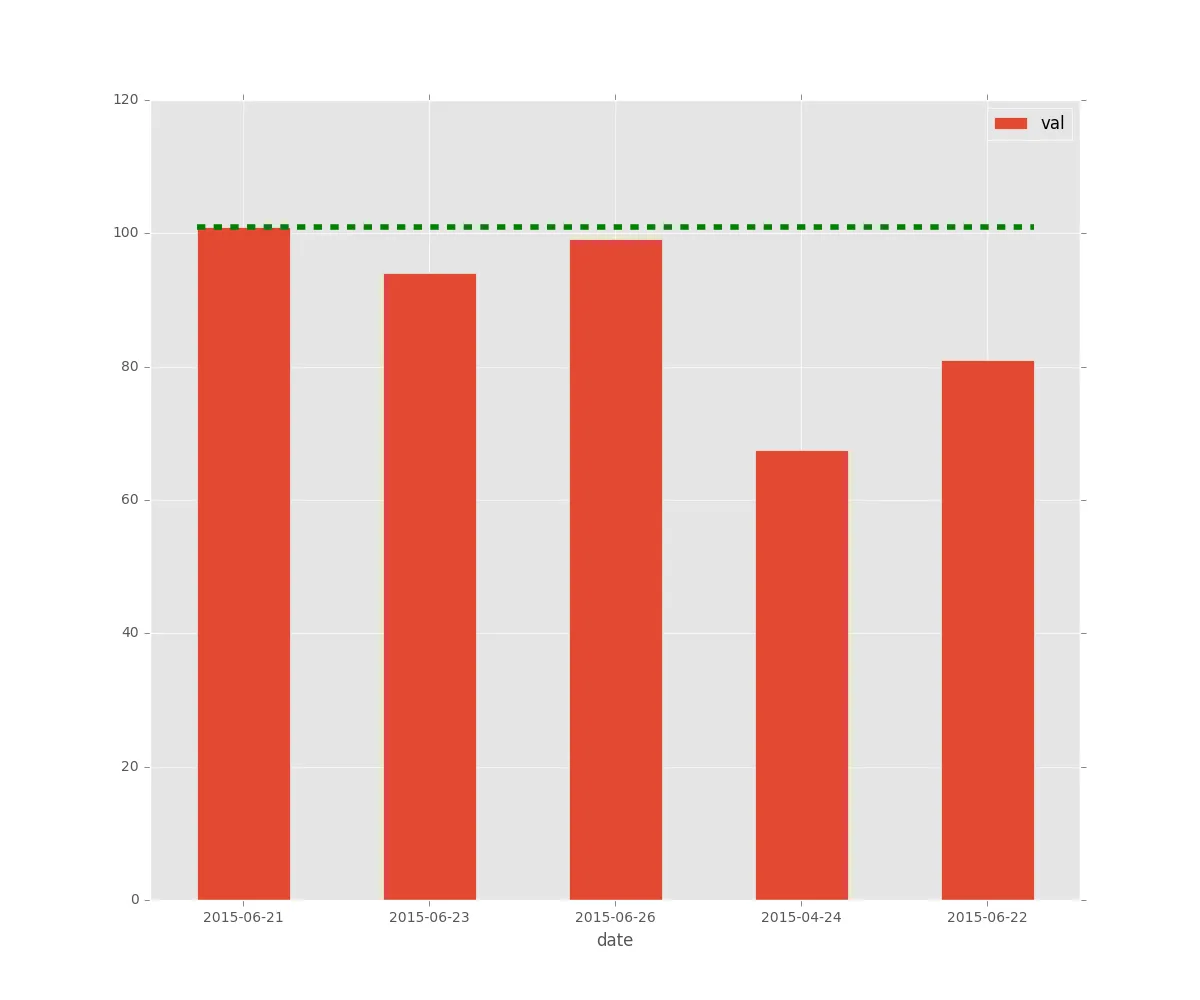
import datetime
import matplotlib as mpl
import matplotlib.pyplot as plt

mpl.style.use('ggplot')

d = {
    datetime.date(2015, 6, 21): 101.0,
    datetime.date(2015, 6, 22): 81.0,
    datetime.date(2015, 6, 23): 94.0,
    datetime.date(2015, 4, 24): 67.5,
    datetime.date(2015, 6, 26): 99.1
}

df = pd.DataFrame({'date': [x for x in d.keys()], 'val':[x for x in d.values()]})

%matplotlib

ax = df.set_index('date').plot.bar(rot=0, figsize=(12, 10))

x = [ax.patches[0].get_x(), ax.patches[-1].get_x() + ax.patches[-1].get_width()]
y = [df.val.max()] * 2

plt.plot(x, y, 'r--', c='g', linewidth=4)

#plt.plot([ax.patches[0].get_width(), ax.patches[-1].get_width()], [y,y], 'r--', c='k')
旧回答:
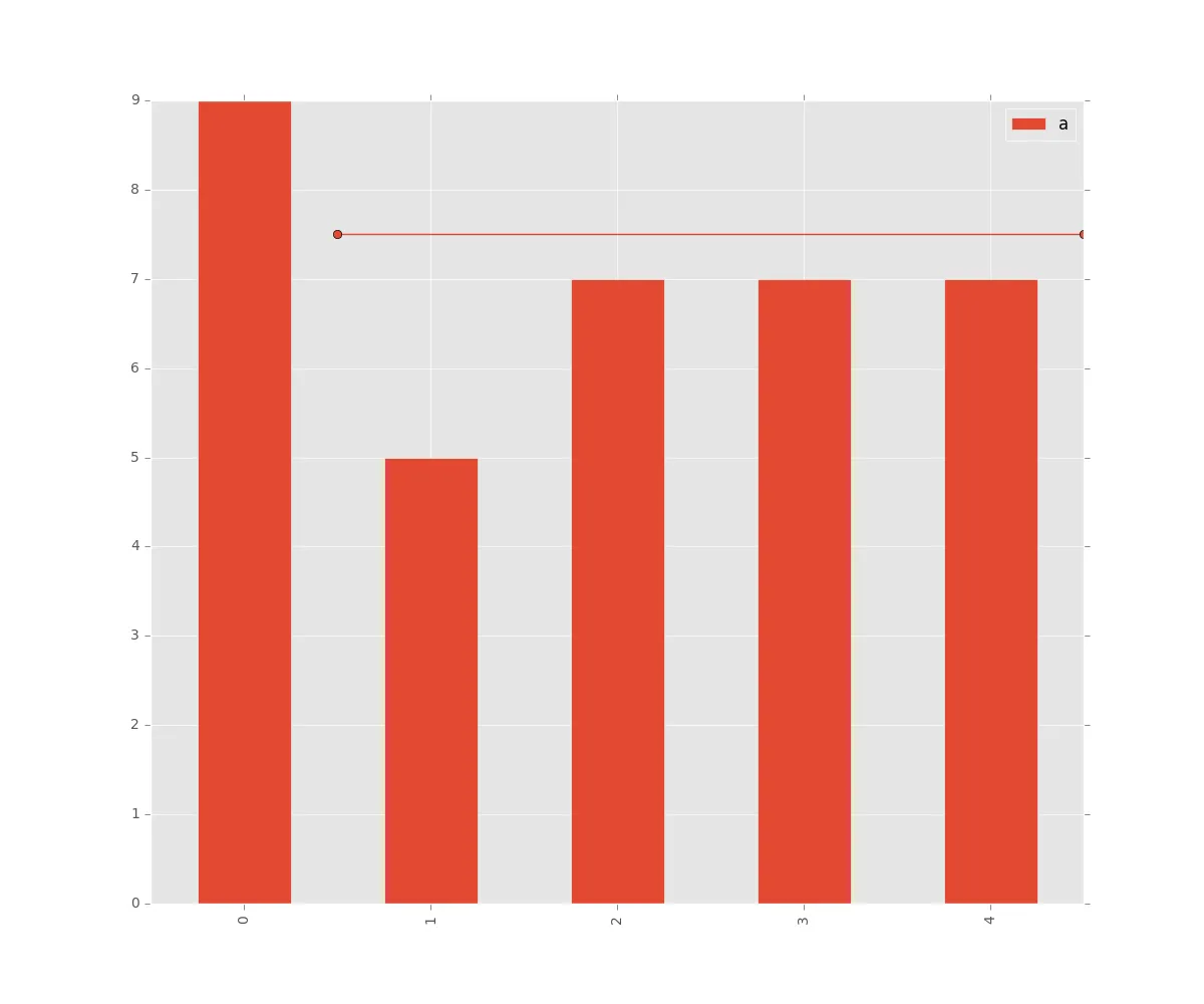
这是一个小的演示:
import matplotlib as mpl
import matplotlib.pyplot as plt

mpl.style.use('ggplot')

df = pd.DataFrame(np.random.randint(0, 10, size=(5)), columns=list('a'))

ax = df.plot.bar(figsize=(12, 10))

coord_x1 = 0.5
coord_y1 = 7.5

coord_x2 = 4.5
coord_y2 = 7.5

plt.plot([coord_x1, coord_x2], [coord_y1, coord_y1], '-o')
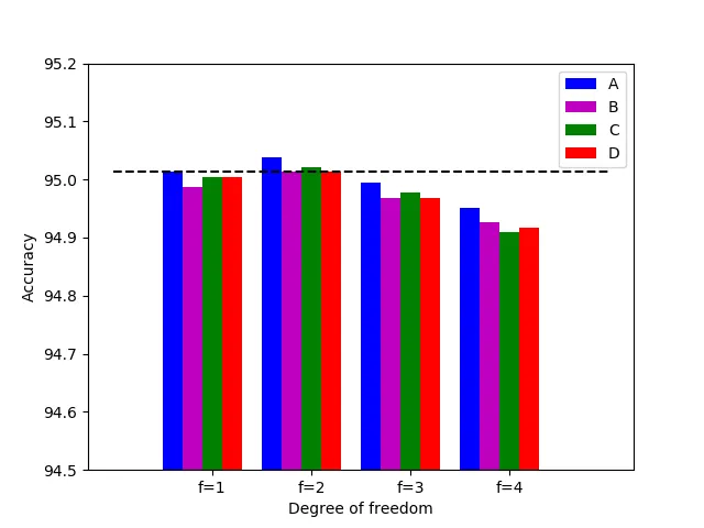
使用matplotlib 3.1.0更容易。你只需在show()之前调用hlines()方法即可:
freedom = np.array([1., 2., 3., 4.])
acc_one = [95.013, 95.039, 94.995, 94.952]
acc_two = [94.987, 95.013, 94.969, 94.926]
acc_three = [95.004, 95.021, 94.978, 94.909]
acc_four = [95.004, 95.013, 94.969, 94.917]

ax = plt.subplot(111)
rec1 = ax.bar(freedom-0.4, acc_one,  width=0.2, color='b', align='center')
rec2 = ax.bar(freedom-0.2, acc_two,  width=0.2, color='m', align='center')
rec3 = ax.bar(freedom, acc_three, width=0.2,color='g', align='center')
rec4 = ax.bar(freedom+0.2, acc_four, width=0.2,color='r', align='center')

ax.set_ylim([94.5, 95.2])
ax.set_xticks(freedom)
ax.set_ylabel('Accuracy')
ax.set_xticklabels(('f=1', 'f=2', 'f=3', 'f=4'))
ax.set_xlabel('Degree of freedom')
ax.legend((rec1, rec2, rec3, rec4), ('A', 'B', 'C', 'D'))
plt.hlines(95.013, xmin=0, xmax=5, linestyles='dashed')
plt.show()
参数的完整描述可以在这里找到。