如何在下面的计数图上方放置百分比标签?
import seaborn as sns
sns.set(style="darkgrid")
titanic = sns.load_dataset("titanic")
ax = sns.countplot(x="class", hue="who", data=titanic)
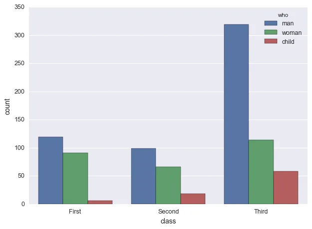
例如,对于“第一”我想要在它们各自的条形图上方显示总第一男性/总第一、总第一女性/总第一和总第一儿童/总第一。
如何在下面的计数图上方放置百分比标签?
import seaborn as sns
sns.set(style="darkgrid")
titanic = sns.load_dataset("titanic")
ax = sns.countplot(x="class", hue="who", data=titanic)
例如,对于“第一”我想要在它们各自的条形图上方显示总第一男性/总第一、总第一女性/总第一和总第一儿童/总第一。
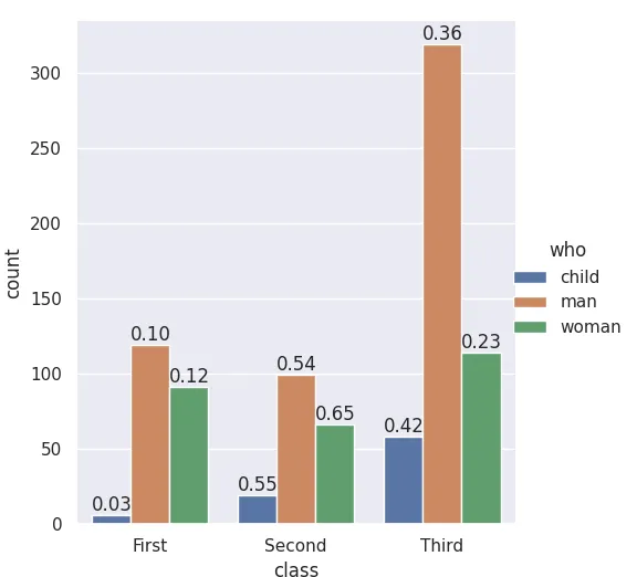
seaborn.catplot 是一个组织函数,返回一个 FacetGrid 对象,可以访问 fig、ax 和其 patches。如果在没有其他绘图的情况下添加标签,则可以知道哪个条形块来自哪个变量。从 @LordZsolt 的答案中,我学到了 catplot 的 order 参数:我喜欢将其明确化,因为现在我们不再依赖于 barplot 函数使用我们认为的默认顺序。
import seaborn as sns
from itertools import product

titanic = sns.load_dataset("titanic")

class_order = ['First','Second','Third']
hue_order = ['child', 'man', 'woman']
bar_order = product(class_order, hue_order)

catp = sns.catplot(data=titanic, kind='count',
                   x='class', hue='who',
                   order = class_order,
                   hue_order = hue_order )

# As long as we haven't plotted anything else into this axis,
# we know the rectangles in it are our barplot bars
# and we know the order, so we can match up graphic and calculations:

spots = zip(catp.ax.patches, bar_order)
for spot in spots:
    class_total = len(titanic[titanic['class']==spot[1][0]])
    class_who_total = len(titanic[(titanic['class']==spot[1][0]) &
        (titanic['who']==spot[1][1])])
    height = spot[0].get_height()
    catp.ax.text(spot[0].get_x(), height+3, '{:1.2f}'.format(class_who_total/class_total))

    #checking the patch order, not for final:
    #catp.ax.text(spot[0].get_x(), -3, spot[1][0][0]+spot[1][1][0])
生成
另一种方法是显式地进行子总和,例如使用出色的 pandas,并用 matplotlib 绘制,并自己进行样式设置。(尽管在使用 matplotlib 绘图函数时,即使使用 sns 上下文,您也可以获得相当多的样式。试试吧--)
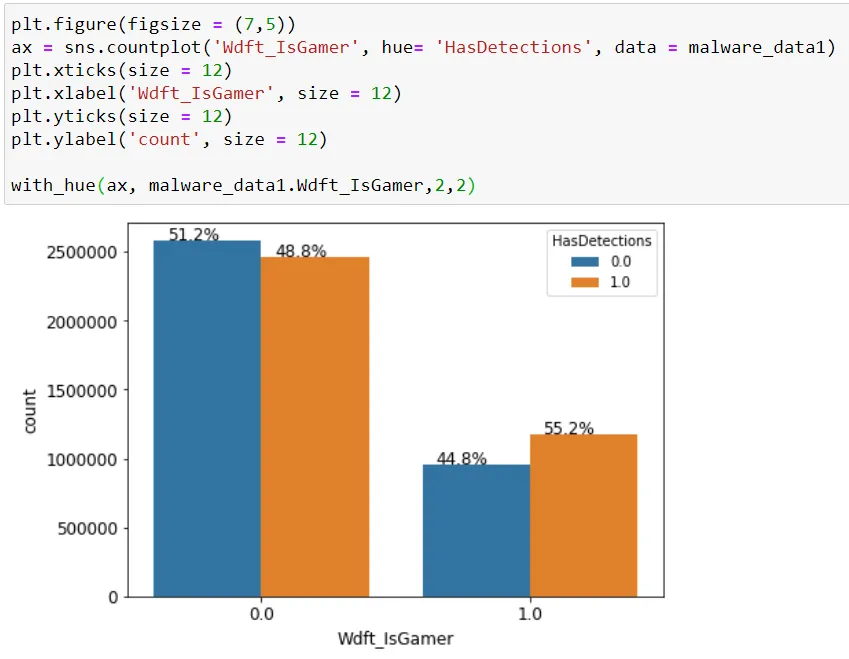
with_hue函数将在您的绘图中使用'hue'参数时,在条形图上绘制百分比。它以实际图形、特征、特征中的类别数和hue特征中的类别数作为参数。
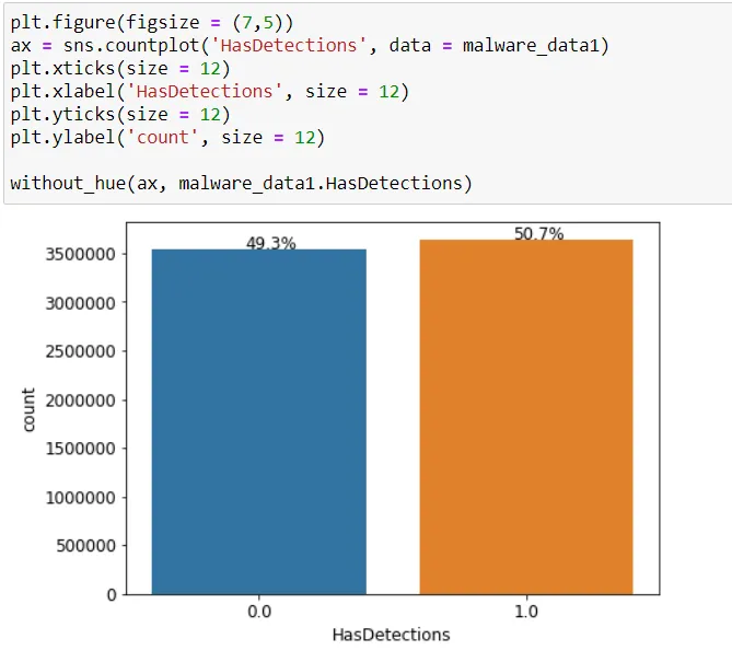
without_hue函数将在您拥有普通绘图时,在条形图上绘制百分比。它以实际图形和特征作为参数。
def with_hue(ax, feature, Number_of_categories, hue_categories):
    a = [p.get_height() for p in ax.patches]
    patch = [p for p in ax.patches]
    for i in range(Number_of_categories):
        total = feature.value_counts().values[i]
        for j in range(hue_categories):
            percentage = '{:.1f}%'.format(100 * a[(j*Number_of_categories + i)]/total)
            x = patch[(j*Number_of_categories + i)].get_x() + patch[(j*Number_of_categories + i)].get_width() / 2 - 0.15
            y = patch[(j*Number_of_categories + i)].get_y() + patch[(j*Number_of_categories + i)].get_height()
            ax.annotate(percentage, (x, y), size = 12)

def without_hue(ax, feature):
    total = len(feature)
    for p in ax.patches:
        percentage = '{:.1f}%'.format(100 * p.get_height()/total)
        x = p.get_x() + p.get_width() / 2 - 0.05
        y = p.get_y() + p.get_height()
        ax.annotate(percentage, (x, y), size = 12)
matplotlib 3.4.2开始最简单的选择是使用matplotlib.pyplot.bar_label..bar_label的更多选项和信息,请查看此答案。labels的列表推导式使用了赋值表达式(:=),需要python >= 3.8。这可以重写为标准for循环。
labels = [f'{v.get_height()/data.who.count()*100:0.1f}' for v in c]可以在不使用赋值表达式的情况下正常工作。v.get_width()。python 3.10、pandas 1.4.2、matplotlib 3.5.1和seaborn 0.11.2中进行了测试import matplotlib.pyplot as plt
import seaborn as sns
# load the data
data = sns.load_dataset('titanic')[['survived', 'class', 'who']]
survived class who
0 0 Third man
1 1 First woman
2 1 Third woman
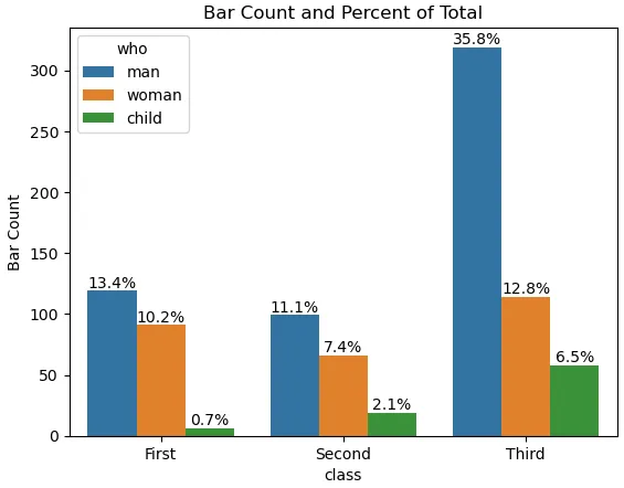
seaborn.countplot或seaborn.barplot一起使用# plot
ax = sns.countplot(x="class", hue="who", data=data)
ax.set(ylabel='Bar Count', title='Bar Count and Percent of Total')
# add annotations
for c in ax.containers:
# custom label calculates percent and add an empty string so 0 value bars don't have a number
labels = [f'{h/data.who.count()*100:0.1f}%' if (h := v.get_height()) > 0 else '' for v in c]
ax.bar_label(c, labels=labels, label_type='edge')
plt.show()
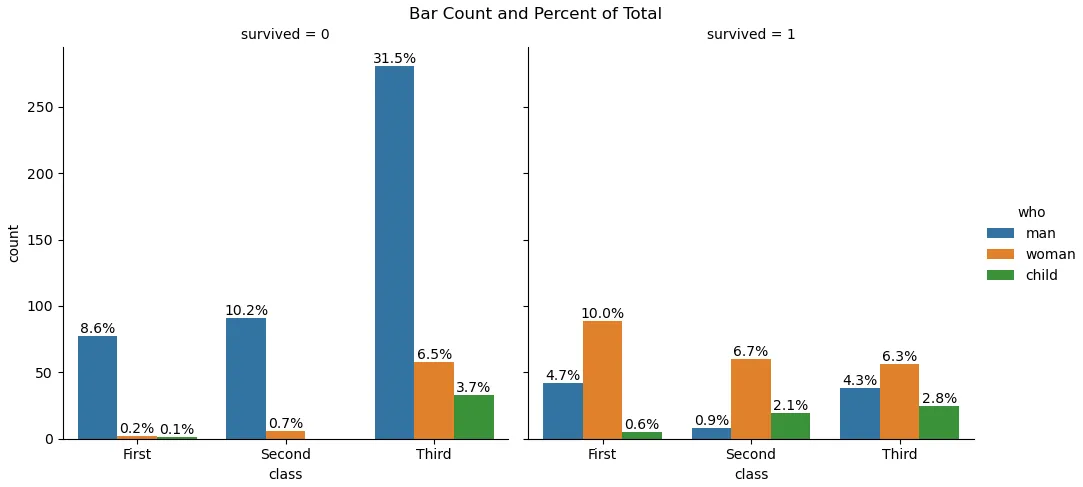
fg = sns.catplot(data=data, kind='count', x='class', hue='who', col='survived')
fg.fig.subplots_adjust(top=0.9)
fg.fig.suptitle('Bar Count and Percent of Total')

for ax in fg.axes.ravel():

    # add annotations
    for c in ax.containers:

        # custom label calculates percent and add an empty string so 0 value bars don't have a number
        labels = [f'{h/data.who.count()*100:0.1f}%' if (h := v.get_height()) > 0 else '' for v in c]

        ax.bar_label(c, labels=labels, label_type='edge')

plt.show()
所借鉴的答案来源于jrjc和cphlewis的回答,但更为简单易懂。
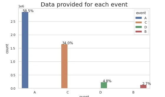
sns.set(style="whitegrid")
plt.figure(figsize=(8,5))
total = float(len(train_df))
ax = sns.countplot(x="event", hue="event", data=train_df)
plt.title('Data provided for each event', fontsize=20)
for p in ax.patches:
    percentage = '{:.1f}%'.format(100 * p.get_height()/total)
    x = p.get_x() + p.get_width()
    y = p.get_height()
    ax.annotate(percentage, (x, y),ha='center')
plt.show()
在cphlewis的解决方案的帮助下,我成功地将正确的百分比放在了图表顶部,使得类别总和为一。
for index, category in enumerate(categorical):
    plt.subplot(plot_count, 1, index + 1)

    order = sorted(data[category].unique())
    ax = sns.countplot(category, data=data, hue="churn", order=order)
    ax.set_ylabel('')

    bars = ax.patches
    half = int(len(bars)/2)
    left_bars = bars[:half]
    right_bars = bars[half:]

    for left, right in zip(left_bars, right_bars):
        height_l = left.get_height()
        height_r = right.get_height()
        total = height_l + height_r

        ax.text(left.get_x() + left.get_width()/2., height_l + 40, '{0:.0%}'.format(height_l/total), ha="center")
        ax.text(right.get_x() + right.get_width()/2., height_r + 40, '{0:.0%}'.format(height_r/total), ha="center")
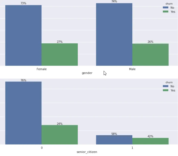
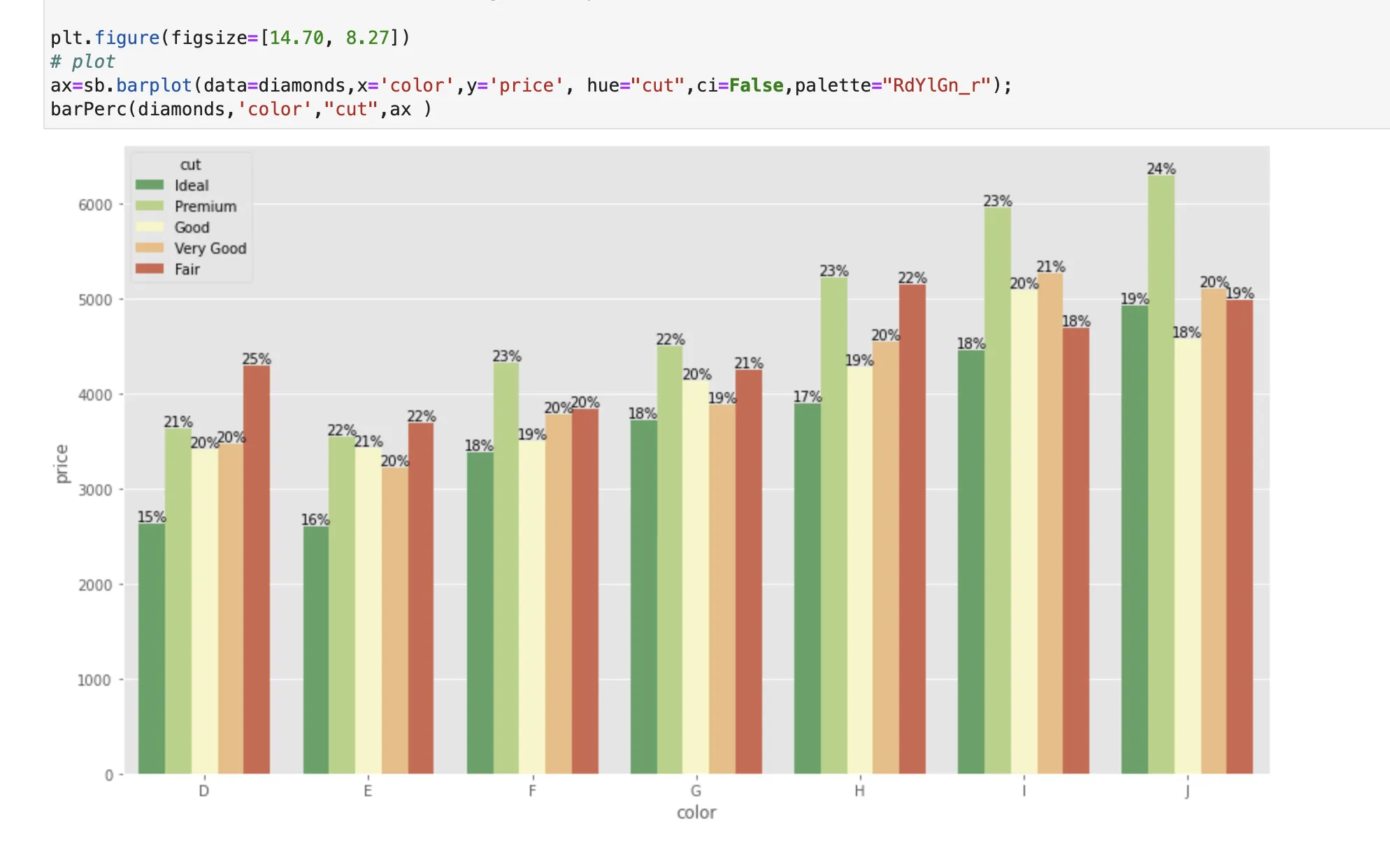
Axes.patches的顺序很奇怪(首先是所有蓝色条,然后是所有绿色条,最后是所有红色条),您需要相应地拆分它们并将它们重新组合。def barPerc(df,xVar,ax):
'''
barPerc(): Add percentage for hues to bar plots
args:
df: pandas dataframe
xVar: (string) X variable
ax: Axes object (for Seaborn Countplot/Bar plot or
pandas bar plot)
'''
# 1. how many X categories
## check for NaN and remove
numX=len([x for x in df[xVar].unique() if x==x])
# 2. The bars are created in hue order, organize them
bars = ax.patches
## 2a. For each X variable
for ind in range(numX):
## 2b. Get every hue bar
## ex. 8 X categories, 4 hues =>
## [0, 8, 16, 24] are hue bars for 1st X category
hueBars=bars[ind:][::numX]
## 2c. Get the total height (for percentages)
total = sum([x.get_height() for x in hueBars])
# 3. Print the percentage on the bars
for bar in hueBars:
ax.text(bar.get_x() + bar.get_width()/2.,
bar.get_height(),
f'{bar.get_height()/total:.0%}',
ha="center",va="bottom")
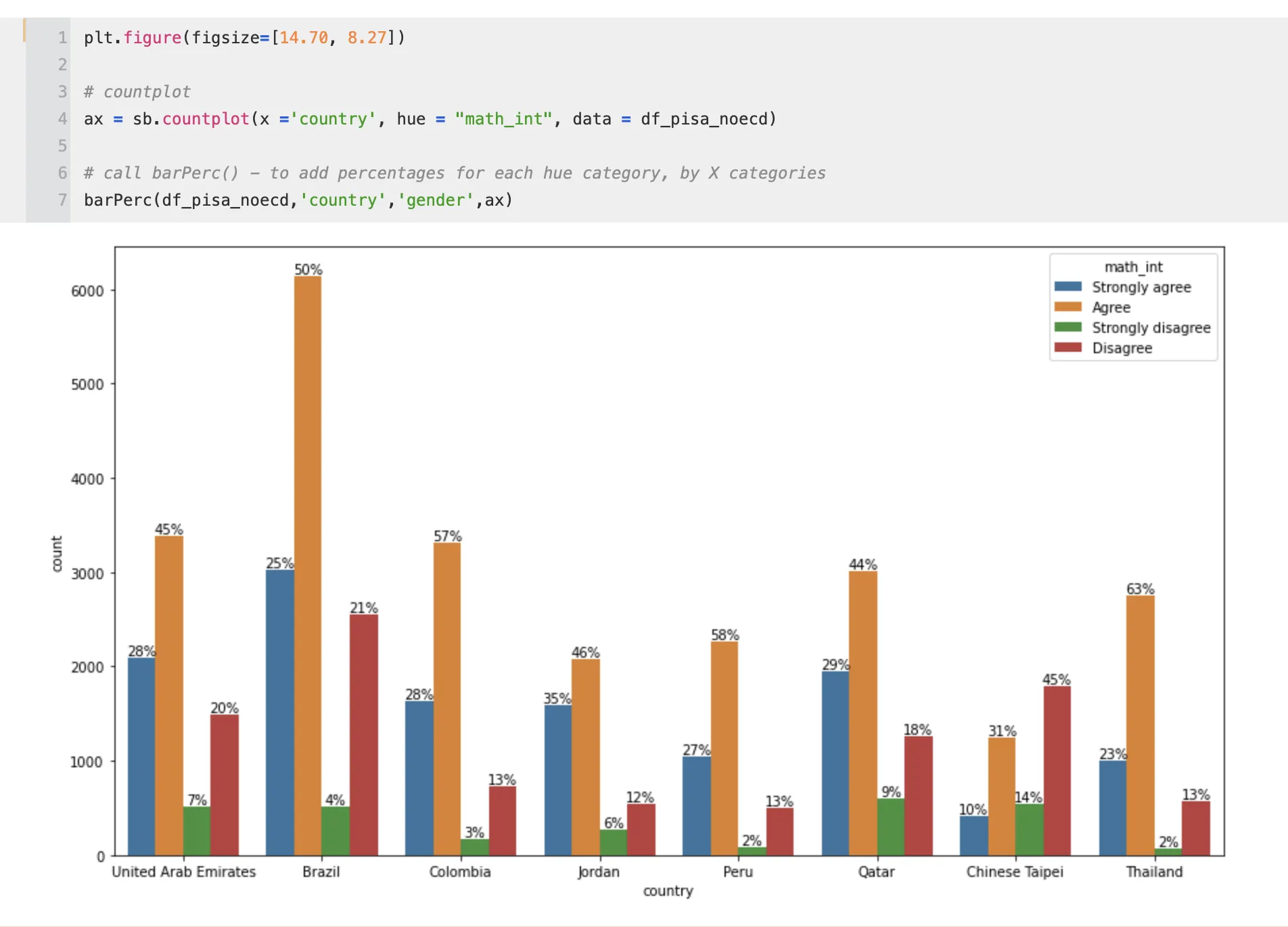
也就是说,添加的值是每个X类别的每个色调的百分比,以便对于每个X类别,百分比总和为100%。我想在各自的条形图顶部显示总第一男性/总第一、总第一女性/总第一和总第一儿童/总第一。
(这也适用于Seaborn的.barplot()函数)
np.sum(a[::hue_categories]代替了总计算。 这个解决方案使用了图表内数据的顺序而不是原始数据,更可靠。 - Seyphaton