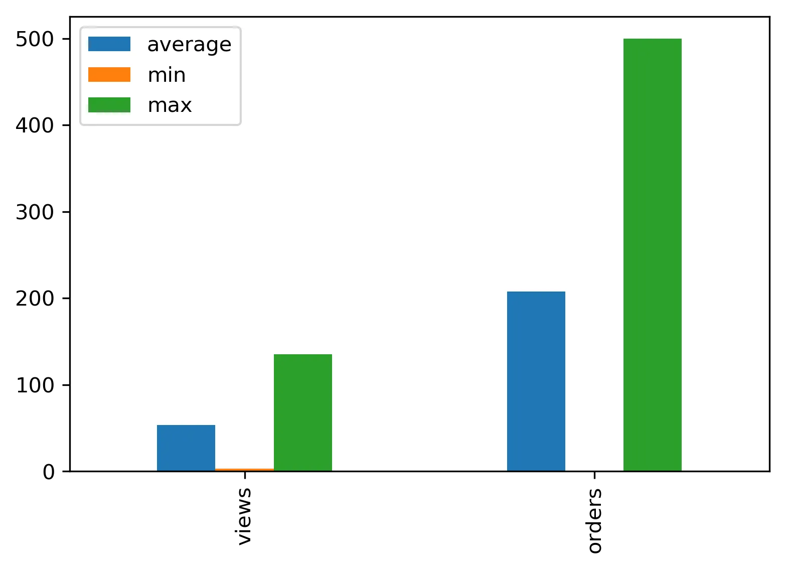
我在pandas的DataFrame中有一张名为df的表:
Translated Text:
我在pandas的DataFrame中有一张名为df的表:
+--- -----+------------+-------------+----------+------------+-----------+
|avg_views| avg_orders | max_views   |max_orders| min_views  |min_orders |
+---------+------------+-------------+----------+------------+-----------+
| 23       | 123       |   135       | 500      |    3       |    1      |
+---------+------------+-------------+----------+------------+-----------+
我现在想要绘制一张分组条形图,它可以在一个图表中显示出浏览量和订单的平均值、最大值和最小值。
例如,x轴上会有浏览量和订单,它们之间会有一定距离,并且分别有3种颜色的条形图表示(平均值、最大值、最小值)。
我附上了一张样本条形图图片,仅供参考。
 绿色应该代表平均值,黄色代表最大值,粉色代表最小值。
我从设置matplotlib中分组条形图之间的间距中获取了以下代码,但对我不起作用:
plt.figure(figsize=(13, 7), dpi=300)

groups = [[23, 135, 3], [123, 500, 1]]
group_labels = ['views', 'orders']
num_items = len(group_labels)
ind = np.arange(num_items)
margin = 0.05
width = (1. - 2. * margin) / num_items

s = plt.subplot(1, 1, 1)
for num, vals in enumerate(groups):
    print 'plotting: ', vals
    # The position of the xdata must be calculated for each of the two data
    # series.
    xdata = ind + margin + (num * width)
    # Removing the "align=center" feature will left align graphs, which is
    # what this method of calculating positions assumes.
    gene_rects = plt.bar(xdata, vals, width)
s.set_xticks(ind + 0.5)
s.set_xticklabels(group_labels)
绘图: [23, 135, 3] ... ValueError: 形状不匹配:无法将对象广播到单个形状