如何绘制多个分组的柱状图

155
如何在matplotlib中绘制多个条形图?当我尝试多次调用bar函数时,它们会重叠在一起,如下图所示,只能看到最高值的红色。 如何在x轴上标记日期并绘制多个条形图?
到目前为止,我尝试了这个:
import matplotlib.pyplot as plt
import datetime

x = [
    datetime.datetime(2011, 1, 4, 0, 0),
    datetime.datetime(2011, 1, 5, 0, 0),
    datetime.datetime(2011, 1, 6, 0, 0)
]
y = [4, 9, 2]
z = [1, 2, 3]
k = [11, 12, 13]

ax = plt.subplot(111)
ax.bar(x, y, width=0.5, color='b', align='center')
ax.bar(x, z, width=0.5, color='g', align='center')
ax.bar(x, k, width=0.5, color='r', align='center')
ax.xaxis_date()

plt.show()

我得到了这个���

enter image description here

结果应该类似于这样,但日期应该在x轴上,条形图应该相邻:

enter image description here

8个回答

157
import matplotlib.pyplot as plt
from matplotlib.dates import date2num
import datetime

x = [
    datetime.datetime(2011, 1, 4, 0, 0),
    datetime.datetime(2011, 1, 5, 0, 0),
    datetime.datetime(2011, 1, 6, 0, 0)
]
x = date2num(x)

y = [4, 9, 2]
z = [1, 2, 3]
k = [11, 12, 13]

ax = plt.subplot(111)
ax.bar(x-0.2, y, width=0.2, color='b', align='center')
ax.bar(x, z, width=0.2, color='g', align='center')
ax.bar(x+0.2, k, width=0.2, color='r', align='center')
ax.xaxis_date()

plt.show()

enter image description here

我不知道"y值也重叠"是什么意思,以下代码是否解决了你的问题?

ax = plt.subplot(111)
w = 0.3
ax.bar(x-w, y, width=w, color='b', align='center')
ax.bar(x, z, width=w, color='g', align='center')
ax.bar(x+w, k, width=w, color='r', align='center')
ax.xaxis_date()
ax.autoscale(tight=True)

plt.show()

enter image description here


81

使用日期作为 x 值的问题在于,如果您想要像第二张图片中那样的条形图,它们将是错误的。 您应该使用堆叠式条形图(颜色重叠)或按日期分组(在 x 轴上使用“虚假”日期,基本上只是分组数据点)。

import numpy as np
import matplotlib.pyplot as plt

N = 3
ind = np.arange(N)  # the x locations for the groups
width = 0.27       # the width of the bars

fig = plt.figure()
ax = fig.add_subplot(111)

yvals = [4, 9, 2]
rects1 = ax.bar(ind, yvals, width, color='r')
zvals = [1,2,3]
rects2 = ax.bar(ind+width, zvals, width, color='g')
kvals = [11,12,13]
rects3 = ax.bar(ind+width*2, kvals, width, color='b')

ax.set_ylabel('Scores')
ax.set_xticks(ind+width)
ax.set_xticklabels( ('2011-Jan-4', '2011-Jan-5', '2011-Jan-6') )
ax.legend( (rects1[0], rects2[0], rects3[0]), ('y', 'z', 'k') )

def autolabel(rects):
    for rect in rects:
        h = rect.get_height()
        ax.text(rect.get_x()+rect.get_width()/2., 1.05*h, '%d'%int(h),
                ha='center', va='bottom')

autolabel(rects1)
autolabel(rects2)
autolabel(rects3)

plt.show()

在此输入图片描述


64

在寻找类似解决方案并未找到足够灵活的选项后,我决定编写自己的函数。它允许您按需设置每个组内的条形数,并指定组的宽度以及组内条形的各自宽度。

请享用:

from matplotlib import pyplot as plt


def bar_plot(ax, data, colors=None, total_width=0.8, single_width=1, legend=True):
    """Draws a bar plot with multiple bars per data point.

    Parameters
    ----------
    ax : matplotlib.pyplot.axis
        The axis we want to draw our plot on.

    data: dictionary
        A dictionary containing the data we want to plot. Keys are the names of the
        data, the items is a list of the values.

        Example:
        data = {
            "x":[1,2,3],
            "y":[1,2,3],
            "z":[1,2,3],
        }

    colors : array-like, optional
        A list of colors which are used for the bars. If None, the colors
        will be the standard matplotlib color cyle. (default: None)

    total_width : float, optional, default: 0.8
        The width of a bar group. 0.8 means that 80% of the x-axis is covered
        by bars and 20% will be spaces between the bars.

    single_width: float, optional, default: 1
        The relative width of a single bar within a group. 1 means the bars
        will touch eachother within a group, values less than 1 will make
        these bars thinner.

    legend: bool, optional, default: True
        If this is set to true, a legend will be added to the axis.
    """

    # Check if colors where provided, otherwhise use the default color cycle
    if colors is None:
        colors = plt.rcParams['axes.prop_cycle'].by_key()['color']

    # Number of bars per group
    n_bars = len(data)

    # The width of a single bar
    bar_width = total_width / n_bars

    # List containing handles for the drawn bars, used for the legend
    bars = []

    # Iterate over all data
    for i, (name, values) in enumerate(data.items()):
        # The offset in x direction of that bar
        x_offset = (i - n_bars / 2) * bar_width + bar_width / 2

        # Draw a bar for every value of that type
        for x, y in enumerate(values):
            bar = ax.bar(x + x_offset, y, width=bar_width * single_width, color=colors[i % len(colors)])

        # Add a handle to the last drawn bar, which we'll need for the legend
        bars.append(bar[0])

    # Draw legend if we need
    if legend:
        ax.legend(bars, data.keys())


if __name__ == "__main__":
    # Usage example:
    data = {
        "a": [1, 2, 3, 2, 1],
        "b": [2, 3, 4, 3, 1],
        "c": [3, 2, 1, 4, 2],
        "d": [5, 9, 2, 1, 8],
        "e": [1, 3, 2, 2, 3],
        "f": [4, 3, 1, 1, 4],
    }

    fig, ax = plt.subplots()
    bar_plot(ax, data, total_width=.8, single_width=.9)
    plt.show()

输出:

在此输入图像描述


我们如何修改代码以在x轴上为每组柱形图添加标签? - x89
2
更改图表的 xticks,例如 plt.xticks(range(5), ["one", "two", "three", "four", "five"]) - pascscha
不错的函数,非常有帮助,谢谢。我唯一改变的是传统说明看起来更简单些,只需在barplot调用中放置label=data.keys[i],然后你就不需要构建bars列表了。 - ClimateUnboxed
这是一个非常简洁的例子,回答了所提出的问题,我真的很喜欢在这里使用函数。+1 - TornadoEric
@pascscha,有没有办法保持宽度固定,这样如果我有很多条,柱子就不会变得非常小?我知道这意味着条形图将无法适应我的屏幕,所以我想知道是否可能使GUI具有滚动条,或者只是保存图像,然后图像查看器将具有滚动条。 - user3494047

46

我知道这与matplotlib有关,但使用pandasseaborn可以节省很多时间:

df = pd.DataFrame(zip(x*3, ["y"]*3+["z"]*3+["k"]*3, y+z+k), columns=["time", "kind", "data"])
plt.figure(figsize=(10, 6))
sns.barplot(x="time", hue="kind", y="data", data=df)
plt.show()

enter image description here


你可以使用以下代码将日期字符串转换为日期对象,并按照日期顺序排序:x = sorted([datetime.datetime.strptime(d, "%Y-%m-%d") for d in x]) - tsveti_iko
1
别忘了 import seaborn as sns ;) - tsveti_iko

8
  • 根据原帖中的数据,最简单的解决方案是将数据加载到一个dataframe中,并使用pandas.DataFrame.plot进行绘图。
    • 使用dict将值列表加载到pandas中,并将x指定为索引。索引将自动设置为x轴,列将作为柱状图绘制。
    • pandas.DataFrame.plot默认使用matplotlib后端。
  • 详情请参见如何在条形图上添加值标签中的详细说明,使用.bar_label方法。
  • python 3.8.11pandas 1.3.2matplotlib 3.4.3版本下进行了测试
import pandas as pd

# using the existing lists from the OP, create the dataframe
df = pd.DataFrame(data={'y': y, 'z': z, 'k': k}, index=x)

# since there's no time component and x was a datetime dtype, set the index to be just the date
df.index = df.index.date

# display(df)
            y  z   k
2011-01-04  4  1  11
2011-01-05  9  2  12
2011-01-06  2  3  13

# plot bars or kind='barh' for horizontal bars; adjust figsize accordingly
ax = df.plot(kind='bar', rot=0, xlabel='Date', ylabel='Value', title='My Plot', figsize=(6, 4))

# add some labels
for c in ax.containers:
    # set the bar label
    ax.bar_label(c, fmt='%.0f', label_type='edge')
    
# add a little space at the top of the plot for the annotation
ax.margins(y=0.1)

# move the legend out of the plot
ax.legend(title='Columns', bbox_to_anchor=(1, 1.02), loc='upper left')

显示图片描述

  • 当有更多的列时,使用水平条
ax = df.plot(kind='barh', ylabel='Date', title='My Plot', figsize=(5, 4))
ax.set(xlabel='Value')
for c in ax.containers:
    # set the bar label
    ax.bar_label(c, fmt='%.0f', label_type='edge')
    
ax.margins(x=0.1)

# move the legend out of the plot
ax.legend(title='Columns', bbox_to_anchor=(1, 1.02), loc='upper left')

enter image description here


1
Trenton McKinney,你的答案是迄今为止最好的,因为它使用了一个通过库可用的功能,所以不需要编写复杂的代码。干得好! - ouba64

6

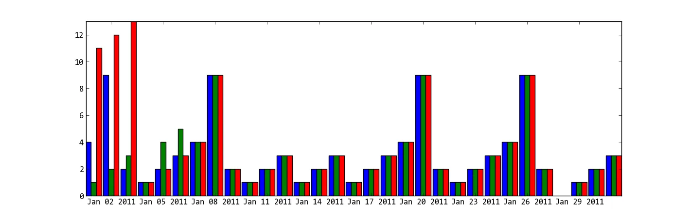
我修改了 pascscha 的解决方案并扩展了接口,希望这对其他人有所帮助!关键特性:

  • 每个条形组可以有可变数量的条目
  • 可自定义颜色
  • 处理 x 轴刻度
  • 完全可自定义的条形标签在条形上方
def bar_plot(ax, data, group_stretch=0.8, bar_stretch=0.95,
             legend=True, x_labels=True, label_fontsize=8,
             colors=None, barlabel_offset=1,
             bar_labeler=lambda k, i, s: str(round(s, 3))):
    """
    Draws a bar plot with multiple bars per data point.
    :param dict data: The data we want to plot, wher keys are the names of each
      bar group, and items is a list of bar values for the corresponding group.
    :param float group_stretch: 1 means groups occupy the most (largest groups
      touch side to side if they have equal number of bars).
    :param float bar_stretch: If 1, bars within a group will touch side to side.
    :param bool x_labels: If true, x-axis will contain labels with the group
      names given at data, centered at the bar group.
    :param int label_fontsize: Font size for the label on top of each bar.
    :param float barlabel_offset: Distance, in y-values, between the top of the
      bar and its label.
    :param function bar_labeler: If not None, must be a functor with signature
      ``f(group_name, i, scalar)->str``, where each scalar is the entry found at
      data[group_name][i]. When given, returns a label to put on the top of each
      bar. Otherwise no labels on top of bars.
    """
    sorted_data = list(sorted(data.items(), key=lambda elt: elt[0]))
    sorted_k, sorted_v  = zip(*sorted_data)
    max_n_bars = max(len(v) for v in data.values())
    group_centers = np.cumsum([max_n_bars
                               for _ in sorted_data]) - (max_n_bars / 2)
    bar_offset = (1 - bar_stretch) / 2
    bars = defaultdict(list)
    #
    if colors is None:
        colors = {g_name: [f"C{i}" for _ in values]
                  for i, (g_name, values) in enumerate(data.items())}
    #
    for g_i, ((g_name, vals), g_center) in enumerate(zip(sorted_data,
                                                         group_centers)):
        n_bars = len(vals)
        group_beg = g_center - (n_bars / 2) + (bar_stretch / 2)
        for val_i, val in enumerate(vals):
            bar = ax.bar(group_beg + val_i + bar_offset,
                         height=val, width=bar_stretch,
                         color=colors[g_name][val_i])[0]
            bars[g_name].append(bar)
            if  bar_labeler is not None:
                x_pos = bar.get_x() + (bar.get_width() / 2.0)
                y_pos = val + barlabel_offset
                barlbl = bar_labeler(g_name, val_i, val)
                ax.text(x_pos, y_pos, barlbl, ha="center", va="bottom",
                        fontsize=label_fontsize)
    if legend:
        ax.legend([bars[k][0] for k in sorted_k], sorted_k)
    #
    ax.set_xticks(group_centers)
    if x_labels:
        ax.set_xticklabels(sorted_k)
    else:
        ax.set_xticklabels()
    return bars, group_centers
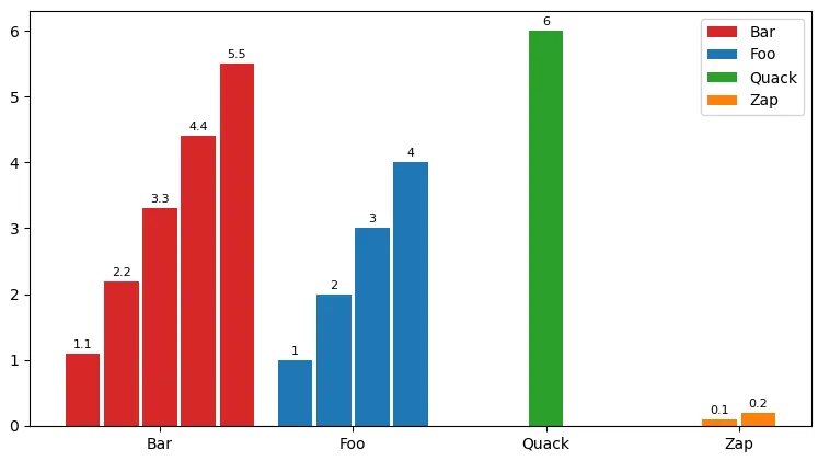
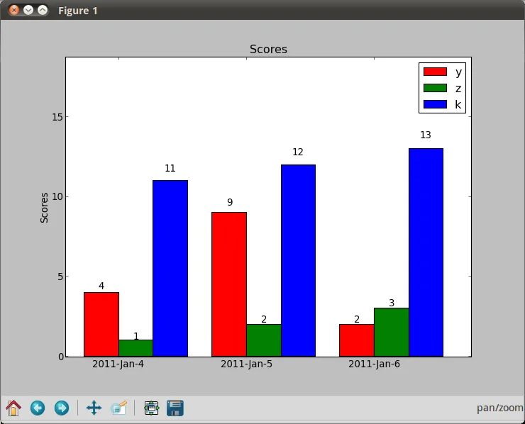
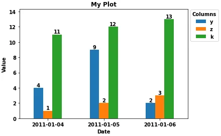
示例运行:

fig, ax = plt.subplots()
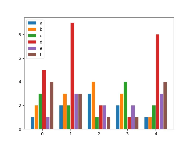
data = {"Foo": [1, 2, 3, 4], "Zap": [0.1, 0.2], "Quack": [6], "Bar": [1.1, 2.2, 3.3, 4.4, 5.5]}
bar_plot(ax, data, group_stretch=0.8, bar_stretch=0.95, legend=True,
         labels=True, label_fontsize=8, barlabel_offset=0.05,
         bar_labeler=lambda k, i, s: str(round(s, 3)))
fig.show()

enter image description here


需要哪个版本的matplotlib? - Abhi25t
已在3.2.2上进行测试(conda版本稍落后于PyPI)。 - fr_andres

1
我做了这个解决方案:如果你想在一个图中绘制多个图形,请确保在绘制下一个图形之前设置正确的matplotlib.pyplot.hold(True)以便添加另一个图形。
关于X轴上的日期时间值,使用条形对齐的解决方案对我有效。当你使用matplotlib.pyplot.bar()创建另一个条形图时,只需使用align='edge|center'并设置width='+|-distance'
当你将所有条形(图)设置正确时,你将看到条形(图)很好看。

1
似乎自v2.0以来,matplotlib.pyplot.hold已被弃用,正如文档中所提到的 - engineervix

-1
这个功能帮助我绘制了分组柱状图。
def multibarplot(ax, data, xlabels, ylabels, fill_ratio = 0.8):
    l = len(data.T)
    D = len(data)
    width = fill_ratio/D

    for i,(d,ylabel) in enumerate(zip(data,ylabels)):
        ax.bar(np.arange(l) + (i-(D-1)/2) *width,d, width=width, label=ylabel)

    ax.set_xticks(np.arange(l), xlabels)
    ax.legend()
    #ax.autoscale(tight=True)

示例调用

data = np.array([np.arange(i,i+5) for i in range(3)]) + .123
#plt.figure(figsize=(10,5))
ax=plt.gca()
multibarplot(ax, data, xlabels=["a","b","c","d","e"], ylabels=["A","B","C"])

multi bar plot example


网页内容由stack overflow 提供, 点击上面的
可以查看英文原文,
原文链接