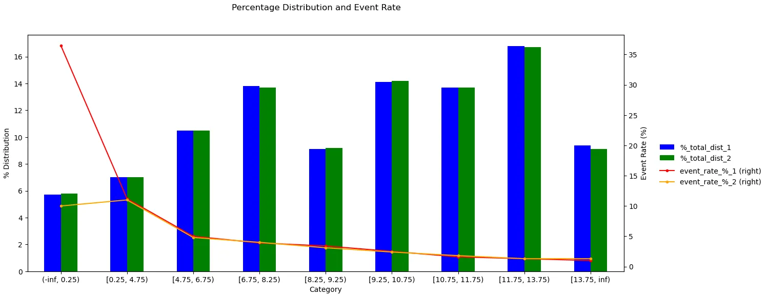
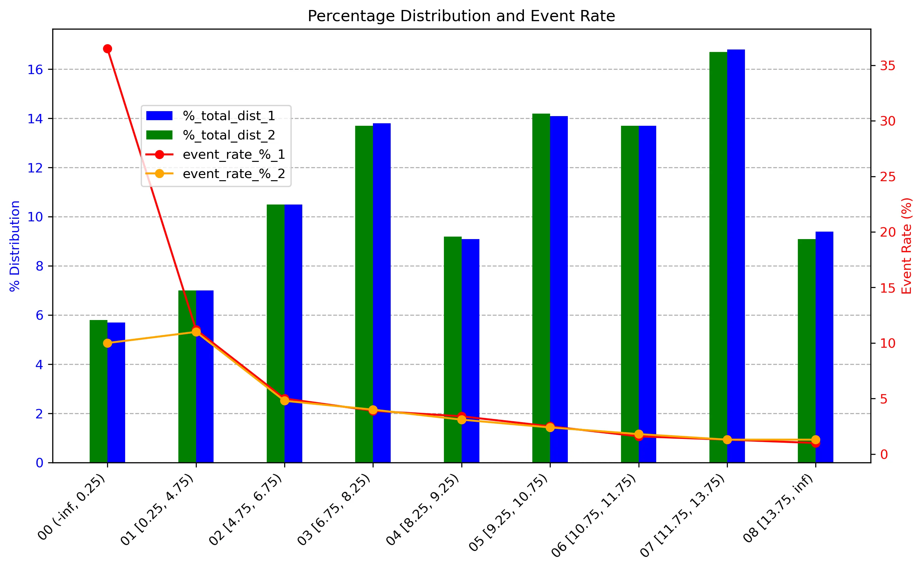
我正在尝试使用matplotlib根据下面的表格在Excel中创建下面的图表。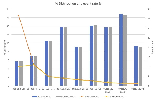 。
。
我面临的问题是:
1. Matplotlib中的列重叠在一起。 2. 我想将x轴标签旋转45度,以避免重叠,但不知道如何实现。 3. 我想在线条上添加标记。
这是我使用的代码:
。
| 类别 | %_总分布_1 | 事件率_%_1 | %_总分布_2 | 事件率_%_2 |
|---|---|---|---|---|
| 00 (-inf, 0.25) | 5.7 | 36.5 | 5.8 | 10 |
| 01 [0.25, 4.75) | 7 | 11.2 | 7 | 11 |
| 02 [4.75, 6.75) | 10.5 | 5 | 10.5 | 4.8 |
| 03 [6.75, 8.25) | 13.8 | 3.9 | 13.7 | 4 |
| 04 [8.25, 9.25) | 9.1 | 3.4 | 9.2 | 3.1 |
| 05 [9.25, 10.75) | 14.1 | 2.5 | 14.2 | 2.4 |
| 06 [10.75, 11.75) | 13.7 | 1.6 | 13.7 | 1.8 |
| 07 [11.75, 13.75) | 16.8 | 1.3 | 16.7 | 1.3 |
| 08 [13.75, inf) | 9.4 | 1 | 9.1 | 1.3 |
1. Matplotlib中的列重叠在一起。 2. 我想将x轴标签旋转45度,以避免重叠,但不知道如何实现。 3. 我想在线条上添加标记。
这是我使用的代码:
import pandas as pd
import matplotlib.pyplot as plt

# Create a Pandas DataFrame with your data
data = {
    "Category": ["00 (-inf, 0.25)", "01 [0.25, 4.75)", "02 [4.75, 6.75)", "03 [6.75, 8.25)",
                 "04 [8.25, 9.25)", "05 [9.25, 10.75)", "06 [10.75, 11.75)", "07 [11.75, 13.75)", "08 [13.75, inf)"],
    "%_total_dist_1": [5.7, 7, 10.5, 13.8, 9.1, 14.1, 13.7, 16.8, 9.4],
    "event_rate_%_1": [36.5, 11.2, 5, 3.9, 3.4, 2.5, 1.6, 1.3, 1],
    "%_total_dist_2": [5.8, 7, 10.5, 13.7, 9.2, 14.2, 13.7, 16.7, 9.1],
    "event_rate_%_2": [10, 11, 4.8, 4, 3.1, 2.4, 1.8, 1.3, 1.3]
}

df = pd.DataFrame(data)

# Create a figure and primary y-axis
fig, ax1 = plt.subplots(figsize=(10, 6))

# Plot percentage distribution on the primary y-axis
ax1.bar(df['Category'], df['%_total_dist_1'], alpha=0.7, label="%_total_dist_1", color='b')
ax1.bar(df['Category'], df['%_total_dist_2'], alpha=0.7, label="%_total_dist_2", color='g')
ax1.set_ylabel('% Distribution', color='b')
ax1.tick_params(axis='y', labelcolor='b')

# Create a secondary y-axis
ax2 = ax1.twinx()

# Plot event rate on the secondary y-axis
ax2.plot(df['Category'], df['event_rate_%_1'], marker='o', label='event_rate_%_1', color='r')
ax2.plot(df['Category'], df['event_rate_%_2'], marker='o', label='event_rate_%_2', color='orange')
ax2.set_ylabel('Event Rate (%)', color='r')
ax2.tick_params(axis='y', labelcolor='r')

# Adding legend
fig.tight_layout()
plt.title('Percentage Distribution and Event Rate')
fig.legend(loc="upper left", bbox_to_anchor=(0.15, 0.85))

# Rotate x-axis labels for better readability
plt.xticks(rotation=45, ha="right")

# Show the plot
plt.show()