我正在学习 Think Stats,希望可以通过视觉方式比较多个数据集。从书中的例子中我发现,作者提供的模块可以生成交错条形图,并为每个数据集使用不同的颜色,那么如何在pyplot中获得相同的结果呢?
如何从多个数据集绘制分组柱状图
13
- tunnuz
3个回答
9
为每个系列调用bar函数多次。您可以使用left参数控制条的左侧位置,并可以使用此参数来防止重叠。
未经测试的代码:
pyplot.bar( numpy.arange(10) * 2, data1, color = 'red' )
pyplot.bar( numpy.arange(10) * 2 + 1, data2, color = 'red' )
相比于数据一的绘制位置,数据二将向右移动。
- Winston Ewert
1
请问您能否提供更多关于这个解决方案的细节? - tunnuz
4
Matplotlib的交错柱状图示例代码在任意实值x坐标时运行良好(如@db42所述)。
然而,如果您的x坐标是类别值(如链接问题中字典的情况),则将类别x坐标转换为实际x坐标是麻烦且不必要的。
您可以直接使用matplotlib的api将两个字典放在一起绘制。绘制两个带偏移量的条形图的技巧是设置align=edge和一个正宽度(+width)来绘制一个条形图,而对于另一个条形图则使用负宽度(-width)。
修改用于绘制两个字典的示例代码如下:
"""
========
Barchart
========

A bar plot with errorbars and height labels on individual bars
"""
import matplotlib.pyplot as plt

# Uncomment the following line if you use ipython notebook
# %matplotlib inline

width = 0.35       # the width of the bars

men_means = {'G1': 20, 'G2': 35, 'G3': 30, 'G4': 35, 'G5': 27}
men_std = {'G1': 2, 'G2': 3, 'G3': 4, 'G4': 1, 'G5': 2}

rects1 = plt.bar(men_means.keys(), men_means.values(), -width, align='edge',
                yerr=men_std.values(), color='r', label='Men')

women_means = {'G1': 25, 'G2': 32, 'G3': 34, 'G4': 20, 'G5': 25}
women_std = {'G1': 3, 'G2': 5, 'G3': 2, 'G4': 3, 'G5': 3}

rects2 = plt.bar(women_means.keys(), women_means.values(), +width, align='edge',
                yerr=women_std.values(), color='y', label='Women')

# add some text for labels, title and axes ticks
plt.xlabel('Groups')
plt.ylabel('Scores')
plt.title('Scores by group and gender')
plt.legend()

def autolabel(rects):
    """
    Attach a text label above each bar displaying its height
    """
    for rect in rects:
        height = rect.get_height()
        plt.text(rect.get_x() + rect.get_width()/2., 1.05*height,
                '%d' % int(height),
                ha='center', va='bottom')

autolabel(rects1)
autolabel(rects2)

plt.show()
结果如下所示:
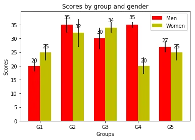
此图显示了柱状图的演示。
- mucaho
3
我前段时间遇到了这个问题,创建了一个包装函数,它接受一个二维数组并自动从中创建一个多列条形图:
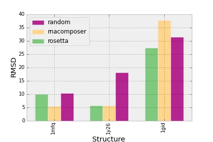
代码如下:
import matplotlib.pyplot as plt
import matplotlib.cm as cm
import operator as o

import numpy as np

dpoints = np.array([['rosetta', '1mfq', 9.97],
           ['rosetta', '1gid', 27.31],
           ['rosetta', '1y26', 5.77],
           ['rnacomposer', '1mfq', 5.55],
           ['rnacomposer', '1gid', 37.74],
           ['rnacomposer', '1y26', 5.77],
           ['random', '1mfq', 10.32],
           ['random', '1gid', 31.46],
           ['random', '1y26', 18.16]])

fig = plt.figure()
ax = fig.add_subplot(111)

def barplot(ax, dpoints):
    '''
    Create a barchart for data across different categories with
    multiple conditions for each category.

    @param ax: The plotting axes from matplotlib.
    @param dpoints: The data set as an (n, 3) numpy array
    '''

    # Aggregate the conditions and the categories according to their
    # mean values
    conditions = [(c, np.mean(dpoints[dpoints[:,0] == c][:,2].astype(float)))
                  for c in np.unique(dpoints[:,0])]
    categories = [(c, np.mean(dpoints[dpoints[:,1] == c][:,2].astype(float)))
                  for c in np.unique(dpoints[:,1])]

    # sort the conditions, categories and data so that the bars in
    # the plot will be ordered by category and condition
    conditions = [c[0] for c in sorted(conditions, key=o.itemgetter(1))]
    categories = [c[0] for c in sorted(categories, key=o.itemgetter(1))]

    dpoints = np.array(sorted(dpoints, key=lambda x: categories.index(x[1])))

    # the space between each set of bars
    space = 0.3
    n = len(conditions)
    width = (1 - space) / (len(conditions))

    # Create a set of bars at each position
    for i,cond in enumerate(conditions):
        indeces = range(1, len(categories)+1)
        vals = dpoints[dpoints[:,0] == cond][:,2].astype(np.float)
        pos = [j - (1 - space) / 2. + i * width for j in indeces]
        ax.bar(pos, vals, width=width, label=cond,
               color=cm.Accent(float(i) / n))

    # Set the x-axis tick labels to be equal to the categories
    ax.set_xticks(indeces)
    ax.set_xticklabels(categories)
    plt.setp(plt.xticks()[1], rotation=90)

    # Add the axis labels
    ax.set_ylabel("RMSD")
    ax.set_xlabel("Structure")

    # Add a legend
    handles, labels = ax.get_legend_handles_labels()
    ax.legend(handles[::-1], labels[::-1], loc='upper left')

barplot(ax, dpoints)
plt.show()
如果您对该函数的功能和逻辑感兴趣,这里是一个(毫不掩饰地自我推销)链接,介绍了它。
- juniper-
1
你好,我该如何为这里呈现的三个系列添加多个“xlabels”? - Dhruv Ghulati
网页内容由stack overflow 提供, 点击上面的可以查看英文原文,
原文链接
原文链接