对于对数坐标的绘图,另一种方法是将log_scale参数传递给jointplot1的边缘组件,可以通过marginal_kws=参数完成。
import seaborn as sns
from scipy import stats
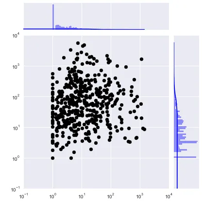
data = sns.load_dataset('tips')[['tip', 'total_bill']]**3
graph = sns.jointplot(x='tip', y='total_bill', data=data, kind='reg', marginal_kws={'log_scale': True})
pearsonr, p = stats.pearsonr(data['tip'], data['total_bill'])
graph.ax_joint.annotate(f'pearsonr = {pearsonr:.2f}; p = {p:.0E}', xy=(35, 50));
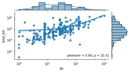
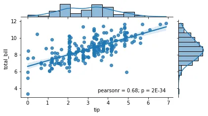
如果我们不对轴进行对数缩放,我们将得到以下的图表:2
请注意,相关系数是相同的,因为用于导出两条拟合线的基础回归函数是相同的。
尽管上面第一个图中的拟合线看起来不是线性的,但它确实是线性的,只是轴被对数缩放了,这“扭曲”了视图。在底层,sns.jointplot() 调用 sns.regplot() 来绘制散点图和拟合线,因此如果我们使用相同的数据并对数缩放轴调用它,我们将得到相同的图。换句话说,以下代码将产生相同的散点图。
sns.regplot(x='tip', y='total_bill', data=data).set(xscale='log', yscale='log');
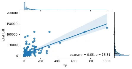
如果在将数据传递给
jointplot()之前对其进行对数处理,那么这将是完全不同的模型(您可能不想要它),因为现在回归系数将来自于
log(y)=a+b*log(x)而不是之前的
y=a+b*x。
您可以在下面的图中看到差异。即使拟合线现在看起来是线性的,相关系数也已经改变了。
1 边际图使用 sns.histplot 绘制,该函数支持 log_scale 参数。
2 一个方便的函数用于绘制本文中的图形:
from scipy import stats
def plot_jointplot(x, y, data, xy=(0.4, 0.1), marginal_kws=None, figsize=(6,4)):
pearsonr, p = stats.pearsonr(data[x], data[y])
graph = sns.jointplot(x=x, y=y, data=data, kind='reg', marginal_kws=marginal_kws)
graph.ax_joint.annotate(f'pearsonr = {pearsonr:.2f}; p = {p:.0E}', xy=xy);
graph.figure.set_size_inches(figsize);
return graph
data = sns.load_dataset('tips')[['tip', 'total_bill']]**3
plot_jointplot('tip', 'total_bill', data, (50, 35), {'log_scale': True})
plot_jointplot('tip', 'total_bill', data, (550, 3.5))
plot_jointplot('tip', 'total_bill', np.log(data), (3.5, 3.5))