我在添加对数X轴到我的图表时遇到了问题。我想根据样本大小使用A、B和C方法来显示结果。
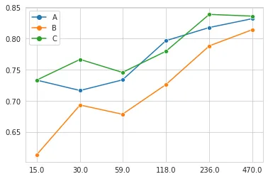
我的数据框:
            A         B         C
15   0.733333  0.613333  0.733333
30   0.716667  0.693333  0.766667
59   0.733684  0.678485  0.745763
118  0.796667  0.726087  0.779661
236  0.817862  0.788333  0.838983
470  0.832125  0.814468  0.836170
我想要实现的目标:
sample_count = np.around(np.logspace(math.log10(15),math.log10(470),6))
sample_count = sample_count.astype(int)

sns.set_style('whitegrid')
g_results=sns.lineplot(data=results,dashes=0,markers=['o','o','o'])
g_results.set(xticks=sample_count)
g_results.set(xscale='log')
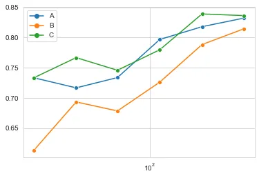
然而,结果并不完全符合我的期望,因为刻度完全消失了:
如果没有最后一行xscale,它看起来像这样,当然是线性刻度,但这次有正确的刻度:
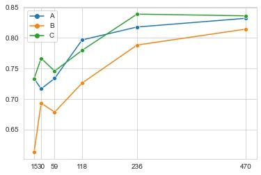
我想要实现的是像这样的功能:
我很感激您能帮助我解决问题。