如何创建一个面积图

4

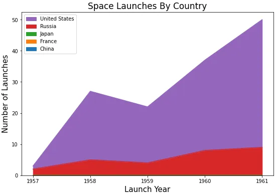
有没有办法在Seaborn中创建一个面积图?我查看了文档,但是没能找到。

这是我想要绘制的数据。

import pandas as pd
import seaborn as sns
import matplotlib.pyplot as plt

data = {'launch_year': [1957, 1958, 1959, 1960, 1961, 1957, 1958, 1959, 1960, 1961, 1957, 1958, 1959,
                        1960, 1961, 1957, 1958, 1959, 1960, 1961, 1957, 1958, 1959, 1960, 1961],
        'state_code': ['China', 'China', 'China', 'China', 'China', 'France', 'France', 'France', 'France',
                       'France', 'Japan', 'Japan', 'Japan', 'Japan', 'Japan', 'Russia', 'Russia', 'Russia',
                       'Russia', 'Russia', 'United States', 'United States', 'United States', 'United States', 'United States'],
        'value': [0, 0, 0, 0, 0, 0, 0, 0, 0, 0, 0, 0, 0, 0, 0, 2, 5, 4, 8, 9, 1, 22, 18, 29, 41]}

# create a long format DataFrame
df = pd.DataFrame(data)

# pivot the DataFrame to a wide format
year_countries = df.pivot(index='launch_year', columns='state_code', values='value')

# display(year_countries)

state_code   China  France  Japan  Russia  United States
launch_year                                             
1957             0       0      0       2              1
1958             0       0      0       5             22
1959             0       0      0       4             18
1960             0       0      0       8             29
1961             0       0      0       9             41

我使用以下代码创建了一条线图 -
sns.relplot(data=year_countries, kind='line',
            height=7, aspect=1.3,linestyle='solid')

plt.xlabel('Lanuch Year', fontsize=15)
plt.ylabel('Number of Launches', fontsize=15)
plt.title('Space Launches By Country',fontsize=17)

plt.show()

但是使用折线图时,图表不够清晰。

Plot fig

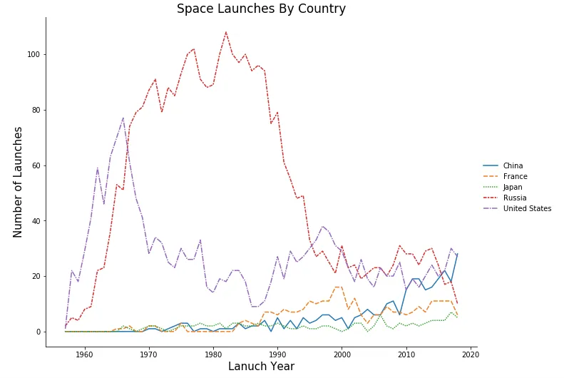
同时,无法使线条呈实线并按降序排列图例中的值。


这种离散数据应该使用条形图
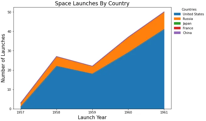
ax = year_countries.plot(kind='bar', rot=0, figsize=(9, 6)),如果需要的话,可以添加参数 logy=True - Trenton McKinney
1个回答

11
如何使用pandas.DataFrame.plotkind='area'进行绘图。

使用plt.style.use('seaborn')设置seaborn样式已经过时。

此外,您需要手动对图例进行排序,如此处所示。但是更改图例顺序不会改变绘图顺序。

xticks=range(1957, 1962)可用于指定xticks,否则'launch_year'x轴上被视为浮点数。

enter image description here

python 3.11pandas 1.5.2matplotlib 3.6.2中测试通过

ax = year_countries.plot(kind='area', figsize=(9, 6), xticks=range(1957, 1962))
ax.set_xlabel('Launch Year', fontsize=15)
ax.set_ylabel('Number of Launches', fontsize=15)
ax.set_title('Space Launches By Country', fontsize=17)

handles, labels = ax.get_legend_handles_labels()
labels, handles = zip(*sorted(zip(labels, handles), key=lambda t: t[0], reverse=True))
ax.legend(handles, labels)
plt.show()

输入图像描述


或者使用pandas.Categorical在数据透视之前设置df中列的顺序。这将确保绘图顺序和图例顺序相同 (例如,图例中的第一组是绘图堆栈中的第一组)。

# set the order of the column in df
df.state_code = pd.Categorical(df.state_code, sorted(df.state_code.unique())[::-1], ordered=True)

# now pivot df
year_countries = df.pivot(index='launch_year', columns='state_code', values='value')

# plot
ax = year_countries.plot(kind='area', figsize=(9, 6), xticks=range(1957, 1962))
ax.set_xlabel('Launch Year', fontsize=15)
ax.set_ylabel('Number of Launches', fontsize=15)
ax.set_title('Space Launches By Country', fontsize=17)

# move the legend
ax.legend(title='Countries', bbox_to_anchor=(1, 1.02), loc='upper left', frameon=False)

enter image description here


网页内容由stack overflow 提供, 点击上面的
可以查看英文原文,
原文链接