我希望使用Bokeh创建一个气泡图,基于分类的x轴和y轴,并使用计数作为它们的大小。
这是我拥有的数据框,并且我已经成功地用Seaborn创建了它:
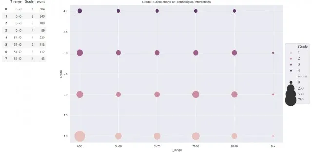
我希望了解如何使用Bokeh实现相同的事情。提前感谢你。 已解决 感谢回答者。我已经成功生成了一张完全符合我的要求的图表。我稍微调整了一下以适应应用程序,具体如下:
这是我拥有的数据框,并且我已经成功地用Seaborn创建了它:
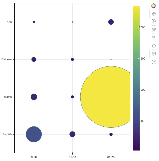
这是我创建的 Seaborn 的简短版本
import pandas as pd
import seaborn as sns

d = {'T_range': ['0-50', '0-50', '0-50', '0-50',
                 '51-60', '51-60', '51-60', '51-60',
                 '61-70', '61-70', '61-70', '61-70'],
     'Subject': ['English', 'Maths', 'Chinese', 'Arts',
                 'English', 'Maths', 'Chinese', 'Arts',
                'English', 'Maths', 'Chinese', 'Arts'],
     'count': [603, 240, 188, 89,
               220, 118, 112, 43,
              123, 2342, 32, 212]}

df_test = pd.DataFrame(data=d)

sns.set(rc={'figure.figsize':(15, 10)})
ax = sns.scatterplot(x='T_range', y='Subject', size='count', hue='Subject',
                    sizes=(100, 5000), legend=None, data=df_test)

display(df_test)

# Show result
ax
我希望了解如何使用Bokeh实现相同的事情。提前感谢你。 已解决 感谢回答者。我已经成功生成了一张完全符合我的要求的图表。我稍微调整了一下以适应应用程序,具体如下:
x = df[range_name].tolist()
y = df[group_name].tolist()
size = list(map(lambda i: i/10, df['count'].tolist()))

d = {'{}'.format(range_name): x,
     '{}'.format(group_name): y,
     'count': size}