使用FuncAnimation制作Seaborn气泡图动画

3
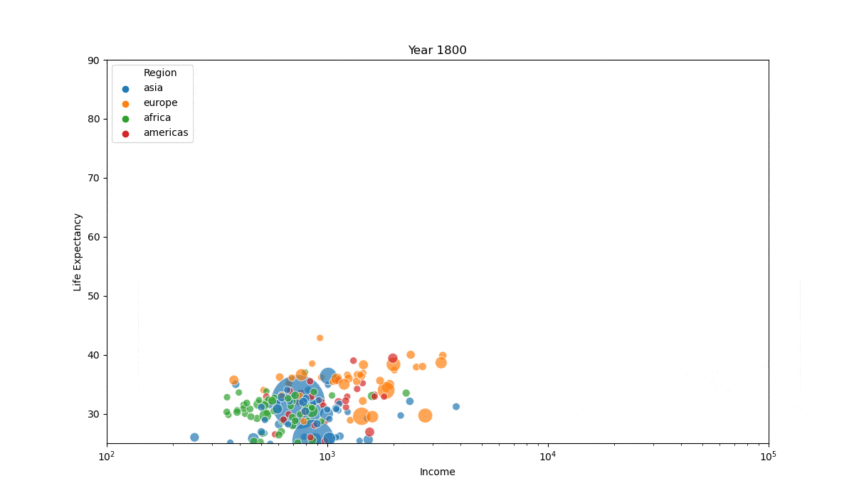
我有一个包含每个国家随时间变化的收入和预期寿命数据集。在1800年,它是这样的: 1 
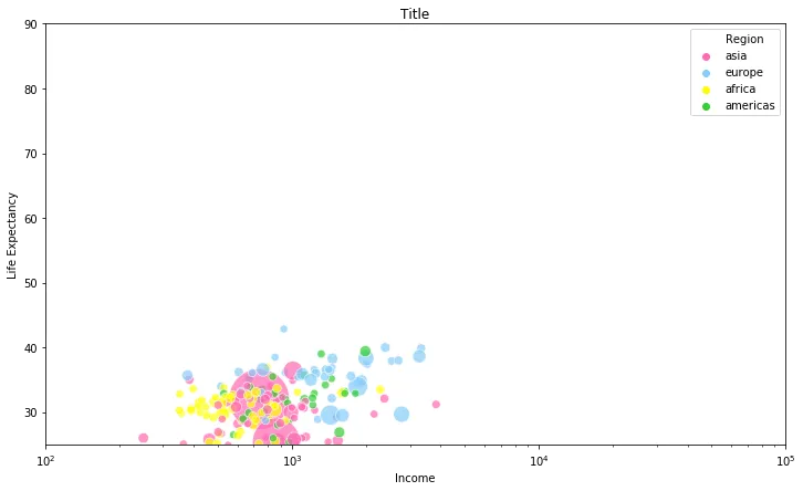
我想制作一个动画图表,展示从1800年到2019年生活预期和收入的变化情况。
这是我目前用于静态绘图的代码:
import matplotlib
fig, ax = plt.subplots(figsize=(12, 7))

chart = sns.scatterplot(x="Income",
                        y="Life Expectancy",
                        size="Population",
                        data=gapminder_df[gapminder_df["Year"]==1800],
                        hue="Region", 
                        ax=ax,
                        alpha=.7,
                        sizes=(50, 3000)
                       )

ax.set_xscale('log')
ax.set_ylim(25, 90)
ax.set_xlim(100, 100000)

scatters = [c for c in ax.collections if isinstance(c, matplotlib.collections.PathCollection)]

handles, labels = ax.get_legend_handles_labels()
ax.legend(handles[:5], labels[:5])

def animate(i):
    data = gapminder_df[gapminder_df["Year"]==i+1800]
    for c in scatters:
        # do whatever do get the new data to plot
        x = data["Income"]
        y = data["Life Expectancy"]
        xy = np.hstack([x,y])
        # update PathCollection offsets
        c.set_offsets(xy)
        c.set_sizes(data["Population"])
        c.set_array(data["Region"])
    return scatters

ani = matplotlib.animation.FuncAnimation(fig, animate, frames=10, blit=True)
ani.save("test.mp4")

以下是数据链接:https://github.com/abdennouraissaoui/Animated-bubble-chart

谢谢!


这些数据是否可在某处获取,以便我们可以使用它们? - Tom
1
你好Tom,我已经更新了帖子并添加了我的新代码。这是数据链接:https://github.com/abdennouraissaoui/Animated-bubble-chart - Aissaoui A
1个回答

4

您可以通过 i 计数器循环遍历数据的年份,每次循环(在每个帧)都会增加1。您可以定义一个基于iyear变量,然后通过这个year筛选您的数据并绘制筛选后的数据框。每次循环时,必须使用 ax.cla() 清除先前的散点图。最后,我选择了220个帧,以便从1800年到2019年每年都有一个帧。
请参考以下代码:

import pandas as pd
import matplotlib.pyplot as plt
import seaborn as sns
from matplotlib.animation import FuncAnimation

gapminder_df = pd.read_csv('data.csv')

fig, ax = plt.subplots(figsize = (12, 7))

def animate(i):
    ax.cla()
    year = 1800 + i
    sns.scatterplot(x = 'Income',
                    y = 'Life Expectancy',
                    size = 'Population',
                    data = gapminder_df[gapminder_df['Year'] == year],
                    hue = 'Region',
                    ax = ax,
                    alpha = 0.7,
                    sizes = (50, 3000))
    ax.set_title(f'Year {year}')
    ax.set_xscale('log')
    ax.set_ylim(25, 90)
    ax.set_xlim(100, 100000)
    handles, labels = ax.get_legend_handles_labels()
    ax.legend(handles[:5], labels[:5], loc = 'upper left')

ani = FuncAnimation(fig = fig, func = animate, frames = 220, interval = 100)
plt.show()

以下是复制并粘贴此动画的代码:

enter image description here

(我裁剪了上面的动画,以便获得更轻的文件,少于2 MB,事实上数据每5年增加一步。但是上面的代码可以复制完整的动画,每年增加一步)


网页内容由stack overflow 提供, 点击上面的
可以查看英文原文,
原文链接