尊敬的,
我可以使用plotly中的
我可以使用plotly中的
Candlestick制作图表。
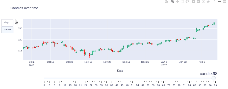
但是,在循环内部,如何使这些图形不是一个接一个地创建,而是全部在一个图形中?创建动画效果。
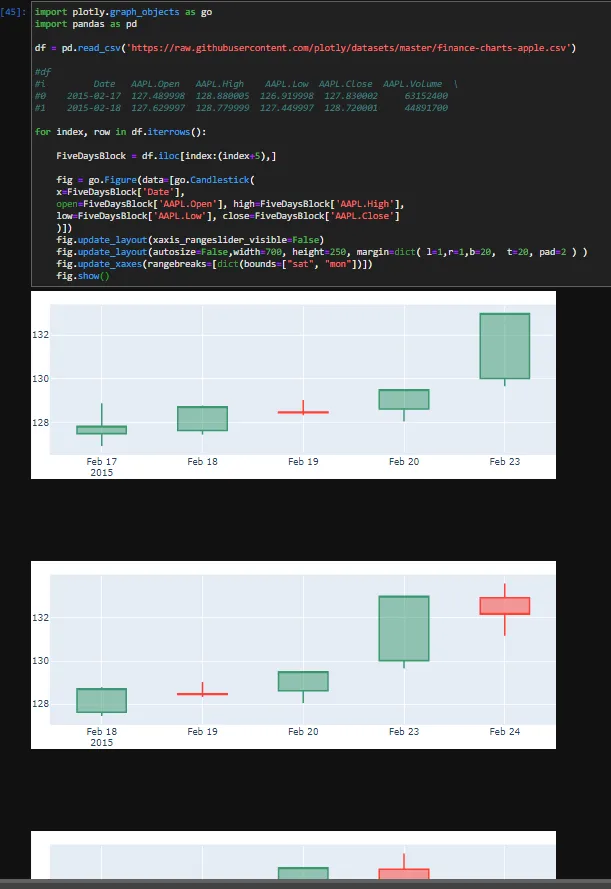
请参见示例,其中我连续绘制具有5天前瞻窗口的蜡烛,遍历整个DataFrame。import plotly.graph_objects as go
import pandas as pd
df = pd.read_csv('https://raw.githubusercontent.com/plotly/datasets/master/finance-charts-apple.csv')
#df
#i Date AAPL.Open AAPL.High AAPL.Low AAPL.Close AAPL.Volume \
#0 2015-02-17 127.489998 128.880005 126.919998 127.830002 63152400
#1 2015-02-18 127.629997 128.779999 127.449997 128.720001 44891700
#....
for index, row in df.iterrows():
FiveDaysBlock = df.iloc[index:(index+5),]
fig = go.Figure(data=[go.Candlestick(
x=FiveDaysBlock['Date'],
open=FiveDaysBlock['AAPL.Open'], high=FiveDaysBlock['AAPL.High'],
low=FiveDaysBlock['AAPL.Low'], close=FiveDaysBlock['AAPL.Close']
)])
fig.update_layout(xaxis_rangeslider_visible=False)
fig.update_layout(autosize=False,width=700, height=250, margin=dict( l=1,r=1,b=20, t=20, pad=2 ) )
fig.update_xaxes(rangebreaks=[dict(bounds=["sat", "mon"])])
fig.show()
谢谢您,