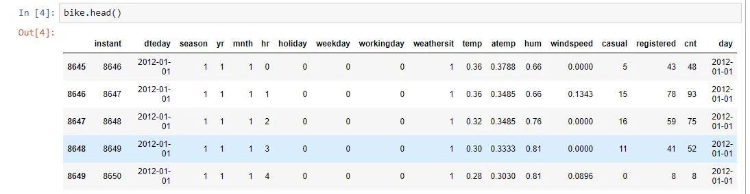
我正在尝试制作一个小时需求的密度图:数据
'hr'表示不同的小时,'cnt'表示需求。
我知道如何制作一个密度图,例如:
sns.kdeplot(bike['hr'])
然而,这仅适用于不知道不同时间需求的情况。因此,我可以将每个小时视为其需求量进行计算。现在我知道了每个小时的需求量,我该如何制作此类数据的密度图?
df = pd.read_csv("../data/hour.csv") # load dataset, inc cols hr, cnt, no NaNs

# using the bar plotter built in to pandas objects
fig, ax = plt.subplots(1,2)
df.groupby('hr').agg({'cnt':sum}).plot.bar(ax=ax[0])

# reconstructed samples - has df.cnt.sum() rows, each one containing an hour of a rental.
samples = np.hstack([ np.repeat(h, df.cnt.iloc[i]) for i, h in enumerate(df.hr)])

# plot a density estimate
sns.kdeplot(samples, bw=0.5, lw=3, c="r", ax=ax[1])

# to make a useful comparison with a density estimate, we need to have our bar areas
# sum up to 1, so we use groupby.apply to divide by the total of all counts.
tot = float(df.cnt.sum())
df.groupby('hr').apply(lambda x: x['cnt'].sum()/tot).plot.bar(ax=ax[1], color='C0')
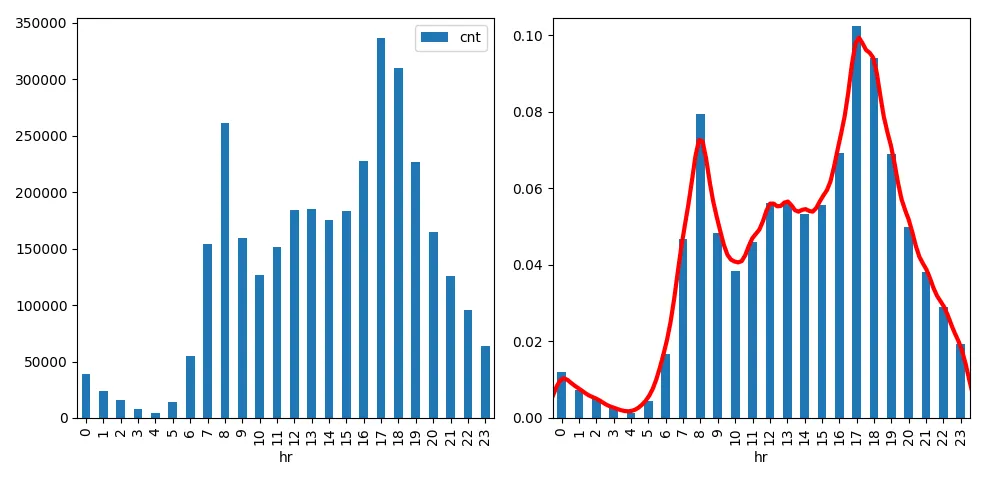
自行车的需求在夜间似乎很低...但显然它们可能是用于通勤,在早上8点和下午5-6点有高峰。