Seaborn的kde图绘制概率而不是密度(无柱直方图)

6
我有一个关于 seaborn 的问题,涉及到 kdeplot。在 histplot 中,人们可以设置他们想要的统计量(计数、频率、密度、概率),如果与 kde 参数一起使用,则也适用于 kdeplot。然而,我没有找到直接在 kdeplot 中更改它的方法,如果我想仅使用具有概率的 kde 图形估计。或者,如果可以关闭柱形图,那么相同的结果也应该来自 histplot,但我也没有找到这个选项。那么怎么做呢?
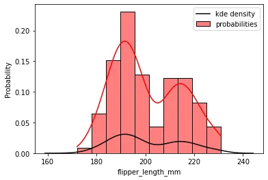
为了举例说明,我只想要红色曲线,即要么将参数传递给 kdeplot 以使用 probabilities,要么从 histplot 中删除柱形图:
import seaborn

penguins = sns.load_dataset("penguins")
sns.histplot(data=penguins, x="flipper_length_mm", kde=True, stat="probability", color="r", label="probabilities")
sns.kdeplot(data=penguins, x="flipper_length_mm", color="k", label="kde density")
plt.legend()

im1 - kde and hist plot

非常感谢。


2
当您使用概率(或计数)统计数据绘制直方图时,y轴和KDE曲线之间没有定量关系。缩放完全取决于直方图中的binwidth - 更改bin大小,y轴将发生变化,并且整个KDE曲线将以乘法因子缩放。 KDE的y轴值仅在
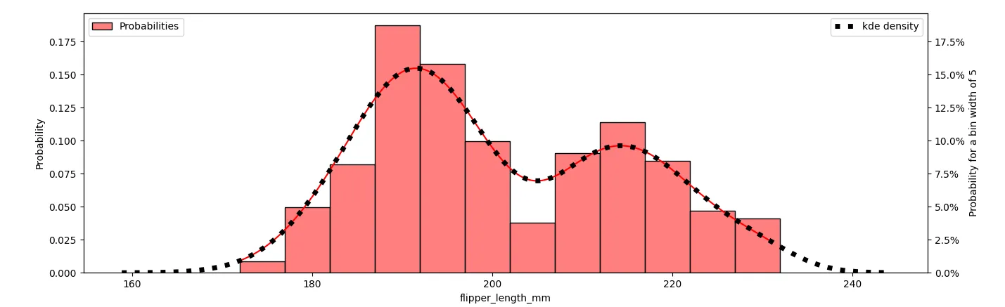
stat =“density”时才有意义,这将对应于从kdeplot获取的内容。 - mwaskom
1个回答

6
使用 stat="probability"histplot 的 y 轴表示值属于某个条形的概率。最高条形的值为 0.23,意味着有大约 23% 的概率翻转器长度在 189.7195.6 mm 之间(是该特定bin的边缘)。请注意,默认情况下,在最小和最大值之间平均分布了 10 个 bin。 kdeplot 的 y 轴类似于 概率密度函数。曲线高度与对应 x 值宽度为 1 的一个 bin 中值可能性成比例。例如,当 x=191 时,0.031 的值意味着长度在 190.5191.5 之间的可能性约为 3.1%
现在,要直接获得 kdeplot 旁边的概率值,首先需要选择 bin 宽度。然后将 y 值除以该 bin 宽度,以使 x 值等于该宽度的 bin 内的概率。使用 PercentageFormatter 可以设置这种对应关系,使用 ax.yaxis.set_major_formatter(PercentFormatter(1/binwidth))
以下示例代码展示了一个 bin 宽度为 5 mm 的示例,以及如何使 histplotkdeplot 匹配。
import matplotlib.pyplot as plt
import seaborn as sns
from matplotlib.ticker import PercentFormatter

fig, ax1 = plt.subplots()
penguins = sns.load_dataset("penguins")
binwidth = 5
sns.histplot(data=penguins, x="flipper_length_mm", kde=True, stat="probability", color="r", label="Probabilities",
             binwidth=binwidth, ax=ax1)
ax2 = ax1.twinx()
sns.kdeplot(data=penguins, x="flipper_length_mm", color="k", label="kde density", ls=':', lw=5, ax=ax2)
ax2.set_ylim(0, ax1.get_ylim()[1] / binwidth)  # similir limits on the y-axis to align the plots
ax2.yaxis.set_major_formatter(PercentFormatter(1 / binwidth))  # show axis such that 1/binwidth corresponds to 100%
ax2.set_ylabel(f'Probability for a bin width of {binwidth}')
ax1.legend(loc='upper left')
ax2.legend(loc='upper right')
plt.show()

示例图

提示:仅显示带有概率的kdeplot,代码可以是:

binwidth = 5
ax = sns.kdeplot(data=penguins, x="flipper_length_mm")
ax.yaxis.set_major_formatter(PercentFormatter(1 / binwidth))  # show axis such that 1/binwidth corresponds to 100%
ax.set_ylabel(f'Probability for a bin width of {binwidth}')

另一种选项是使用kde=True绘制histplot,并删除生成的条形图。为了可解释性,应设置binwidth。使用binwidth=1可以获得与密度图相同的y轴。(kde_kws={'cut': 3})使kde平滑地到达约为零,默认情况下,kde曲线被截断为数据的最小值和最大值。)

ax = sns.histplot(data=penguins, x="flipper_length_mm", binwidth=1, kde=True, stat='probability', kde_kws={'cut': 3})
ax.containers[0].remove() # remove the bars
ax.relim() # the axis limits need to be recalculated without the bars
ax.autoscale_view()

网页内容由stack overflow 提供, 点击上面的
可以查看英文原文,
原文链接