Seaborn 绘制边际多个 KDE 图表

5

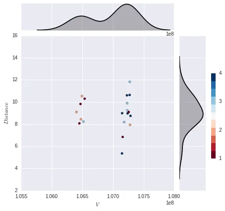
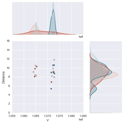
我希望能够在y轴边缘上绘制多个重叠的kde图(不需要x轴边缘图)。每个kde图将对应一种颜色类别(共有4种),因此我将有4个kde,每个都描述一个类别的分布。这是我到目前为止做到的:

import numpy as np
import pandas as pd
import seaborn as sns
import matplotlib.pyplot as plt


%matplotlib inline
%config InlineBackend.figure_format = 'svg'


x = [106405611, 107148674, 107151119, 107159869, 107183396, 107229405, 107231917, 107236097,
 107239994, 107259338, 107273842, 107275873, 107281000, 107287770, 106452671, 106471246, 
 106478110, 106494135, 106518400, 106539079]


y = np.array([  9.09803208,   5.357552  ,   8.98868469,   6.84549005,
         8.17990909,  10.60640521,   9.89935692,   9.24079133,
         8.97441459,   9.09803208,  10.63753055,  11.82336724,
         7.93663794,   8.74819285,   8.07146236,   9.82336724,
         8.4429435 ,  10.53332973,   8.23361968,  10.30035256])


x1 = pd.Series(x, name="$V$")
x2 = pd.Series(y, name="$Distance$")  

col = np.array([2, 4, 4, 1, 3, 4, 3, 3, 4, 1, 4, 3, 2, 4, 1, 1, 2, 2, 3, 1])

g = sns.JointGrid(x1, x2)
g = g.plot_joint(plt.scatter, color=col, edgecolor="black", cmap=plt.cm.get_cmap('RdBu', 11))
cax = g.fig.add_axes([1, .25, .02, .4])
plt.colorbar(cax=cax, ticks=np.linspace(1,11,11))
g.plot_marginals(sns.kdeplot, color="black", shade=True)

enter image description here

1个回答

6

要绘制每个类别的分布图,我认为最好的方法是先将数据组合成 pandas 数据框。接着你可以通过对数据框进行筛选,循环遍历每个唯一的类别,并使用调用 sns.kdeplot 来绘制分布图。

import numpy as np
import pandas as pd
import seaborn as sns
import matplotlib.pyplot as plt


x = np.array([106405611, 107148674, 107151119, 107159869, 107183396, 107229405,
              107231917, 107236097, 107239994, 107259338, 107273842, 107275873,
              107281000, 107287770, 106452671, 106471246, 106478110, 106494135,
              106518400, 106539079])

y = np.array([9.09803208,   5.357552  ,   8.98868469,   6.84549005,
              8.17990909,  10.60640521,   9.89935692,   9.24079133,
              8.97441459,   9.09803208,  10.63753055,  11.82336724,
              7.93663794,   8.74819285,   8.07146236,   9.82336724,
              8.4429435 ,  10.53332973,   8.23361968,  10.30035256])

col = np.array([2, 4, 4, 1, 3, 4, 3, 3, 4, 1, 4, 3, 2, 4, 1, 1, 2, 2, 3, 1])

# Combine data into DataFrame
df = pd.DataFrame({'V': x, 'Distance': y, 'col': col})

# Define colormap and create corresponding color palette
cmap = sns.diverging_palette(20, 220, as_cmap=True)
colors = sns.diverging_palette(20, 220, n=4)

# Plot data onto seaborn JointGrid
g = sns.JointGrid('V', 'Distance', data=df, ratio=2)
g = g.plot_joint(plt.scatter, c=df['col'], edgecolor="black", cmap=cmap)

# Loop through unique categories and plot individual kdes
for c in df['col'].unique():
    sns.kdeplot(df['Distance'][df['col']==c], ax=g.ax_marg_y, vertical=True,
                color=colors[c-1], shade=True)
    sns.kdeplot(df['V'][df['col']==c], ax=g.ax_marg_x, vertical=False,
                color=colors[c-1], shade=True)

在此输入图像描述

我认为这比我的原始答案更好、更干净,因为我不必重新定义seaborn kdeplot,因为我没有想到用这种方法。感谢mwaskom指出这一点。另外请注意,发布的解决方案中已经移除了图例标签,并且使用以下方式实现:

g.ax_marg_x.legend_.remove()
g.ax_marg_y.legend_.remove()

能下投票者解释一下吗?我认为这正是原帖所要求的内容。 - lanery
为什么要重写seaborn.kdeplot函数? - mwaskom
@mwaskom,没有什么好的理由。我最近在其他地方使用了那个函数,并不恰当地重新应用到了这里。现在我认为修改后的答案要好得多,谢谢。 - lanery

网页内容由stack overflow 提供, 点击上面的
可以查看英文原文,
原文链接