在seaborn clustermap上绘制图表

6
我使用seaborn.clustermap生成了一个聚类热图。 我想在热图顶部绘制一条水平线,就像这张图片中的那样enter image description here 
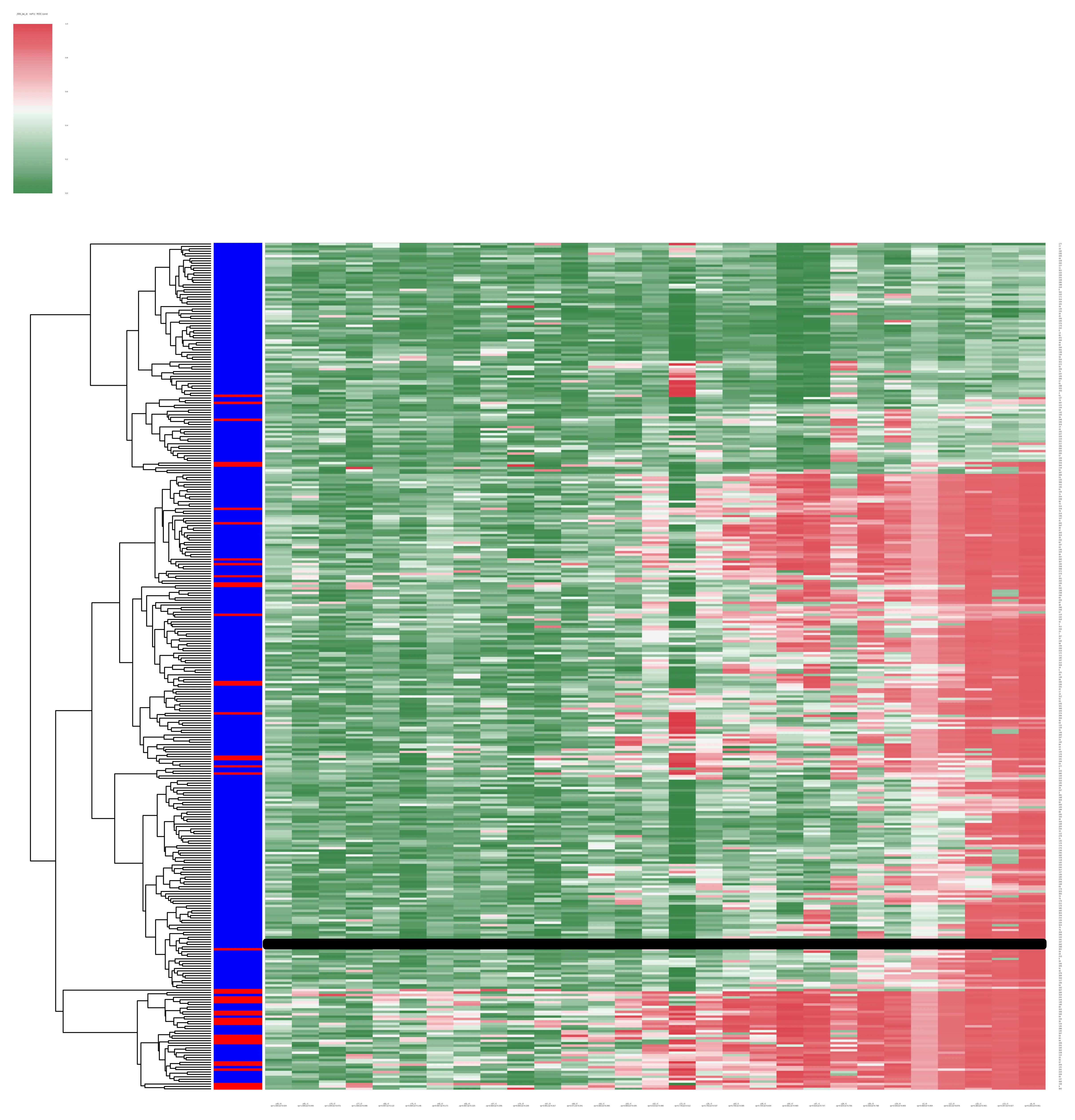
我尝试使用matplotlib,代码如下:
plt.plot([x1, x2], [y1, y2], 'k-', lw = 10)

但是线没有显示出来。 由seaborn.clustermap返回的对象不像这个类似问题中那样具有任何属性。 我该如何绘制这条线? 这里是生成类似于我发布的“随机”聚类图的代码:
import numpy as np
import seaborn as sns
import pandas as pd
import matplotlib.pyplot as plt
import random 

data = np.random.random((50, 50))
df = pd.DataFrame(data)
row_colors = ["b" if random.random() > 0.2 else "r"  for i in range (0,50)]
cmap = sns.diverging_palette(133, 10, n=7, as_cmap=True)
result = sns.clustermap(df, row_colors=row_colors, col_cluster = False, cmap=cmap, linewidths = 0)
plt.plot([5, 30], [5, 5], 'k-', lw = 10)
plt.show()

你能否提供一个最小化的工作示例来生成聚类图,以便我们可以进行测试?我本来期望你的代码能够正常运行,但也许你正在绘制的线条被聚类图遮挡了?或许你可以使用plt.plot( ... , zorder=10)来设置线条的z-order。 - DanHickstein
我尝试使用plt.plot( ... , zorder=10),但没有任何变化。我添加了一个可工作的示例。 - Titus Pullo
1
聚类图有多个轴,
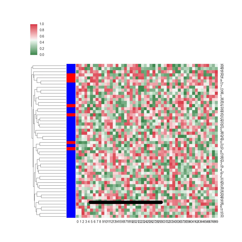
plt.plot在“活动”轴上绘制,但那可能不是热力图轴。因此,您只需要在相关轴上调用plot方法,这将是您调用result对象的属性。 - mwaskom
1个回答

13

你需要的轴对象隐藏在ClusterGrid.ax_heatmap中。这段代码会找到这个轴并简单地使用ax.plot()来绘制线条。你也可以使用ax.axhline()。

import numpy as np
import seaborn as sns
import pandas as pd
import matplotlib.pyplot as plt
import random 

data = np.random.random((50, 50))
df = pd.DataFrame(data)
row_colors = ["b" if random.random() > 0.2 else "r"  for i in range (0,50)]
cmap = sns.diverging_palette(133, 10, n=7, as_cmap=True)
result = sns.clustermap(df, row_colors=row_colors, col_cluster = False, cmap=cmap, linewidths = 0)
print dir(result)  # here is where you see that the ClusterGrid has several axes objects hiding in it
ax = result.ax_heatmap  # this is the important part
ax.plot([5, 30], [5, 5], 'k-', lw = 10)
plt.show()

输入图片描述


网页内容由stack overflow 提供, 点击上面的
可以查看英文原文,
原文链接