ggplot2:绘制安德鲁曲线

3

我正在尝试通过实践学习Andrews图。 我知道R有andrews包使用基本绘图系统,但我想使用ggplot2。我按照pandas库中andrews_curves函数实现的步骤进行了转换。

我已经成功地翻译了Python函数的数据转换步骤:

andrews <- function(df, class_column, samples=200) {
  t <- seq(-pi, pi, length.out = samples) 
  
  vals <- t(
    data.matrix(                    
      df[, -which(names(df) %in% class_column)]
    )
  )
  
  curves <- outer(vals[1, ], rep(1, length(t))) 
  
  for (i in 2:nrow(vals)) {                       
    ft = (i %/% 2) * t                          
    if (i %% 2 == 0) {                                
      curves <- curves + outer(vals[i, ], sin(ft))
    } else {
      curves <- curves + outer(vals[i, ], cos(ft))
    }  
  }
  
  df_out <- data.frame( 
    t = rep(seq_len(samples), nrow(curves)),
    sample =  rep(seq_len(nrow(curves)), ncol(curves)),
    values = as.vector(t(curves)),
    class_column = rep(df[, class_column], samples)
  ) 
  
  df_out 
} 

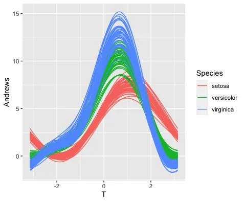
很遗憾,我是Python的初学者,不理解绘图系统(在andrews_curves中的60-69)。 我只想使用相同的数据复制这个图表,但得到的结果却十分偏差:

iris <- read.csv('https://raw.github.com/pandas-dev/pandas/main/pandas/tests/io/data/csv/iris.csv')

adrews_data <- andrews(iris, "Name", 30)

library(ggplot2)
ggplot(adrews_data, aes(x = t, y = values, color = class_column, group = interaction(class_column, sample))) +   
  geom_line(size = 1.2)

此代码示例由 reprex包(v2.0.1)于2022-01-26创建

2个回答

3
下面的代码似乎达到了您的要求,并且通过视觉检查,与您链接的Wikibedia页面上的图形相匹配。
唯一棘手的部分是为每个在 -pi 和 pi 之间的 T 值重复 iris 数据帧的每一行。关键是传递给 uncount() 的值必须与向量 t 的长度相同。
我已经采用了每行Andrews评分公式中列的顺序,这个顺序就是它们在 iris 数据帧中出现的顺序。我不知道改变列的顺序会产生什么影响。
library(tidyverse)

t=seq(-pi, pi, length.out=100)
root2 <- sqrt(2)
as_tibble(iris) %>%
  mutate(Row=row_number(), .before=1) %>% 
  uncount(100) %>% 
  add_column(T=rep(t, times=nrow(iris))) %>% 
  mutate(Andrews=Sepal.Length/root2 + Sepal.Width*sin(t) + Petal.Length*cos(t) + Petal.Width*sin(2*t)) %>% 
  ggplot() +
    geom_line(aes(x=T, y=Andrews, group=Row, colour=Species))

giving

enter image description here

group=Row 会为数据框中的每一行产生一条线。 colour=Species 根据相应的 Species 值为每条线着色。

[也许有比 uncount() %>% add_column() 更简洁的方法,可以使用 expand() 复制每个值为tiris中的每一行,但我无法使其正常工作。]


谢谢您的回答。我会点赞,但不会接受它作为解决方案,因为它不能推广到其他数据集(例如,当有更多列时)。确实,在ggplot2中有许多绘制andrews图的方法(例如https://gist.github.com/yannabraham/5b71b9599b460968f72e9b7ae63868e7),但我正在尝试复制“andrews_curves”函数。 - Claudiu Papasteri
1
啊!我没意识到普适性是关键... - Limey
也许,如果你想要一个通用的解决方案,你不应该以“我只想复制这个图 {...}”结束你的问题,这恰好是Limey展示如何做的。 - teunbrand

1
我觉得问题在于R中的矩阵是按列主序存储的,而Python中则是按行主序存储的。此外,在你的 df_out 参数中硬编码了鸢尾花数据集,但它并不是函数的正式参数。
library(ggplot2)

andrews <- function(df, class_column, samples=200) {
  t <- seq(-pi, pi, length.out = samples) 
  
  vals <- t(
    data.matrix(                    
      df[, -which(names(df) %in% class_column)]
    )
  )
  
  curves <- outer(vals[1, ], rep(1, length(t))) 
  
  for (i in 2:nrow(vals)) {                       
    ft = (i %/% 2) * t                          
    if (i %% 2 == 0) {                                
      curves <- curves + outer(vals[i, ], sin(ft))
    } else {
      curves <- curves + outer(vals[i, ], cos(ft))
    }  
  }
  
  row <- as.vector(row(curves))
  col <- as.vector(col(curves))
  
  df_out <- data.frame(
    t = col,
    sample = row,
    values = as.vector(curves),
    class_column = df[[class_column]][row]
  )
  
  df_out 
} 

df <- andrews(iris, "Species")

ggplot(df, aes(x = t, y = values, color = class_column, 
               group = sample)) +   
  geom_line()

创建于2022年1月26日,使用reprex包(v2.0.1)


网页内容由stack overflow 提供, 点击上面的
可以查看英文原文,
原文链接