使用ggplot2在R中绘制生存曲线

10

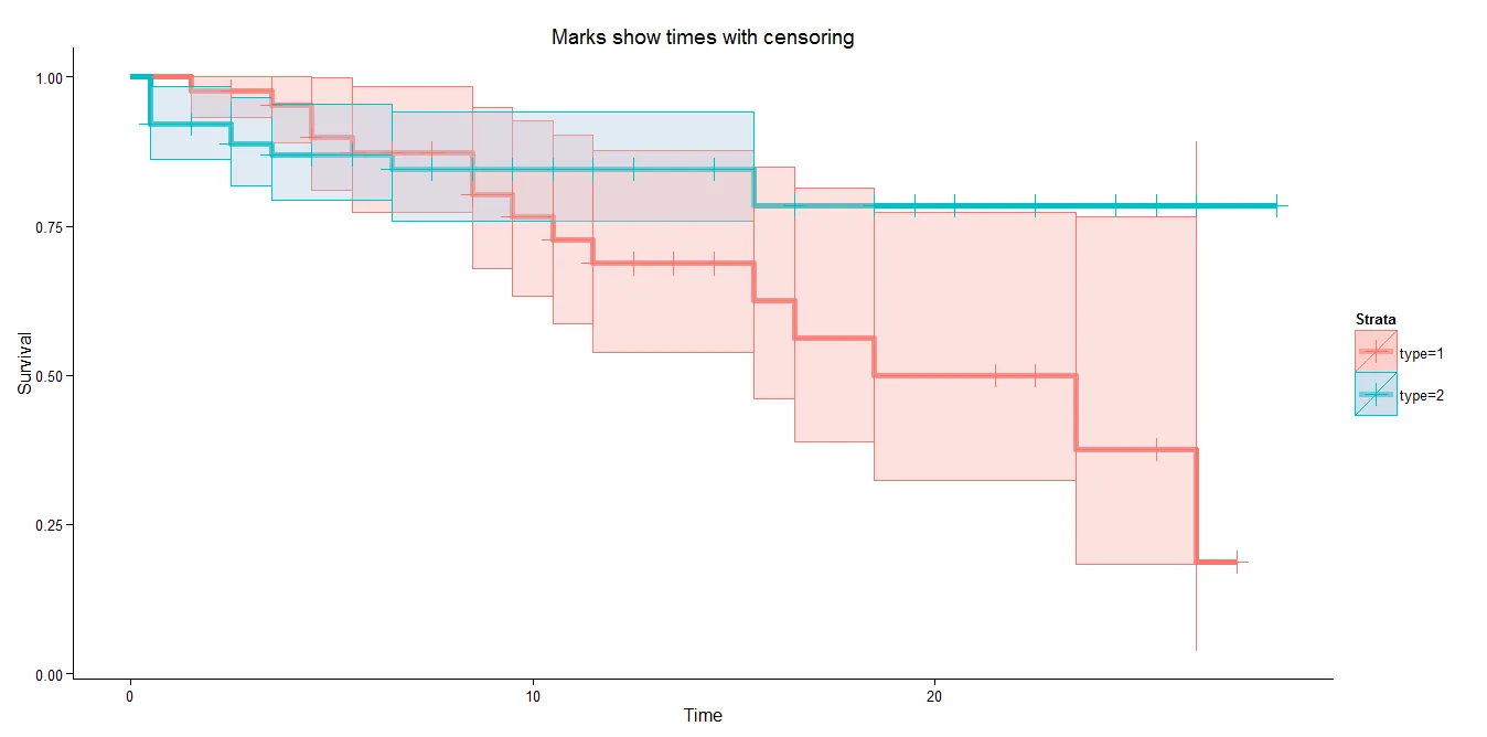
我一直在寻找使用ggplot2绘制生存曲线的解决方案。我找到了一些不错的例子,但它们并没有遵循整个ggplot2美学(主要是关于阴影置信区间等方面)。因此,最终我编写了自己的函数:

ggsurvplot<-function(s, conf.int=T, events=T, shape="|", xlab="Time", 
                  ylab="Survival probability", zeroy=F, col=T, linetype=F){

#s: a survfit object.
#conf.int: TRUE or FALSE to plot confidence intervals.
#events: TRUE or FALSE to draw points when censoring events occur
#shape: the shape of these points
#zeroy: Force the y axis to reach 0
#col: TRUE, FALSE or a vector with colours. Colour or B/W
#linetype: TRUE, FALSE or a vector with line types.

require(ggplot2)
require(survival)

if(class(s)!="survfit") stop("Survfit object required")

#Build a data frame with all the data
sdata<-data.frame(time=s$time, surv=s$surv, lower=s$lower, upper=s$upper)
sdata$strata<-rep(names(s$strata), s$strata)

#Create a blank canvas
kmplot<-ggplot(sdata, aes(x=time, y=surv))+
    geom_blank()+
    xlab(xlab)+
    ylab(ylab)+
    theme_bw()

#Set color palette
if(is.logical(col)) ifelse(col,
                         kmplot<-kmplot+scale_colour_brewer(type="qual", palette=6)+scale_fill_brewer(type="qual", palette=6),
                         kmplot<-kmplot+scale_colour_manual(values=rep("black",length(s$strata)))+scale_fill_manual(values=rep("black",length(s$strata)))
                        )
else kmplot<-kmplot+scale_fill_manual(values=col)+scale_colour_manual(values=col)

#Set line types
if(is.logical(linetype)) ifelse(linetype,
                              kmplot<-kmplot+scale_linetype_manual(values=1:length(s$strata)),
                              kmplot<-kmplot+scale_linetype_manual(values=rep(1,  length(s$strata)))
                              )
else kmplot<-kmplot+scale_linetype_manual(values=linetype)

#Force y axis to zero
if(zeroy) {
    kmplot<-kmplot+ylim(0,1)
}

#Confidence intervals
if(conf.int) {  

    #Create a data frame with stepped lines
    n <- nrow(sdata)
    ys <- rep(1:n, each = 2)[-2*n] #duplicate row numbers and remove the last one
    xs <- c(1, rep(2:n, each=2))   #first row 1, and then duplicate row numbers
    scurve.step<-data.frame(time=sdata$time[xs], lower=sdata$lower[ys], upper=sdata$upper[ys],  surv=sdata$surv[ys], strata=sdata$strata[ys])

    kmplot<-kmplot+
      geom_ribbon(data=scurve.step, aes(x=time,ymin=lower, ymax=upper, fill=strata), alpha=0.2)
}

#Events
if(events) {
    kmplot<-kmplot+
      geom_point(aes(x=time, y=surv, col=strata), shape=shape)
}

#Survival stepped line
kmplot<-kmplot+geom_step(data=sdata, aes(x=time, y=surv, col=strata, linetype=strata))

#Return the ggplot2 object
kmplot
}

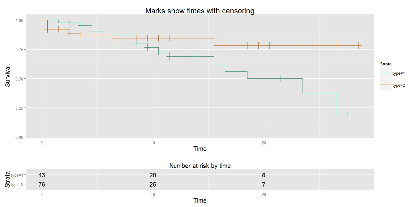
我曾经使用for循环来处理每个层级的先前版本,但速度较慢。由于我不是程序员,因此寻求改进函数的建议。也许可以添加一个包含风险患者数据表,或更好地集成到ggplot2框架中。
谢谢。
2个回答

7
您可以尝试以下内容,其中包含置信区间之间的阴影区域:

(我在这里使用开发版本,因为生产版本中参数alpha存在缺陷(对于非默认值不正确地着色上部矩形)。否则,这些函数是相同的)。

library(devtools)
dev_mode(TRUE) # in case you don't want a permanent install
install_github("survMisc", "dardisco")
library("survMisc", lib.loc="C:/Users/c/R-dev") # or wherever you/devtools has put it
data(kidney, package="KMsurv")
p1 <- autoplot(survfit(Surv(time, delta) ~ type, data=kidney),
               type="fill", survSize=2, palette="Pastel1",
               fillLineSize=0.1, alpha=0.4)$plot
p1 + theme_classic()
dev_mode(FALSE)

提供:

enter image description here

以及一个经典的图表:

autoplot(autoplot(survfit(Surv(time, delta) ~ type, data=kidney),
                  type="CI"))

在此输入图片描述

请参阅?survMisc::autoplot.survfit?survMisc::autoplot.tableAndPlot以获取更多选项。


这正是我所需要的,但是当我尝试使用填充选项的图表时,出现了以下错误:Error in vecseq(f__, len__, if (allow.cartesian || notjoin) NULL else as.integer(max(nrow(x), : Join results in 32 rows; more than 28 = max(nrow(x),nrow(i))...If you are sure you wish to proceed, rerun with allow.cartesian=TRUE. ... 我尝试理解它的含义,但我不明白!你有任何想法吗? - Doc Martin's
这个软件包/示例在最新的 R (4.0+) 上无法工作。 - jiggunjer

0

我想做同样的事情,但也遇到了笛卡尔错误。此外,我还想在我的代码中有被审查的数字和事件数量。所以我写了这个小片段。虽然还有点粗糙,但可能对某些人有用。

ggsurvplot<-function(  
  time, 
  event, 
  event.marker=1, 
  marker,
  tabletitle="tabletitle", 
  xlab="Time(months)", 
  ylab="Disease Specific Survival", 
  ystratalabs=c("High", "Low"),
  pv=TRUE,
  legend=TRUE, 
  n.risk=TRUE,
  n.event=TRUE,
  n.cens=TRUE,
  timeby=24, 
  xmax=120,
  panel="A")

{
  require(ggplot2)
  require(survival)
  require(gridExtra)

  s.fit=survfit(Surv(time, event==event.marker)~marker)
  s.diff=survdiff(Surv(time, event=event.marker)~marker)


  #Build a data frame with all the data
  sdata<-data.frame(time=s.fit$time, 
                    surv=s.fit$surv, 
                    lower=s.fit$lower, 
                    upper=s.fit$upper,
                    n.censor=s.fit$n.censor,
                    n.event=s.fit$n.event,
                    n.risk=s.fit$n.risk)
  sdata$strata<-rep(names(s.fit$strata), s.fit$strata)
  m <- max(nchar(ystratalabs))
  if(xmax<=max(sdata$time)){
    xlims=c(0, round(xmax/timeby, digits=0)*timeby)
  }else{
    xlims=c(0, round((max(sdata$time))/timeby, digits=0)*timeby)
  }
  times <- seq(0, max(xlims), by = timeby)
  subs <- 1:length(summary(s.fit,times=times,extend = TRUE)$strata)
  strata = factor(summary(s.fit,times = times,extend = TRUE)$strata[subs])
  time = summary(s.fit, time = times, extend = TRUE)$time


  #Buidling the plot basics
  p<-ggplot(data = sdata, aes(colour = strata, group = strata, shape=strata)) + 
                        theme_classic()+
                        geom_step(aes(x = time, y = surv), direction = "hv")+
                        scale_x_continuous(breaks=times)+ 
                        scale_y_continuous(breaks=seq(0,1,by=0.1)) +
                        geom_ribbon(aes(x = time, ymax = upper, ymin = lower, fill = strata), directions = "hv", linetype = 0,alpha = 0.10) + 
                        geom_point(data = subset(sdata, n.censor == 1), aes(x = time, y = surv), shape = 3) + 
                        labs(title=tabletitle)+
                        theme(
                          plot.margin=unit(c(1,0.5,(2.5+length(levels(factor(marker)))*2),2), "lines"),
                          legend.title=element_blank(),
                          legend.background=element_blank(),
                          legend.position=c(0.2,0.2))+
                        scale_colour_discrete(
                          breaks=c(levels(factor(sdata$strata))),
                          labels=ystratalabs) +
                        scale_shape_discrete(
                          breaks=c(levels(factor(sdata$strata))),
                          labels=ystratalabs) +
                        scale_fill_discrete(
                          breaks=c(levels(factor(sdata$strata))),
                          labels=ystratalabs) +
                        xlab(xlab)+
                        ylab(ylab)+
                        coord_cartesian(xlim = xlims, ylim=c(0,1)) 

                        #addping the p-value
                        if (pv==TRUE){
                                pval <- 1 - pchisq(s.diff$chisq, length(s.diff$n) - 1)
                                pvaltxt<-if(pval>=0.001){
                                              paste0("P = ", round(pval, digits=3))
                                          }else{
                                              "P < 0.001"
                                          }
                                          p <- p + annotate("text", x = 0.85 * max(xlims), y = 0.1, label = pvaltxt)
                        }

                        #adding information for tables
                        times <- seq(0, max(xlims), by = timeby)
                        subs <- 1:length(summary(s.fit,times=times,extend = TRUE)$strata)

                        risk.data<-data.frame(strata = factor(summary(s.fit,times = times,extend = TRUE)$strata[subs]),
                                              time = summary(s.fit, time = times, extend = TRUE)$time[subs],
                                              n.risk = summary(s.fit,times = times,extend = TRUE)$n.risk[subs],
                                              n.cens = summary(s.fit, times=times, extend=TRUE)$n.cens[subs],
                                              n.event=summary(s.fit, times=times, extend=TRUE)$n.event[subs])
                        #adding the risk table 
                        if(n.risk==TRUE){ 
                                p<- p + annotate("text", cex=3, x=0.5*max(xlims), y=-0.15, label="Numbers at risk")
                                for (q in 1:length(levels(factor(marker)))){          
                                    p<- p + annotate("text", cex=3, x=-0.15*max(xlims),y=(-0.15+(-0.05*q)), label=paste0(ystratalabs[q]))
                                    for(i in ((q-1)*length(times)+1):(q*length(times))){
                                          p <- p + annotate("text", cex=3, x=risk.data$time[i], y=(-0.15+(-0.05*q)), label=paste0(risk.data$n.risk[i]))
                                    }
                                }
                        }
                        #adding the event table 
                        if(n.event==TRUE){ 
                                p<- p + annotate("text", cex=3, x=0.5*max(xlims), y=(-0.20+(-0.05*length(levels(factor(marker))))), label="Number of events")
                                for (q in 1:length(levels(factor(marker)))){          
                                    p<- p + annotate("text", cex=3, x=-0.15*max(xlims),y=(-0.20+(-0.05*length(levels(factor(marker))))+(-0.05*q)), label=paste0(ystratalabs[q]))
                                for(i in ((q-1)*length(times)+1):(q*length(times))){
                                    p <- p + annotate("text", cex=3, x=risk.data$time[i], y=(-0.20+(-0.05*length(levels(factor(marker))))+(-0.05*q)), label=paste0(risk.data$n.event[i]))
                                  }
                                }
                              }
                        #adding the cens table 
                        if(n.event==TRUE){ 
                                p<- p + annotate("text", cex=3, x=0.5*max(xlims), y=(-0.25+(-0.05*length(levels(factor(marker)))*2)), label="Number of censored")
                                for (q in 1:length(levels(factor(marker)))){          
                                    p<- p + annotate("text", cex=3, x=-0.15*max(xlims),y=(-0.25+(-0.05*length(levels(factor(marker)))*2)+(-0.05*q)), label=paste0(ystratalabs[q]))
                                for(i in ((q-1)*length(times)+1):(q*length(times))){
                                    p <- p + annotate("text", cex=3, x=risk.data$time[i], y=(-0.25+(-0.05*length(levels(factor(marker)))*2)+(-0.05*q)), label=paste0(risk.data$n.cens[i]))
                                  }
                                }
                              }

                        #adding panel marker
                              p <- p + annotate("text", cex=10, x= -0.2*max(xlims), y=1.1, label=panel)
                        #drawing the plot with  the tables outside the margins
                              gt <- ggplot_gtable(ggplot_build(p))
                              gt$layout$clip[gt$layout$name=="panel"] <- "off"
                              grid.draw(gt)
}

网页内容由stack overflow 提供, 点击上面的
可以查看英文原文,
原文链接