使用ggplot2和drc绘制剂量反应曲线

10
在生物学中,我们经常需要绘制剂量-反应曲线。R包“drc”非常有用,并且基本图形可以轻松处理“drm模型”。然而,我想将我的drm曲线添加到ggplot2中。
我的数据集:
 library("drc")
 library("reshape2")
 library("ggplot2")
 demo=structure(list(X = c(0, 1e-08, 3e-08, 1e-07, 3e-07, 1e-06, 3e-06, 
 1e-05, 3e-05, 1e-04, 3e-04), Y1 = c(0, 1, 12, 19, 28, 32, 35, 
 39, NA, 39, NA), Y2 = c(0, 0, 10, 18, 30, 35, 41, 43, NA, 43, 
 NA), Y3 = c(0, 4, 15, 22, 28, 35, 38, 44, NA, 44, NA)), .Names = c("X", 
"Y1", "Y2", "Y3"), class = "data.frame", row.names = c(NA, -11L
))

使用基础图形:

plot(drm(data = reshape2::melt(demo,id.vars = "X"),value~X,fct=LL.4(),na.action = na.omit),type="bars")
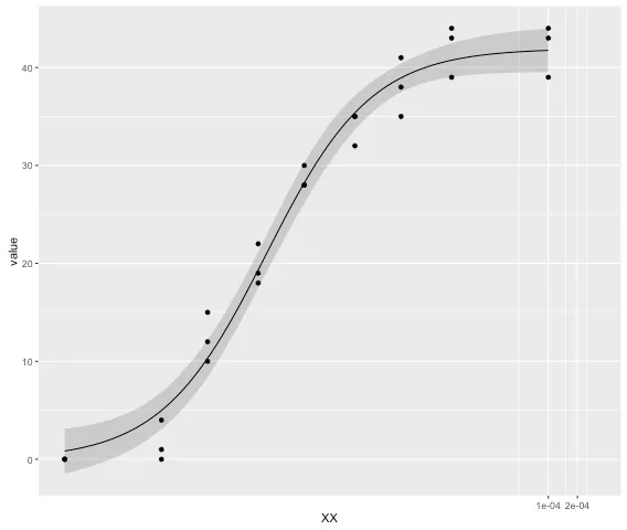
生成一个不错的四参数剂量响应曲线图。

试图在ggplot2中绘制相同的图表时,我遇到了两个问题。

  1. There is no way of directly adding the drm model curve. I need to rewrite the 4-PL as a function and add it in the form of a stat_function, which is cumbersome to say the least.

    ggplot(reshape2::melt(demo,id.vars = "X"),aes(X,value)) + 
      geom_point() + 
      stat_function(fun = function(x){
        drm_y=function(x, drm){
          coef(drm)[2]+((coef(drm)[3]-coef(drm)[2])/(1+exp((coef(drm)[1]*(log(x)-log(coef(drm)[4]))))))
        }
    + drm_y(x,drm = drm(data = reshape2::melt(demo,id.vars = "X"), value~X, fct=LL.4(), na.action = na.omit))
     })
    
  2. If that wasn't enough it only works if scale_x is continuous. If I want to add scale_x_log10(), I get: Warning message: In log(x): NaNs produced.

我知道log10(0) = -Inf,但有方法可以处理。要么(如plot.drc的情况),x=0的值将在x轴上绘制,实际上是预先最低x值的1/100。(demo$X[which.min(demo$X)+1]/100)或者像GraphPad Prism一样,完全省略剂量-反应曲线中的0。
我的问题是:
1. 是否有直接在ggplot2中绘制drm模型的方法? 2. 如何将数据集与其对应的4-PL曲线拟合联系起来,以便它们将以相同的颜色绘制?

我会很想把drm的计算放在ggplot之外,将结果放入data.frame中,并将其提供给ggplot。 - Richard Telford
3个回答

19

这篇最新发表的文章由于drc包作者提供了用于为ggplot2提取参数的指令。它们不能在ggplot2内部工作,但可以从模型中提取数据。这是他们应用于您的数据的解决方案。

demo1 <- reshape2::melt(demo,id.vars = "X") # get numbers ready for use.
demo.LL.4 <- drm(data = demo1,value~X,fct=LL.4(),na.action = na.omit) # run model.

predict 函数可以从 drm 模型中提取参数。它与使用 curveid 拟合的多个曲线不兼容。

# predictions and confidence intervals.
demo.fits <- expand.grid(conc=exp(seq(log(1.00e-04), log(1.00e-09), length=100))) 
# new data with predictions
pm <- predict(demo.LL.4, newdata=demo.fits, interval="confidence") 
    demo.fits$p <- pm[,1]
    demo.fits$pmin <- pm[,2]
    demo.fits$pmax <- pm[,3]

他们建议将零浓度值进行调整,以避免在coord_trans方面出现问题。

demo1$XX <- demo1$X
demo1$XX[demo1$XX == 0] <- 1.00e-09

然后是绘制曲线,省略geom_ribbon可以避免错误被绘制出来。

ggplot(demo1, aes(x = XX, y = value)) +
  geom_point() +
  geom_ribbon(data=demo.fits, aes(x=conc, y=p, ymin=pmin, ymax=pmax), alpha=0.2) +
  geom_line(data=demo.fits, aes(x=conc, y=p)) +
  coord_trans(x="log") 

输入图片描述

若想将多条曲线绘制在同一张图中,可重复该过程并为每组数据添加ID。

demo.fits_1 <- data.frame(label = "curve1", demo.fits)

然后使用rbind将所有提取的参数组合在一起。从那里,ggplot可以处理颜色。


7
我将回答自己的问题,希望这可以帮助其他面临相同问题的人。当然可以使用ggplot2和drc包绘制剂量响应曲线,只需添加geom_或stat_smooth (method=drm, fct=LL.4(),se=FALSE)(如果在线性比例尺上绘制)或geom_或stat_smooth (method=drm, fct=L.4(),se=FALSE)(如果添加了scale_x_log10())。为了能够使用log10比例尺,我将我的数据转换为:
demo <- demo %>% 
      mutate(X = 
       ifelse(X == 0, 
              yes = (sort(demo$X[which.min(sort(demo$X)) + 1]/100)),
              no = X
              )
            )         #looks for the pre-lowest value in X and divides it by 100

在这种情况下,我已经将X = 0的值替换为上一个X值的1/100(在此例中为1e-10)。然而,你可以通过完全省略它来轻松删除混乱对数绘图的0值,就像Prism一样。
需要注意的一点是,ggplot首先缩放坐标轴,然后添加数据,这就是为什么代码在尝试log10(0)时会中断的原因。
另一个细节是,stat_smooth函数完全能够使用“method = drm”处理drm模型,但它不知道如何拟合'SE'置信区间。选择“se = FALSE”因此可以实现绘制,并且在我看来绘图不会那么凌乱 - 只需添加误差线即可。
最后,将“fct = LL.4()”更改为“fct = L.4()”允许在log10比例上绘图,因为比例首先被选择,然后才进行拟合。因此,即使轴值不是对数级别,ggplot实际上已经将数据集转换为log10,因此拟合函数现在只需要是logit-4P(即L.4())而不是log-logit-4P(LL.4())。
geom_smooth()和stat_smooth()函数自然会采用与数据集相同的颜色,无需调整拟合函数的颜色与数据点的颜色相对应。
总之:
demo <- demo %>% 
      mutate(X = 
       ifelse(X == 0, 
              yes = (sort(demo$X[which.min(sort(demo$X)) + 1]/100)),
              no = X
              )
            )
demo.long <- reshape2::melt(demo,id.vars = "X") #reshapes the demo dataset to long format
ggplot(data = demo.long,
       aes(x = X, y = value, col = variable)
      ) + 
   geom_point() + 
   geom_smooth(method = drm, fct = L.4(), se = FALSE) +
   scale_x_log10() #plots out the dataset with the corresponding 4-parameter log-logit dose response curves

5
在使用R version 3.6.2ggplot2_3.2.1drc_3.0-1时,只有当将"fct"包装到method.args = list()中时,此代码才能正常工作,例如:geom_smooth(method = drm, method.args = list(fct = L.4()), se = FALSE) - Nakx

3
更新后的答案:geom_smooth(method = drm,method.args = list(fct = L.4()),se = FALSE)非常有帮助!

请不要将“谢谢”作为答案。一旦您拥有足够的声望,您就可以投票支持有用的问题和答案。- 来自审核 - Artem

网页内容由stack overflow 提供, 点击上面的
可以查看英文原文,
原文链接