简单答案请跳转至最后一段。本答案的其余部分是为了展示我得出答案的过程。
查看drc:::plot.drc的代码,我们可以看到最终一行通过隐式返回一个data.frame retData。
function (x, ..., add = FALSE, level = NULL, type = c("average",
"all", "bars", "none", "obs", "confidence"), broken = FALSE,
bp, bcontrol = NULL, conName = NULL, axes = TRUE, gridsize = 100,
log = "x", xtsty, xttrim = TRUE, xt = NULL, xtlab = NULL,
xlab, xlim, yt = NULL, ytlab = NULL, ylab, ylim, cex, cex.axis = 1,
col = FALSE, lty, pch, legend, legendText, legendPos, cex.legend = 1,
normal = FALSE, normRef = 1, confidence.level = 0.95)
{
invisible(retData)
}
retData包含拟合模型线的坐标,因此我们可以使用它来绘制与plot.drc相同的模型
pl <- plot(chickweed.m1, xlab = "Time (hours)", ylab = "Proportion germinated",
        xlim=c(0, 340), ylim=c(0, 0.25), log="", lwd=2, cex=1.2)
names(pl) <- c("x", "y")
ggplot(data= dt1Means, mapping=aes(x=start, y=Germinated)) +
  geom_point() +
  geom_line(data=pl, aes(x=x, y = y)) +
  lims(y=c(0, 0.25)) +
  theme_bw()
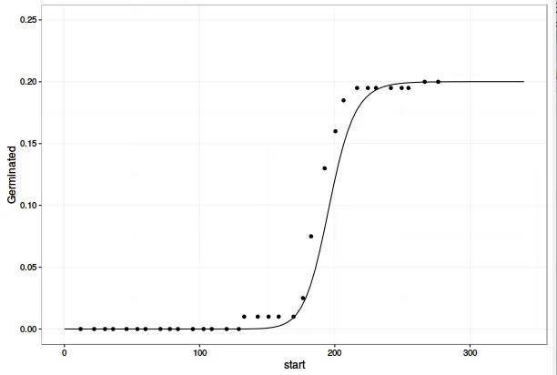
这与您使用 predict(object=chickweed.m1) 在 ggplot 中创建的版本相同。 因此,不同之处不在于模型线,而在于数据点的绘制位置。 我们可以通过将函数的最后一行从 invisible(retData) 更改为 list(retData, plotPoints) 来从 drc:::plot.drc 导出数据点。 为方便起见,我将整个 drc:::plot.drc 代码复制到了一个新函数中。请注意,如果您希望重复此步骤,则需要调用 drcplot 中的一些函数,这些函数未在 drc 命名空间中导出,因此必须在对函数 parFct、addAxes、brokenAxis 和 makeLegend 的所有调用之前添加前缀 drc:::。
drcplot <- function (x, ..., add = FALSE, level = NULL, type = c("average",
"all", "bars", "none", "obs", "confidence"), broken = FALSE,
bp, bcontrol = NULL, conName = NULL, axes = TRUE, gridsize = 100,
log = "x", xtsty, xttrim = TRUE, xt = NULL, xtlab = NULL,
xlab, xlim, yt = NULL, ytlab = NULL, ylab, ylim, cex, cex.axis = 1,
col = FALSE, lty, pch, legend, legendText, legendPos, cex.legend = 1,
normal = FALSE, normRef = 1, confidence.level = 0.95)
{
list(retData, plotPoints)
}
并且使用您的数据运行此程序。
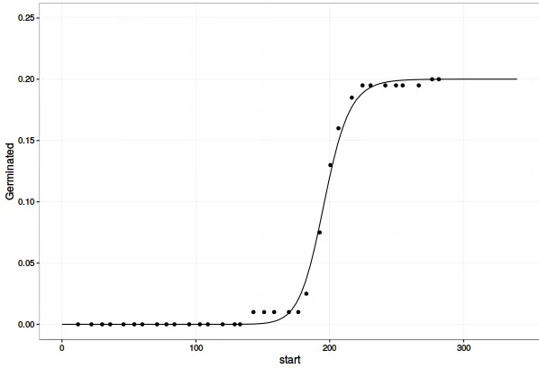
pl <- drcplot(chickweed.m1, xlab = "Time (hours)", ylab = "Proportion germinated",
          xlim=c(0, 340), ylim=c(0, 0.25), log="", lwd=2, cex=1.2)

germ.points <- as.data.frame(pl[[2]])
drc.fit <- as.data.frame(pl[[1]])
names(germ.points) <- c("x", "y")
names(drc.fit) <- c("x", "y")
现在,使用ggplot2绘制这些图形可以得到您想要的结果。
ggplot(data= dt1Means, mapping=aes(x=start, y=Germinated)) +
  geom_point(data=germ.points, aes(x=x, y = y)) +
  geom_line(data=drc.fit, aes(x=x, y = y)) +
  lims(y=c(0, 0.25)) +
  theme_bw()
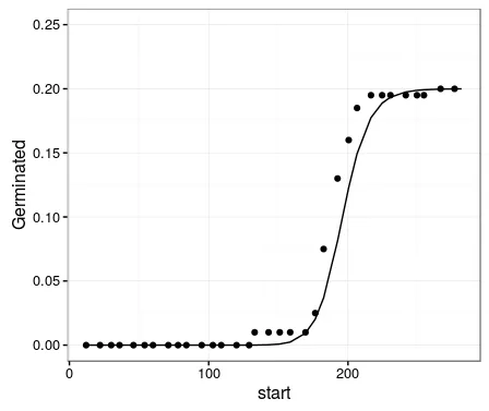
最后,将此图的数据点值(germ.points)与您原始的ggplot图(dt1Means)进行比较,可以看出差异的原因。您在dt1Means中计算的点相对于plot.drc中的时间段提前了一个时间段。换句话说,plot.drc将事件指派给它们发生的时间段的结束时间,而您将萌发事件指派给它们发生的时间间隔的开始时间。您可以通过简单地调整来解决这个问题,例如使用
dt1 <- data.table(chickweed)
dt1[, Germinated := mean(count)/200, by=start]
dt1[, cum_Germinated := cumsum(Germinated)]
dt1[, Pred := c(predict(object=chickweed.m1), NA)]
ggplot(data= dt1, mapping=aes(x=end, y=cum_Germinated)) +
geom_point() +
geom_line(aes(y = Pred)) +
lims(y=c(0, 0.25)) +
theme_bw()
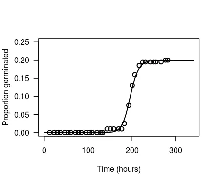
getAnywhere(plot.drc),以了解在基本绘图中如何计算数据。 - Andy W