我正在使用ggplot2进行多图绘制。尽管经过了很多调整,我仍然面临以下问题:
数据集(
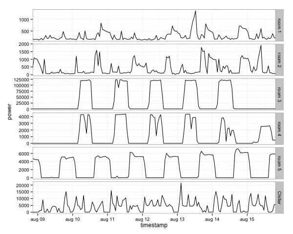
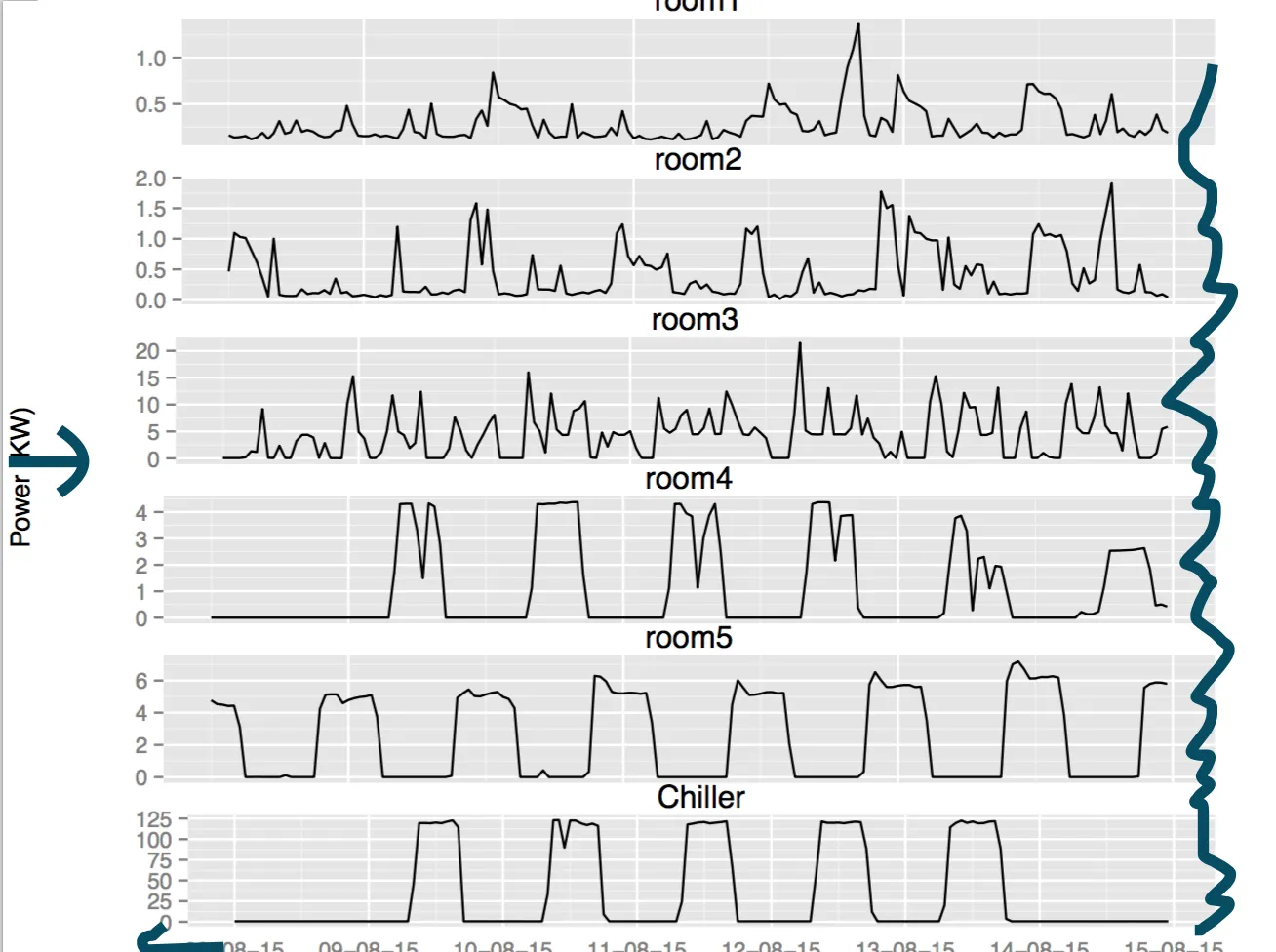
- 每个图的左/右两侧都会绘制出一些空白区域。我在每个图的右侧标记了这一点。
- 图形没有通过左侧对齐。这个问题在底部的图中明显。
- Y轴标签距离图形太远。我能减少这个间隔吗?
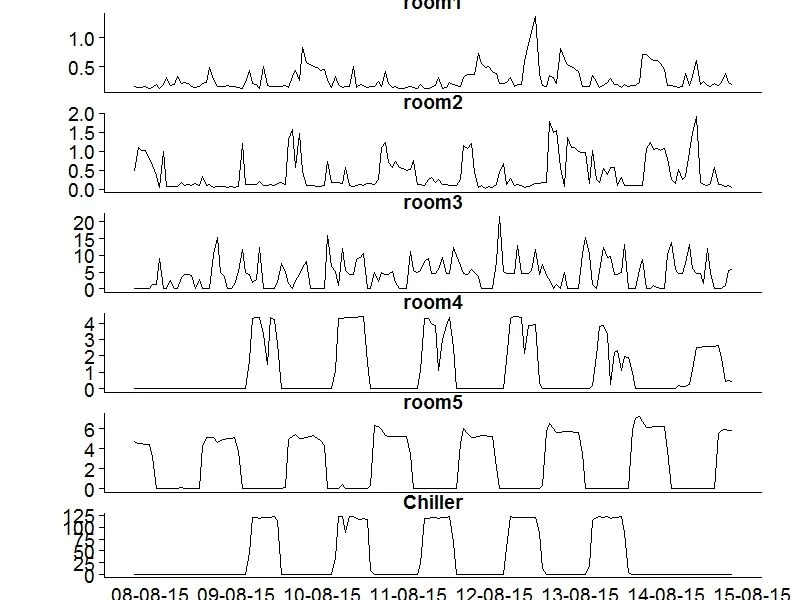
多图如下:
我使用了以下R代码:
p1 <- ggplot(data = dplots[[1]],aes(timestamp,power/1000))+ geom_line()+
      ylab("")+theme(axis.text.x=element_blank(),axis.title.x=element_blank(),axis.ticks.x=element_blank(),plot.margin = unit(c(-0.3,1,-0.3,1), "cm"))+labs(title="room1")
p2 <- ggplot(data = dplots[[2]],aes(timestamp,power/1000))+ geom_line()+
  ylab("")+theme(axis.text.x=element_blank(),axis.title.x=element_blank(),axis.ticks.x=element_blank(),plot.margin = unit(c(-0.3,1,-0.3,1), "cm"))+ labs(title="room2")
p3 <- ggplot(data = dplots[[6]],aes(timestamp,power/1000))+ geom_line()+
  ylab("")+theme(axis.text.x=element_blank(),axis.title.x=element_blank(),axis.ticks.x=element_blank(),plot.margin = unit(c(-0.3,1,-0.3,1), "cm"))+ labs(title="room3")
p4 <- ggplot(data = dplots[[4]],aes(timestamp,power/1000))+ geom_line()+
  ylab("")+theme(axis.text.x=element_blank(),axis.title.x=element_blank(),axis.ticks.x=element_blank(),plot.margin = unit(c(-0.3,1,-0.3,1), "cm"))+ labs(title="room4")
p5 <- ggplot(data = dplots[[5]],aes(timestamp,power/1000))+ geom_line()+
  ylab("")+theme(axis.text.x=element_blank(),axis.title.x=element_blank(),axis.ticks.x=element_blank(),plot.margin = unit(c(-0.3,1,-0.3,1), "cm"))+ labs(title="room5")
p6 <- ggplot(data = dplots[[3]],aes(timestamp,power/1000))+ geom_line()+
        ylab("")+theme(axis.title.x=element_blank(),axis.ticks.x=element_blank(),plot.margin = unit(c(-0.3,1,-0.3,1), "cm"))+ labs(title="Chiller") +
       scale_x_datetime(labels= date_format("%d-%m-%y",tz ="UTC"),breaks = pretty_breaks(8))
grid.arrange(p1,p2,p3,p4,p5,p6,nrow=6,ncol=1,heights=c(0.15,0.15,0.15,0.15,0.15,0.15),left="Power (KW)")
数据集(
dplots)存储在链接中。