我最近开始使用Python,但是我不知道如何绘制给定数据(或数据集)的置信区间。
我已经有一个函数,可以计算出给定一组测量值时,根据传递给它的置信水平确定的上限和下限,但是我应该如何使用这两个值来绘制置信区间呢?
我最近开始使用Python,但是我不知道如何绘制给定数据(或数据集)的置信区间。
我已经有一个函数,可以计算出给定一组测量值时,根据传递给它的置信水平确定的上限和下限,但是我应该如何使用这两个值来绘制置信区间呢?
matplotlib
from matplotlib import pyplot as plt
import numpy as np

#some example data
x = np.linspace(0.1, 9.9, 20)
y = 3.0 * x
#some confidence interval
ci = 1.96 * np.std(y)/np.sqrt(len(x))

fig, ax = plt.subplots()
ax.plot(x,y)
ax.fill_between(x, (y-ci), (y+ci), color='b', alpha=.1)
fill_between可以实现你想要的功能。有关如何使用此功能的更多信息,请参见:https://matplotlib.org/3.1.1/api/_as_gen/matplotlib.pyplot.fill_between.html
输出

或者使用seaborn,它支持使用lineplot或regplot实现此功能,
请参阅:https://seaborn.pydata.org/generated/seaborn.lineplot.html
ci = 1.96 * np.std(y)/np.mean(y) 中。难道不应该是样本大小的平方根吗?根据维基百科:https://en.wikipedia.org/wiki/Confidence_interval#Basic_steps - CGFoXax.fill_between 时,您可以使用 label 参数为图例提供标签字符串。 - Fourier假设我们有三个类别和这些类别中某个估计值的置信区间的下限和上限:
data_dict = {}
data_dict['category'] = ['category 1','category 2','category 3']
data_dict['lower'] = [0.1,0.2,0.15]
data_dict['upper'] = [0.22,0.3,0.21]
dataset = pd.DataFrame(data_dict)
您可以使用以下代码绘制每个类别的置信区间:
for lower,upper,y in zip(dataset['lower'],dataset['upper'],range(len(dataset))):
    plt.plot((lower,upper),(y,y),'ro-',color='orange')
plt.yticks(range(len(dataset)),list(dataset['category']))
最终结果如下图所示:

import matplotlib.pyplot as plt
import statistics
from math import sqrt
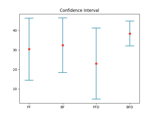
def plot_confidence_interval(x, values, z=1.96, color='#2187bb', horizontal_line_width=0.25):
mean = statistics.mean(values)
stdev = statistics.stdev(values)
confidence_interval = z * stdev / sqrt(len(values))
left = x - horizontal_line_width / 2
top = mean - confidence_interval
right = x + horizontal_line_width / 2
bottom = mean + confidence_interval
plt.plot([x, x], [top, bottom], color=color)
plt.plot([left, right], [top, top], color=color)
plt.plot([left, right], [bottom, bottom], color=color)
plt.plot(x, mean, 'o', color='#f44336')
return mean, confidence_interval
plt.xticks([1, 2, 3, 4], ['FF', 'BF', 'FFD', 'BFD'])
plt.title('Confidence Interval')
plot_confidence_interval(1, [10, 11, 42, 45, 44])
plot_confidence_interval(2, [10, 21, 42, 45, 44])
plot_confidence_interval(3, [20, 2, 4, 45, 44])
plot_confidence_interval(4, [30, 31, 42, 45, 44])
plt.show()
x:输入的 x 值。values:包含相应于 x 值的 y 的重复值(通常是测量值)的数组。z:z 分布的临界值。使用 1.96 对应于 95% 的临界值。结果:
category 1、category 2 和 category 3)的列和另一个包含连续数据(如某种 rating)的列,下面是一个使用 pd.groupby() 和 scipy.stats 函数来绘制组间均值差异及其置信区间的函数:import pandas as pd
import numpy as np
import scipy.stats as st
def plot_diff_in_means(data: pd.DataFrame, col1: str, col2: str):
"""
Given data, plots difference in means with confidence intervals across groups
col1: categorical data with groups
col2: continuous data for the means
"""
n = data.groupby(col1)[col2].count()
# n contains a pd.Series with sample size for each category
cat = list(data.groupby(col1, as_index=False)[col2].count()[col1])
# 'cat' has the names of the categories, like 'category 1', 'category 2'
mean = data.groupby(col1)[col2].agg('mean')
# The average value of col2 across the categories
std = data.groupby(col1)[col2].agg(np.std)
se = std / np.sqrt(n)
# Standard deviation and standard error
lower = st.t.interval(alpha = 0.95, df=n-1, loc = mean, scale = se)[0]
upper = st.t.interval(alpha = 0.95, df =n-1, loc = mean, scale = se)[1]
# Calculates the upper and lower bounds using SciPy
for upper, mean, lower, y in zip(upper, mean, lower, cat):
plt.plot((lower, mean, upper), (y, y, y), 'b.-')
# for 'b.-': 'b' means 'blue', '.' means dot, '-' means solid line
plt.yticks(
range(len(n)),
list(data.groupby(col1, as_index = False)[col2].count()[col1])
)
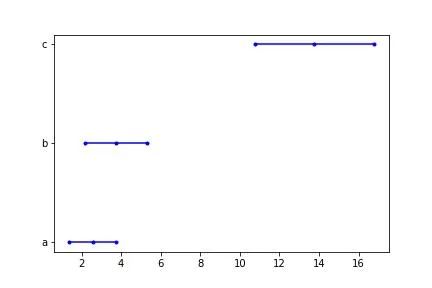
给定假设数据:
cat = ['a'] * 10 + ['b'] * 10 + ['c'] * 10
a = np.linspace(0.1, 5.0, 10)
b = np.linspace(0.5, 7.0, 10)
c = np.linspace(7.5, 20.0, 10)
rating = np.concatenate([a, b, c])

dat_dict = dict()
dat_dict['cat'] = cat
dat_dict['rating'] = rating
test_dat = pd.DataFrame(dat_dict)
以下是一个类似的表格(当然会有更多行):
| 分类 | 评分 |
|---|---|
| a | 0.10000 |
| a | 0.64444 |
| b | 0.50000 |
| b | 0.12222 |
| c | 7.50000 |
| c | 8.88889 |
我们可以使用该函数绘制平均值之间的差异及置信区间:
plot_diff_in_means(data = test_dat, col1 = 'cat', col2 = 'rating')
which gives us the following graph: