如何在Python中绘制带置信区间的时间序列数组?

17

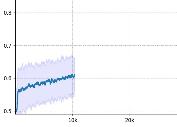
我有一些时间序列,它们缓慢增长,但在短时间内非常波动。例如,时间序列可能如下所示:

[10 + np.random.rand() for i in range(100)] + [12 + np.random.rand() for i in range(100)] + [14 + np.random.rand() for i in range(100)] 

我希望能够绘制时间序列图,重点关注总体趋势,而不是小波动。有没有一种方式可以绘制一段时间内的平均值,并用带状线表示波动范围(该带状线应表示信赖区间,在该时刻数据点可能存在的区域)?
一个简单的图形如下所示:

enter image description here

我想要的绘图,带有置信区间,应该是这样的:

enter image description here

有没有一种优雅的方式在Python中实现?

2个回答

25

您可以使用pandas函数rolling(n)生成在n个连续点上的均值和标准差。

对于置信区间的阴影(由标准差之间的空间表示),您可以使用来自matplotlib.pyplot的函数fill_between()。要了解更多信息,您可以查看此处的内容,以下代码受到该页面的启发。

import numpy             as np
import pandas            as pd
import matplotlib.pyplot as plt

#Declare the array containing the series you want to plot. 
#For example:
time_series_array = np.sin(np.linspace(-np.pi, np.pi, 400)) + np.random.rand((400))
n_steps           = 15 #number of rolling steps for the mean/std.

#Compute curves of interest:
time_series_df = pd.DataFrame(time_series_array)
smooth_path    = time_series_df.rolling(n_steps).mean()
path_deviation = 2 * time_series_df.rolling(n_steps).std()

under_line     = (smooth_path-path_deviation)[0]
over_line      = (smooth_path+path_deviation)[0]

#Plotting:
plt.plot(smooth_path, linewidth=2) #mean curve.
plt.fill_between(path_deviation.index, under_line, over_line, color='b', alpha=.1) #std curves.

使用以上代码,您可以获得类似于以下内容的东西: 在此输入图片描述


6
看起来,您对std进行了两次加倍。我想应该像这样写:
time_series_df = pd.DataFrame(time_series_array)
smooth_path = time_series_df.rolling(20).mean()
path_deviation = time_series_df.rolling(20).std()
plt.plot(smooth_path, linewidth=2)
plt.fill_between(path_deviation.index, (smooth_path-2*path_deviation)[0], (smooth_path+2*path_deviation)[0], color='b', alpha=.1)

网页内容由stack overflow 提供, 点击上面的
可以查看英文原文,
原文链接