我正在使用以下代码在R中制作ggplot:
s=40
ggplot(data = NULL) +
  geom_line(data = stk, aes(x = date, y = price)) +
  geom_line(data = gdp, aes(x = year, y = gdp1*s)) +
  scale_y_continuous("Index of Total Stock Price",
                     sec.axis = sec_axis(~. /s, name = "Real GDP (trillions of USD in 2012)"),
                     limits = c(0, 100)) +
  scale_x_date(breaks = seq(from = as.Date("1900-01-01"),
                            to = as.Date("1945-01-01"),
                            by = "5 years"),
               labels=date_format("%Y")) +
  xlab(element_blank())
并且这是输出结果:
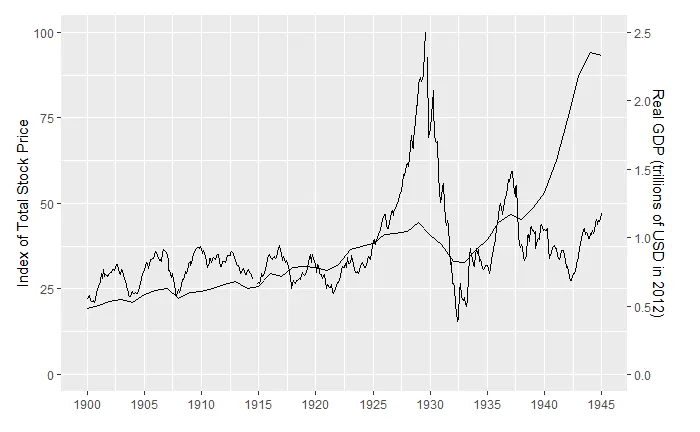
问题是次要轴上的文本和刻度看起来非常拥挤。如何使两个y轴标签之间的刻度和轴标签间距相同?谢谢。
编辑:
这里是可重现的数据:
set.seed(1000)
df1 <- data.frame(y1=rnorm(100, 0, 1),
                  x=seq(1, 100, 1))
df2 <- data.frame(y2=rnorm(100, 0, 1),
                  x=seq(1, 100, 1))
ggplot(data = NULL) +
  geom_line(data = df1, aes(x = x, y = y1)) +
  geom_line(data = df2, aes(x = x, y = y2*2)) +
  scale_y_continuous("Label of Primary Y Axis",
                     sec.axis = sec_axis(~. *2, name = "Label of Secondary Y Axis"))
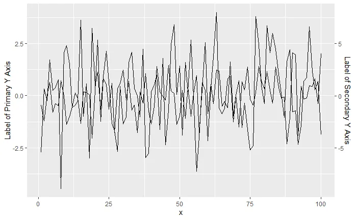
theme(axis.title.y.right = element_text(margin = margin(t = 0, r = 0, b = 0, l = 10))的后半部分就可以了,这样效果非常好。第一部分只是添加了主 y 轴的间距,所以我没有加上它。奇怪的是为什么主标签似乎预先设置了更多的空间,但这是一个很好的修复方法,谢谢! - Marco Pastor Mayo