我正在尝试为ggplot2的一些数据添加一个次要y轴。我的数据p看起来像这样:
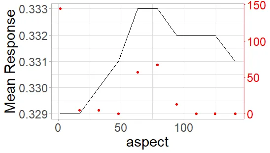
  aspect  yhat Count
    <dbl> <dbl> <dbl>
 1   1.37 0.329   144
 2  16.9  0.329     5
 3  32.3  0.330     5
 4  47.8  0.331     0
 5  63.3  0.333    57
 6  78.8  0.333    67
 7  94.3  0.332    13
 8 110.   0.332     0
 9 125.   0.332     0
10 141.   0.331     0
我试图按照以下方式绘制它:
 #get the information to for using a secondary y axis
    ylim.prim <- c(min(p$yhat), max(p$yhat))
    ylim.sec <- c(min(p$Count, na.rm = T), max(p$Count, na.rm = T))

    b <- diff(ylim.prim)/diff(ylim.sec)
    a <- b*(ylim.prim[1] - ylim.sec[1])

    #now make plot
    p1 = ggplot(p, aes(x = get(col), y = yhat)) +
      geom_line() +
      labs(x = col) +
      geom_line(aes(y = a + Count*b), color = "red", linetype = 2) +
      scale_y_continuous(name = "Mean Response", sec.axis = sec_axis(~ (. - a)/b, name = "Number of Pixels")) +
      theme_light() +
      theme(axis.line.y.right = element_line(color = "red"),
            axis.ticks.y.right = element_line(color = "red"),
            axis.text.y.right = element_text(color = "red"),
            axis.title.y.right = element_text(color = "red")
      ) +
      theme(legend.title = element_blank()) +
      theme(text=element_text(size=22))
这条命令生成了如下的图形:
我的问题在于黑线和红线之间存在很多未使用的空白空间,这使得解读数值有些困难,我想知道是否可以使用更好的转换方法将线条拉近,甚至重叠在一起,但我无法想出如何实现。
我认为这可能与相同的yhat值可以具有不同的count值有关。如果是这样,是否有办法解决?