我有一个名为df的数据框。我的问题与y轴上的顺序有关。我希望y轴上的名称根据变量depth排序。
如果我这样做:
ggplot(df,aes(x=factor(name),y=depth)) + geom_bar(stat='identity') + coord_flip() + labs(y='depth',x='species')
我获得了下面的graph1,它没有按顺序排列。因此,我按深度对我的因子name的级别进行排序,遵循在这里找到的说明。
df2=df[order(df$depth),]
df2$name=factor(df2$name,levels=df2$name)
ggplot(df2,aes(x=factor(name),y=depth)) + geom_bar(stat='identity') + coord_flip() + labs(y='depth',x='species')
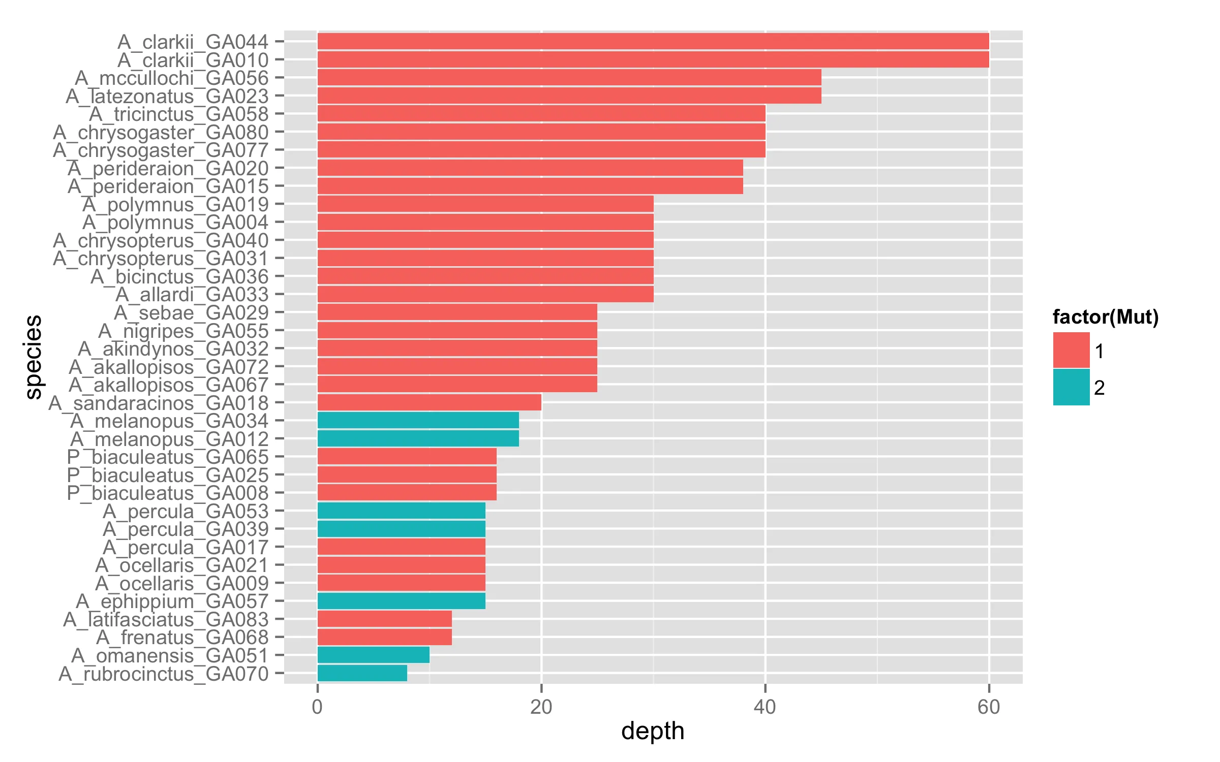
我得到了下面的Graph2。但是对我来说下一步是根据Mut变量以不同的颜色着色条形图。
ggplot(df2,aes(x=factor(name),y=depth)) + geom_bar(stat='identity',data=subset(df2,df2$Mut==2),fill='red') + geom_bar(stat='identity',data=subset(df2,df2$Mut==1),fill='blue') + coord_flip() + labs(y='depth',x='species')
我得到了Graph3,它不再有序了!!
如何生成一个与在Graph2中显示的顺序相符的Graph3
                    name depth Mut            x
25  A_rubrocinctus_GA070     8   2 -0.033318659
9      A_omanensis_GA051    10   2 -0.020387101
4  A_latifasciatus_GA083    12   1 -0.005645811
27      A_frenatus_GA068    12   1 -0.024190876
13       A_percula_GA017    15   1  0.034591721
14       A_percula_GA039    15   2  0.034591721
15       A_percula_GA053    15   2  0.034591721
16     A_ocellaris_GA009    15   1  0.052042539
17     A_ocellaris_GA021    15   1  0.052042539
24     A_ephippium_GA057    15   2 -0.016859412
20   P_biaculeatus_GA008    16   1 -0.014466403
21   P_biaculeatus_GA025    16   1 -0.014466403
22   P_biaculeatus_GA065    16   1 -0.014466403
23     A_melanopus_GA034    18   2 -0.026915545
26     A_melanopus_GA012    18   2 -0.026915545
12  A_sandaracinos_GA018    20   1  0.055839755
6       A_nigripes_GA055    25   1  0.023420045
8          A_sebae_GA029    25   1  0.021767793
11   A_akallopisos_GA067    25   1  0.043272525
28   A_akallopisos_GA072    25   1  0.043272525
34     A_akindynos_GA032    25   1 -0.020707141
1       A_polymnus_GA004    30   1  0.030902254
3        A_allardi_GA033    30   1 -0.020277664
5      A_bicinctus_GA036    30   1 -0.025354572
7       A_polymnus_GA019    30   1  0.030902254
32  A_chrysopterus_GA040    30   1 -0.022402365
33  A_chrysopterus_GA031    30   1 -0.022402365
35   A_perideraion_GA020    38   1  0.052830132
36   A_perideraion_GA015    38   1  0.052830132
2     A_tricinctus_GA058    40   1 -0.016230301
18  A_chrysogaster_GA080    40   1  0.012608835
19  A_chrysogaster_GA077    40   1  0.012608835
10   A_latezonatus_GA023    45   1 -0.010718845
31    A_mccullochi_GA056    45   1 -0.031664307
29       A_clarkii_GA044    60   1 -0.014474658
30       A_clarkii_GA010    60   1 -0.014474658
图1
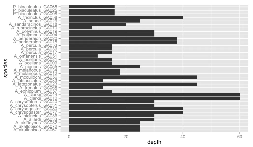 图2
图2
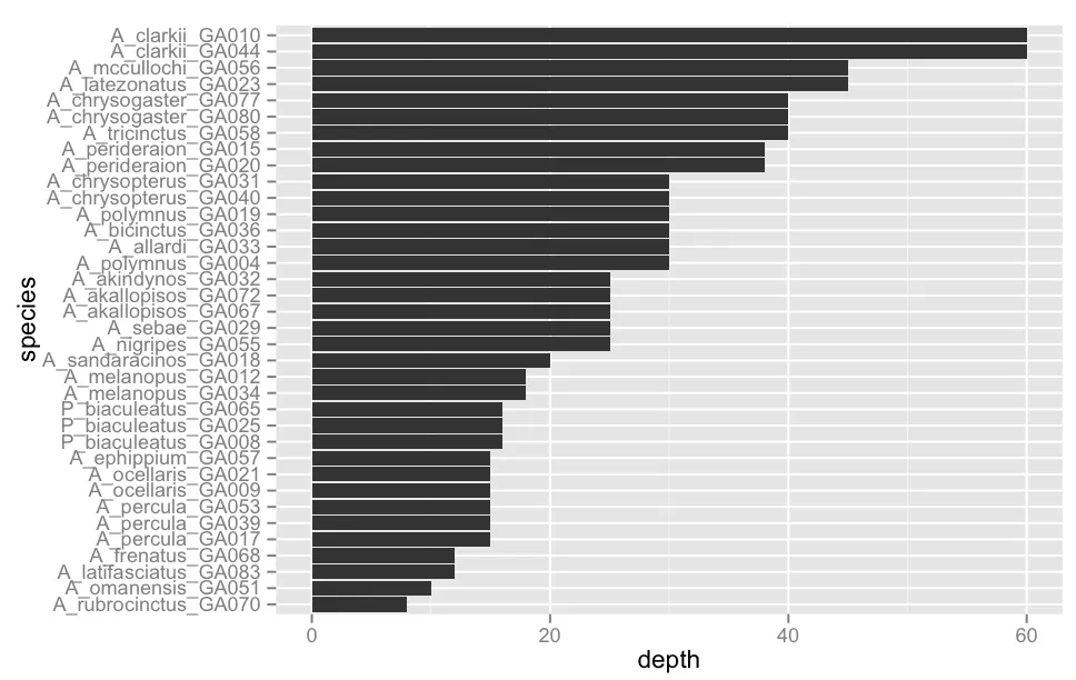 图3
图3
 谢谢!
谢谢!