我想绘制分面条形图并将它们按照从最大到最小值的顺序从左到右排列。我应该可以使用类似于以下代码的代码来实现:
library(ggplot2)
ggplot(mpg, aes(reorder(cyl, -hwy), hwy)) +
  geom_col() +
  facet_wrap(~ manufacturer, scales = "free")
我想要的是按照y轴降序排列,使其看起来像巴雷图,而不是按照x轴(即“cyl”)从小到大排序。同时,它还必须是分面的。谢谢。
这里有一种不同的方法,可以直接在ggplot中使用两个来自这里的函数进行操作。我将使用eipi10的示例:
library(tidyverse)
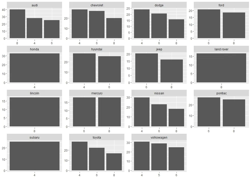
mpg$hwy[mpg$manufacturer=="audi" & mpg$cyl==8] <- 40
dat <- mpg %>% group_by(manufacturer, cyl) %>%
summarise(hwy = mean(hwy)) %>%
arrange(desc(hwy)) %>%
mutate(cyl = factor(cyl, levels = cyl))
功能:
reorder_within <- function(x, by, within, fun = mean, sep = "___", ...) {
  new_x <- paste(x, within, sep = sep)
  stats::reorder(new_x, by, FUN = fun)
}


scale_x_reordered <- function(..., sep = "___") {
  reg <- paste0(sep, ".+$")
  ggplot2::scale_x_discrete(labels = function(x) gsub(reg, "", x), ...)
}
绘图:
ggplot(dat, aes(reorder_within(cyl, -hwy, manufacturer), y = hwy), hwy) +
  geom_col() +
  scale_x_reordered() +
  facet_wrap(~ manufacturer, scales = "free") +
  theme(axis.title=element_blank())
要升序排列,您需要使用如下代码:reorder_within(cyl, hwy, manufacturer)
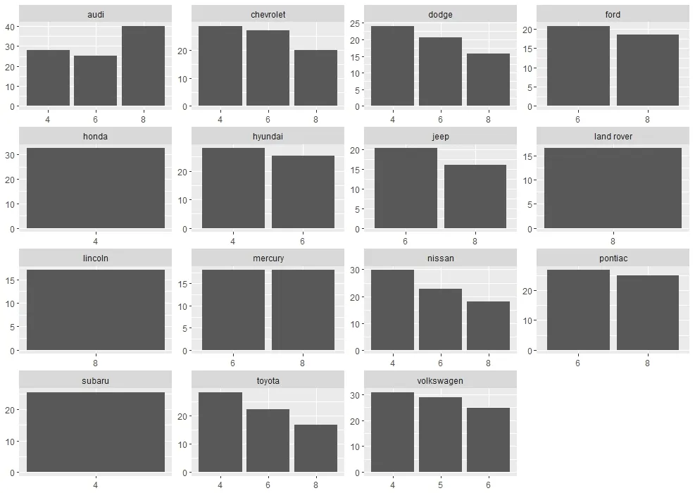
不带函数的绘图:
ggplot(dat, aes(cyl, y = hwy)) +
  geom_col() +
  facet_wrap(~ manufacturer, scales = "free") +
  theme(axis.title=element_blank())
cyl列)绘制平均公路英里数(公路里程,hwy列)。在每个制造商内部,您希望通过每个气缸数的平均公路里程值对x轴(cyl值)进行排序。library(tidyverse)
library(egg)
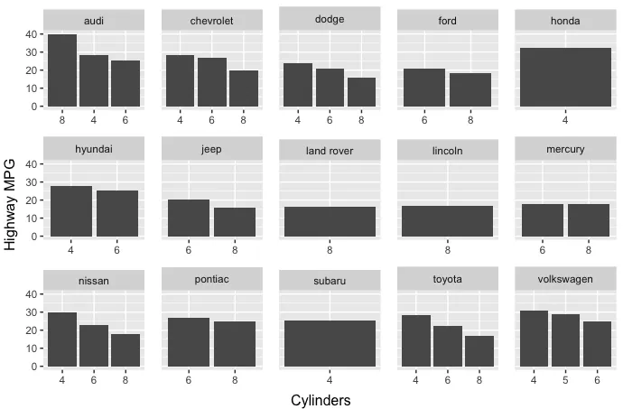
因为在实际数据中,hwy 的平均值总是随着 cyl 的增加而单调递减,所以我们将为8缸奥迪创造一个人工高的 hwy 值,仅用于说明:
mpg$hwy[mpg$manufacturer=="audi" & mpg$cyl==8] = 40
manufacturer拆分数据,以便创建单独的图表,因此每个制造商都有单独的cyl排序。我们将使用map函数迭代制造商。plot.list = split(mpg, mpg$manufacturer) %>%
map(function(dat) {
# Order cyl by mean(hwy)
dat = dat %>% group_by(manufacturer, cyl) %>%
summarise(hwy = mean(hwy)) %>%
arrange(desc(hwy)) %>%
mutate(cyl = factor(cyl, levels=cyl))
ggplot(dat, aes(cyl, hwy)) +
geom_col() +
facet_wrap(~ manufacturer) +
theme(axis.title=element_blank()) +
expand_limits(y=mpg %>%
group_by(manufacturer,cyl) %>%
mutate(hwy=mean(hwy)) %>%
pull(hwy) %>% max)
})
现在让我们从图表中删除y轴的值和刻度,因为当我们把这些图表放在一起时,它们不会出现在第一列中:
num_cols = 5

plot.list[-seq(1,length(plot.list), num_cols)] =
  lapply(plot.list[-seq(1,length(plot.list), num_cols)], function(p) {
    p + theme(axis.text.y=element_blank(),
              axis.ticks.y=element_blank())
  })
egg包的ggarrange确保所有面板具有相同的宽度(否则第一列中的面板将比其他面板更窄,因为y轴标签占用了空间)。ggarrange(plots=plot.list, left="Highway MPG", bottom="Cylinders", ncol=num_cols)
audi 的 cyl 值不是按升序排列的,这表明我们的重新排序已经正常工作。
facet_wrap(~ manufacturer, scales = 'free_y')不能在上面的图中释放y轴刻度。我该如何释放y轴刻度? - stackinatorexpand_limits 语句即可获得等效的自由比例尺。然而,我更喜欢 @missuse 的答案。 - eipi10
cyl级别的hwy均值吗? - eipi10