在每个分面修改X轴标签

16
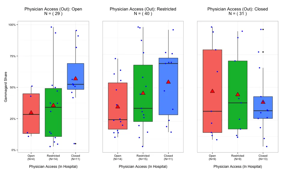
我有一个图表 - 我希望在每个标签上添加文本N=xx来表示观测数量。我知道如何做,而且在没有分面的图表上已经做过了。
但是当我在分面图表上尝试时,它没有起作用,(所有3张图表的开放刻度线上都显示相同的N,所有Restricted刻度线上也是如此。)
我希望有人能指点一下解决方案,如何控制给定分面上的元素?
library(ggplot2)
library(scales)

stat_sum_single <- function(fun, geom="point", ...) {
  stat_summary(fun.y=fun, fill="red", geom=geom, size = 5, shape=24)
}

set.seed(1)
data1 <- data.frame(Physicians_In=sample(1:3,100,replace=T),Physicians_Out=sample(1:3,100,replace=T),share=runif(100,0,1))
data1$Physicians_In <- factor(data1$Physicians_In,levels=c(1,2,3),labels=c("Open","Restricted","Closed"))
data1$Physicians_Out <- factor(data1$Physicians_Out,levels=c(1,2,3),labels=c("Open","Restricted","Closed"))

access_ch3 <- ggplot(data1,aes(x=Physicians_In,y=share,fill=Physicians_In))+geom_boxplot()+stat_sum_single(mean)
access_ch3 <- access_ch3 +geom_jitter(position = position_jitter(width = .2),color="blue")+theme_bw()
access_ch3 <- access_ch3 + theme(legend.position="none") +scale_y_continuous("Gammagard Share",labels=percent)
gpo_labs5 <- paste(gsub("/","-\n",names(table(data1$Physicians_Out)),fixed=T),"\n(N=",table(data1$Physicians_Out),")",sep="")
access_ch3 <- access_ch3 + scale_x_discrete("Physician Access (In Hospital)",labels=gpo_labs5)
access_ch3 <- access_ch3 +facet_grid(.~Physicians_Out,labeller=label_both)
access_ch3

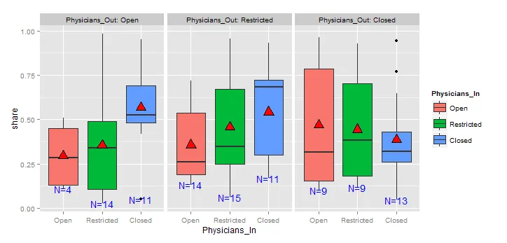
我尝试创建了9个标签,然后将该向量传递给scale_x_discrete元素,但这只是循环使用了前3个标签,因此仍未解决问题。

1
这不是很清楚。您想修改轴刻度还是分面标签? - agstudy
轴刻度标签 - 如果在第一个 Open 面板上有 6 个观测值,我希望它显示为 "Open (N=6)",如果在第二个面板上 Open 有 9 个观测值,那么它将显示为 "open (N=9)"。 - user1617979
2个回答

17
使用相同的数据,我采用了四步方法。
第一步:数据子集化。
open <- subset(data1, Physicians_Out == "Open")
restr <- subset(data1, Physicians_Out == "Restricted")
closed <- subset(data1, Physicians_Out == "Closed")

第二步:为不同的子集创建标签。
labs.open <- paste(gsub("/","-\n",names(table(open$Physicians_In)),fixed=T),
               "\n(N=",table(open$Physicians_In),")",sep="")
labs.restr <- paste(gsub("/","-\n",names(table(restr$Physicians_In)),fixed=T),
               "\n(N=",table(restr$Physicians_In),")",sep="")
labs.closed <- paste(gsub("/","-\n",names(table(closed$Physicians_In)),fixed=T),
               "\n(N=",table(closed$Physicians_In),")",sep="")

第三步:创建一个主题,用于删除第二个和第三个子图的y轴标签和文本。

mytheme <- theme(
  axis.title.y = element_blank(),
  axis.text.y = element_blank(),
  axis.ticks.y = element_blank()
)

最后:创建图表

p1 <- ggplot(open,aes(x=Physicians_In,y=share,fill=Physicians_In)) +
  geom_boxplot() + stat_sum_single(mean) + 
  geom_jitter(position = position_jitter(width = .2),color="blue") +
  guides(fill=FALSE) +
  ggtitle(paste("Physician Access (Out): Open\nN = (", nrow(open), ")\n")) +
  scale_y_continuous("Gammagard Share",labels=percent) +
  scale_x_discrete("\nPhysician Access (In Hospital)",labels=labs.open) +
  theme_bw()

p2 <- ggplot(restr,aes(x=Physicians_In,y=share,fill=Physicians_In)) +
  geom_boxplot() + stat_sum_single(mean) + 
  geom_jitter(position = position_jitter(width = .2),color="blue") +
  guides(fill=FALSE) +
  ggtitle(paste("Physician Access (Out): Restricted\nN = (", nrow(restr), ")\n")) +
  scale_x_discrete("\nPhysician Access (In Hospital)",labels=labs.restr) +
  theme_bw() + mytheme

p3 <- ggplot(closed,aes(x=Physicians_In,y=share,fill=Physicians_In)) +
  geom_boxplot() + stat_sum_single(mean) + 
  geom_jitter(position = position_jitter(width = .2),color="blue") +
  guides(fill=FALSE) +
  ggtitle(paste("Physician Access (Out): Closed\nN = (", nrow(closed), ")\n")) +
  scale_x_discrete("\nPhysician Access (In Hospital)",labels=labs.closed) +
  theme_bw() + mytheme

library(gridExtra)

grid.arrange(p1, p2, p3, ncol=3)

Which gives the following result:

enter image description here


这是一个不错的解决方法,但你会失去一些要素标题。 - Herman Toothrot

10

这不完全是你想要做的,但我认为这可能会有所帮助(至少是一个良好的开端)

library(ggplot2)
library(plyr)
data1 <- ddply(data1,.(Physicians_Out,Physicians_In),transform,label = length(share))
ggplot(data1,aes(x=Physicians_In,y=share,fill=Physicians_In))+ 
    geom_boxplot() + 
    stat_sum_single(mean) +
    facet_grid(.~Physicians_Out,labeller=label_both,scales='free_x') +
    stat_summary(fun.y=min,aes(label=paste0('N=',label)),geom='text',col='blue',cex=5)

输入图像说明


谢谢你的回答,我想要在我展示的每个箱线图中添加观测值的数量。 - user1617979
1
@user1617979 我完全改变了我的答案。 - agstudy
1
谢谢,这个确实非常好用,我喜欢它因为它允许使用facet_grid。我通过在stat_summary中的aes()语句中添加y=0来将它们对齐到底部。我还学会了如何在ddply中使用transform,这是我不熟悉的(可以节省很多合并)。 - user1617979

网页内容由stack overflow 提供, 点击上面的
可以查看英文原文,
原文链接