ggplot2:在分面绘图中给轴标签染色

13

之前有一个问题previously asked question,解决了如何给坐标轴文本着色的问题。然而,在分面设置中,特别是当scales参数设置为"free"时,提供的解决方案都不起作用。

考虑以下数据集:

library( ggplot2 )
X <- data.frame( V1 = LETTERS, V2 = runif( 26 ),
    V3 = rep( c("F1", "F2"), each = 13 ) )

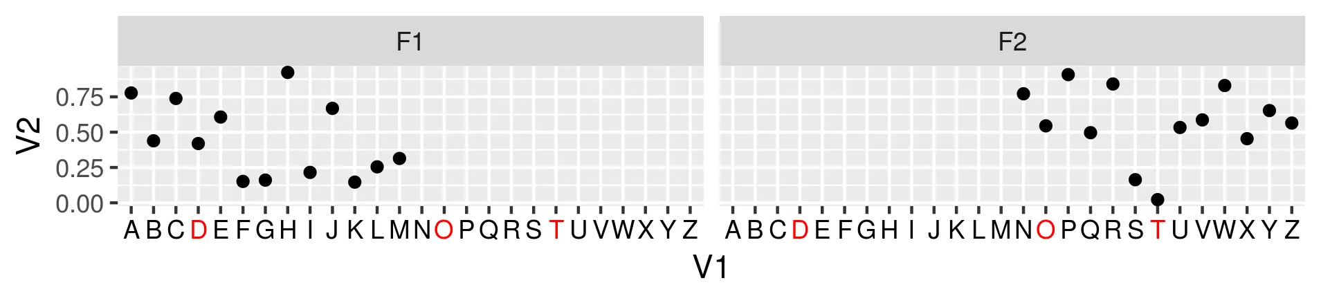
我们可以在单个面板上绘制数据,如下所示突出显示字母D、O、T。
v <- ifelse( X$V1 %in% c( "D", "O", "T" ), "red", "black" )
g <- ggplot( X, aes( x = V1, y = V2 ) ) + geom_point() +
    theme( axis.text.x = element_text( color = v ) )

使用默认的scales = "fixed"将图形分面,可以正确地在两个分面上突出显示D、O和T。
g + facet_wrap( ~V3 )

enter image description here

然而,将scales参数切换为"free"会导致意外行为,只有D和Q被突出显示。
g + facet_wrap( ~V3, scales = "free" )

enter image description here

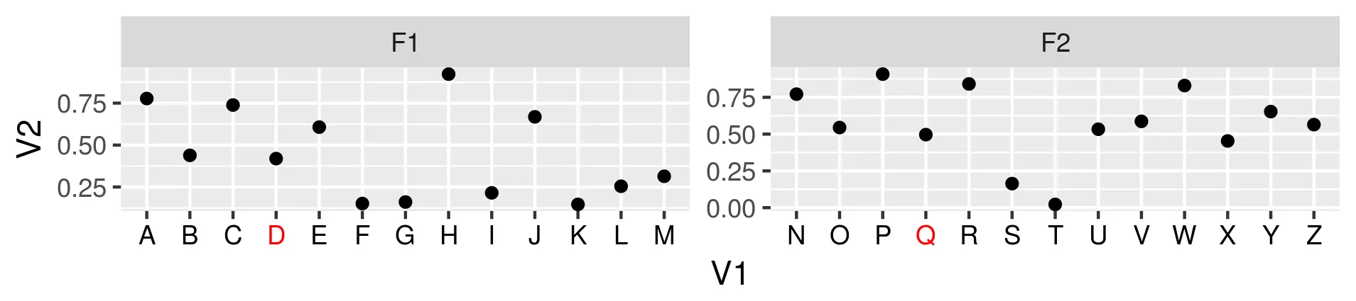
我的问题是这是一个bug还是我需要修改v的定义来适应自由比例。如果这是一个bug,有人知道在每个(自由缩放)facet中突出显示特定轴文本的解决方法吗?


关于您的编辑 Artem;我已经投票支持保留这个关闭,因为答案 https://dev59.com/dFkT5IYBdhLWcg3wPtQv 看起来适用于facet。 - user20650
使用以下答案来修改你的代码/数据: 
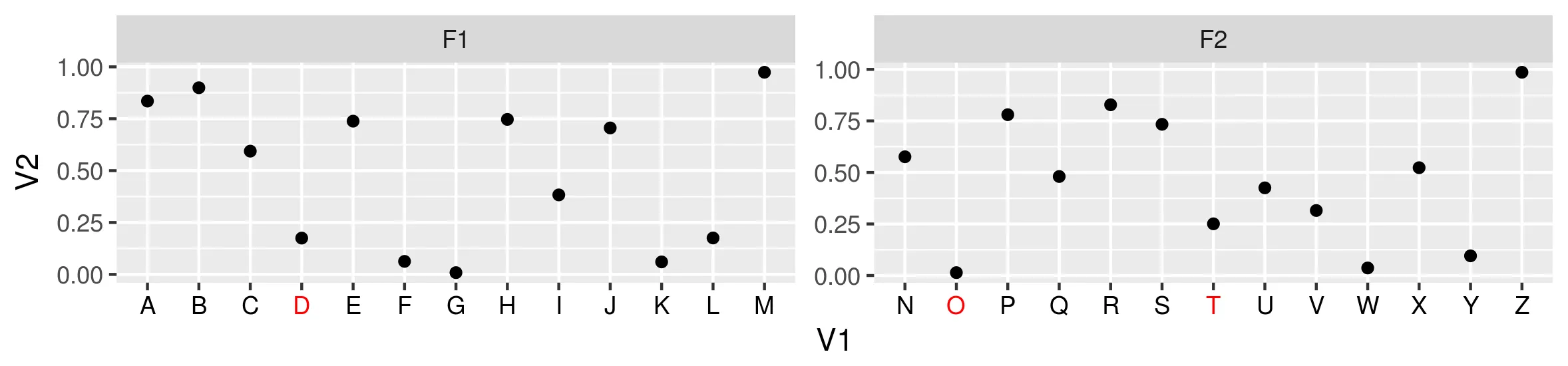
X <- X %>% mutate(x.label = paste("<span style = 'color: ", ifelse( X$V1 %in% c( "D", "O", "T" ), "red", "black" ), ";'>", V1, "</span>", sep = ""), x.label = fct_reorder(x.label, as.character(V1))) ; ggplot( X, aes( x = x.label, y = V2 ) ) + geom_point() + theme( axis.text.x = element_markdown( hjust = 1)) + facet_wrap( ~V3, scales = "free" ) - user20650
2个回答

9
在研究与图形相关的对象(grobs)时,我发现了一个潜在的解决方法来解决这个问题。虽然不如Z.Lin的解决方案那么优雅,但出于教育目的,我想分享它。
我们开始通过检索grobs来进行:
gt <- ggplotGrob( g + facet_wrap( ~V3, scales = "free" ) )
## TableGrob (11 x 11) "layout": 20 grobs
##     z         cells        name                                  grob
## 1   0 ( 1-11, 1-11)  background       rect[plot.background..rect.105]
## 2   1 ( 7- 7, 4- 4)   panel-1-1               gTree[panel-1.gTree.17]
## 3   1 ( 7- 7, 8- 8)   panel-2-1               gTree[panel-2.gTree.30]
## 4   3 ( 5- 5, 4- 4)  axis-t-1-1                        zeroGrob[NULL]
## 5   3 ( 5- 5, 8- 8)  axis-t-2-1                        zeroGrob[NULL]
## 6   3 ( 8- 8, 4- 4)  axis-b-1-1    absoluteGrob[GRID.absoluteGrob.43]
## 7   3 ( 8- 8, 8- 8)  axis-b-2-1    absoluteGrob[GRID.absoluteGrob.50]
## 8   3 ( 7- 7, 7- 7)  axis-l-1-2    absoluteGrob[GRID.absoluteGrob.64]
## 9   3 ( 7- 7, 3- 3)  axis-l-1-1    absoluteGrob[GRID.absoluteGrob.57]
## 10  3 ( 7- 7, 9- 9)  axis-r-1-2                        zeroGrob[NULL]
## 11  3 ( 7- 7, 5- 5)  axis-r-1-1                        zeroGrob[NULL]
## 12  2 ( 6- 6, 4- 4) strip-t-1-1                         gtable[strip]
## 13  2 ( 6- 6, 8- 8) strip-t-2-1                         gtable[strip]
## 14  4 ( 4- 4, 4- 8)      xlab-t                        zeroGrob[NULL]
## 15  5 ( 9- 9, 4- 8)      xlab-b titleGrob[axis.title.x..titleGrob.33]
## 16  6 ( 7- 7, 2- 2)      ylab-l titleGrob[axis.title.y..titleGrob.36]
## 17  7 ( 7- 7,10-10)      ylab-r                        zeroGrob[NULL]
## 18  8 ( 3- 3, 4- 8)    subtitle zeroGrob[plot.subtitle..zeroGrob.102]
## 19  9 ( 2- 2, 4- 8)       title    zeroGrob[plot.title..zeroGrob.101]
## 20 10 (10-10, 4- 8)     caption  zeroGrob[plot.caption..zeroGrob.103]

Grobs是分层对象,遍历这些结构的一般规则可分为两类:
  1. 如果grob的类型是gtable(如上面的gt),可以通过$grobs访问进入表格的单个grob。
  2. 如果grob不是gtable类型,则可以通过$children访问其子grob。
查看上面的gtable,我们可以观察到grob 6和7分别对应于局部1和2的底部轴。每个轴grob都是absoluteGrob类型,因此使用上述两条规则,我们可以像这样检查它们由什么组成:
gt$grobs[[6]]$children
## (zeroGrob[axis.line.x..zeroGrob.40], gtable[axis]) 
##  and likewise for gt$grobs[[7]]$children

注意到第二个子元素是一个gtable,我们可以继续下降图形对象的层次结构,直到我们到达gt$grobs [[6]] $children [[2]] $grobs [[2]] $children [[1]],它是图形对象层次结构的叶子(其$childrenNULL),对应于轴文本。让我们检查它的图形参数,这些参数可以通过$gp访问:

## Double-check that we have the correct text object
gt$grobs[[6]]$children[[2]]$grobs[[2]]$children[[1]]$label
## [1] "A" "B" "C" "D" "E" "F" "G" "H" "I" "J" "K" "L" "M"

## Display the summary of graphical parameters
str( gt$grobs[[6]]$children[[2]]$grobs[[2]]$children[[1]]$gp )
## List of 5
##  $ fontsize  : num 8.8
##  $ col       : chr [1:26] "black" "black" "black" "red" ...
##  $ fontfamily: chr ""
##  $ lineheight: num 0.9
##  $ font      : Named int 1
##   ..- attr(*, "names")= chr "plain"
##  - attr(*, "class")= chr "gpar"

请注意,col属性的长度为26,与问题中的v变量完全对应。如果我们查看第二个面板的底部轴(gt$grobs[[7]]$...),我们会发现那里也使用了相同的col值,从而导致两个面板中的轴文本颜色完全相同(如Z.Lin的解决方案所建议的那样)。
因此,将这些颜色设置仅手动设置为v的相应部分,可以修改原始图并实现所需的结果。
gt$grobs[[6]]$children[[2]]$grobs[[2]]$children[[1]]$gp$col <- v[1:13]
gt$grobs[[7]]$children[[2]]$grobs[[2]]$children[[1]]$gp$col <- v[14:26]
grid::grid.draw( gt )

enter image description here


1
grid_draw() 现在变成了 grid.draw() - TrigonaMinima

8
我认为这不是一个错误。问题在于这里的“v”基本上是一个字符字符串,长度为26,它定义了x轴上前26个间隔的颜色。当x轴恰好有26个间隔时,一切都很好;当它少于26个(当您设置“scales = free”时),它就会在每个轴上重新开始。这里Q是红色的,因为它在第二个图中处于第四个位置,尽管“v [4]”的红色实际上是为第一个图中的D准备的。
根据我在SO上尝试和阅读的内容,无法将美学映射到控制ggplot中轴文本外观的“theme()”中。
通过隐藏轴并使用“geom_text()”来模拟轴,从而可以通过将数据映射到美学特征来解决问题。虽然这可能不太优雅:
g2 <- ggplot(cbind(X, v), #add v to X
             aes(x = V1, y = V2)) + 
  geom_point() +
  # make space to accommodate the fake axis
  expand_limits(y = -0.05) +
  # create a strip of white background under the fake axis
  geom_rect(ymin = -5, ymax = 0, xmin = 0, xmax = nrow(X) + 1, fill = "white") +
  # fake axis layer, aligned below y = 0
  geom_text(aes(colour = v, label = V1), y = 0, vjust = 1.1) +
  # specify the font colours for fake axis
  scale_colour_manual(values = c("black", "red"), guide = F) +
  # hide the actual x-axis text / ticks
  theme(axis.text.x = element_blank(), axis.ticks.x = element_blank())

g2 + facet_wrap( ~V3, scales = "free" )

facet plot with fake axis


这是关于在y轴上执行相同操作的相关信息:https://github.com/tidyverse/ggplot2/issues/2656 - ldecicco

网页内容由stack overflow 提供, 点击上面的
可以查看英文原文,
原文链接