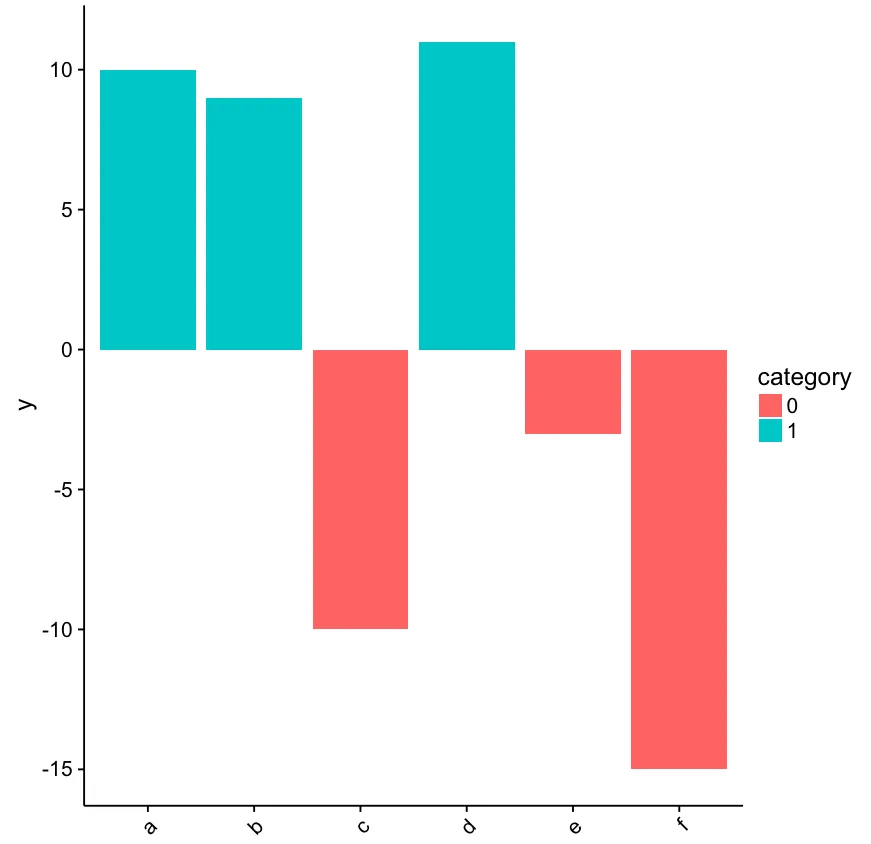
我使用ggplot2创建了一个基本的柱形图。y变量包含正值和负值,大约一半向量值为负。我想自定义坐标轴标签,使得当相应的x因子的y值为负时,其标签为红色。以下是一个可再现的例子:
#Create data
x <- c("a","b","c","d","e","f")
y <- c("10", "9","-10","11","-3","-15")
data <- data.frame(x, y)
data$y <- as.numeric(as.character(data$y))

data$category <- ifelse(as.numeric(data$y)<0, 0, 1)
data$category <- as.factor(data$category)

#Graph
library(cowplot) #theme
library(ggplot2)

ggplot(data, aes(x=x, y=y)) +
  geom_bar(stat = "identity", aes(fill=category)) +
  theme(axis.text.x = element_text(angle = 45, hjust = 1)) +
  theme(axis.text.x = element_text(colour = "black"))
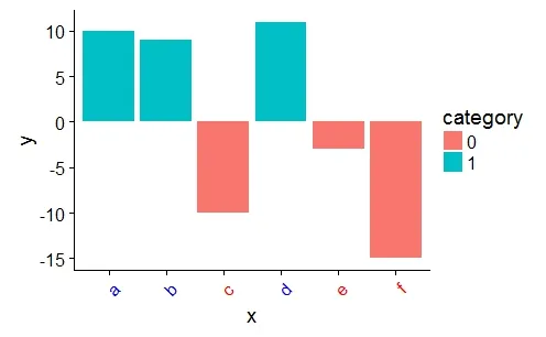
我需要一种方法来将 "c", "e" 和 "f" 的标签颜色更改为我选择的颜色。 我尝试切换 theme(aes(axis.text.x=element_text(colour=Air_pricier))) 但出现了错误。
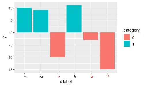
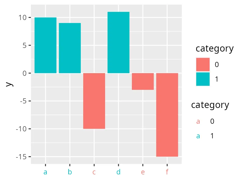
mystrings <- c("vector","of","categories")然后a <- ifelse(data$category %in% mystrings, "red", "blue")。 - Justapigeonfacet_wrap结合使用,看起来必须在所有小面板中使用相同的颜色方案;即不同的小面板不能有不同的颜色集。 - S. Robinsonggtext::element_markdown替代element_text来避免警告信息Warning message: Vectorized input to "element_text()" is not officially supported. Results may be unexpected or may change in future versions of ggplot2.,因为ggtext::element_markdown官方支持向量化输入。 - Matthias Munz