我正在尝试使用ggplot2构建一个图表,其中在X轴上,我可以找到一些方法来为变量组的标签。以下是我的代码的最小版本:
Bzero <-100*matrix(runif(100),ncol=10,nrow=10)
B <-99
LNtype <-c(1,1,1,1,2,2,2,3,3,3)
LNnames <-c('grp1','grp2','grp3')
tB <-t(Bzero)/(B+1)
dfB <-data.frame(tB)
dfB$grp <-LNtype
dfB$vid <-1:nrow(tB)
mB0 <- melt(dfB,id.vars=c('grp','vid'))
mB0 <- mB0[order(mB0$grp,mB0$vid),]
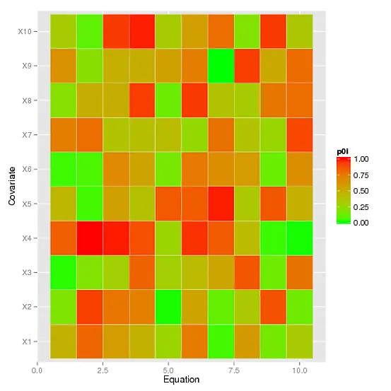
gg0 <- ggplot(mB0,aes(x=vid,y=variable))
gg0 <- gg0 + geom_tile(aes(fill = value),colour = "white")
gg0 <- gg0 + scale_fill_gradient(low = "green", high = "red",na.value='white',limits=c(0,1),name='p0i')
gg0 <- gg0 + xlab('Equation')+ylab('Covariate')
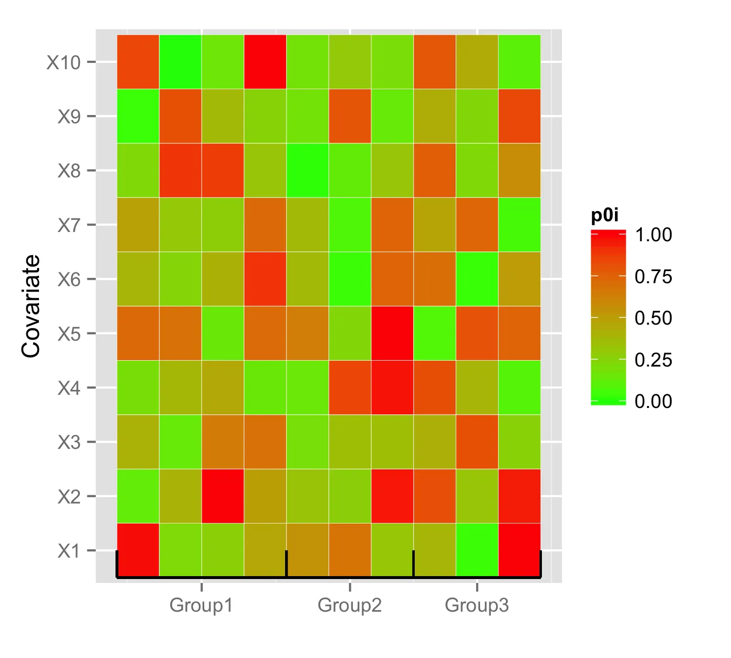
这里是生成的图表:
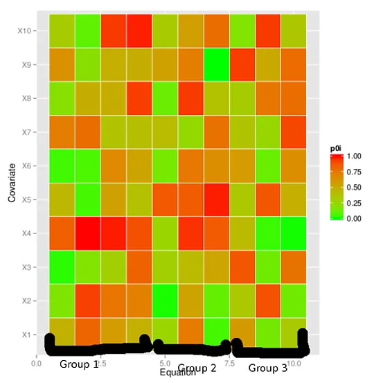 我已经尝试了比例尺、分段和标签的调整,但都无济于事。即使大量谷歌搜索也没有找到带有那种轴的图表。有没有办法得到我想要的效果呢?