使用ggplot2是否可以手动向次要y轴添加间断和标签?
 (见右下方)
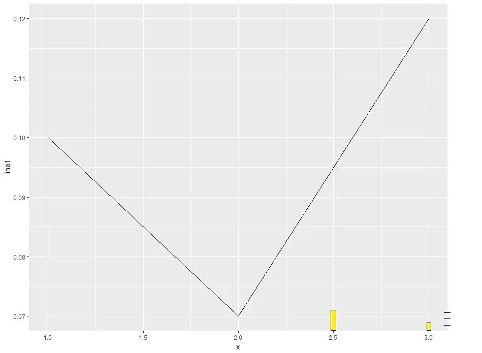
我希望右侧的y轴上显示更紧凑的间断,以表示条形图。
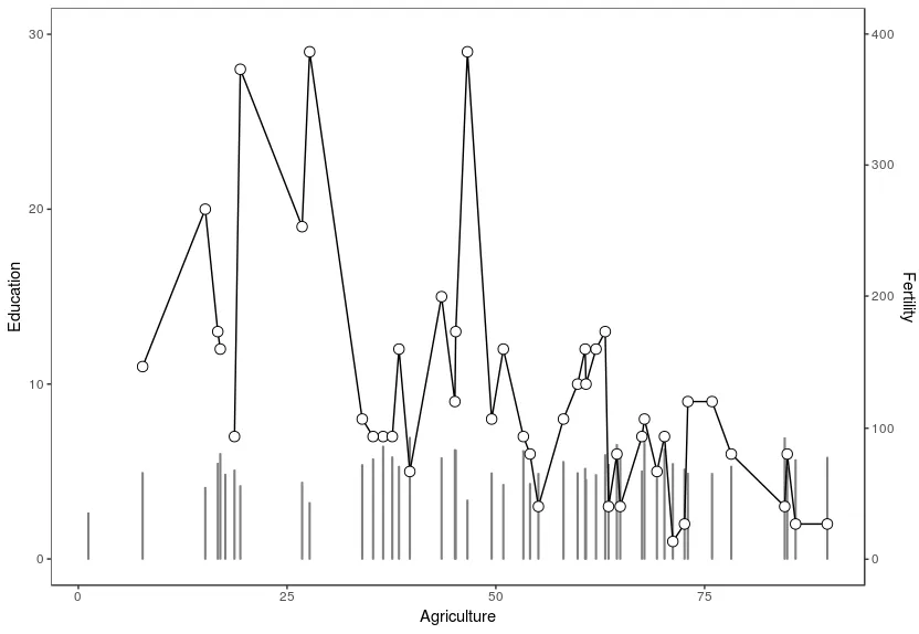
这张图表将作为基础情况,接下来我将展示如何更改次要y轴的刻度和标签:
sapply(c("pipeR", "ggplot2"), require, character.only = TRUE)

data(swiss)
swiss %>>% ggplot() +
  geom_bar(mapping = aes(x = Agriculture, y = Fertility * 30 / 400), stat = "identity", colour = gray(0.5), fill = gray(0.5)) +
  geom_line(mapping = aes(x = Agriculture, y = Education)) +
  geom_point(mapping = aes(x = Agriculture, y = Education), size = 3, shape = 21, fill = "white") +
  scale_x_continuous() +
  scale_y_continuous(
    name = expression("Education"),
    sec.axis = sec_axis(~ . * 400 / 30 , name = "Fertility"),
    limits = c(0, 30)) +
  theme_bw() +
  theme(
    panel.grid.major = element_blank(),
    panel.grid.minor = element_blank()
  )
更换刹车:
swiss %>>% ggplot() +
  geom_bar(mapping = aes(x = Agriculture, y = Fertility * 30 / 400), stat = "identity", colour = gray(0.5), fill = gray(0.5)) +
  geom_line(mapping = aes(x = Agriculture, y = Education)) +
  geom_point(mapping = aes(x = Agriculture, y = Education), size = 3, shape = 21, fill = "white") +
  scale_x_continuous() +
  scale_y_continuous(
    name = expression("Education"),
    sec.axis = sec_axis(~ . * 400 / 30 , name = "Fertility", breaks = seq(1,1000,10)),
    limits = c(0, 30)) +
  theme_bw() +
  theme(
    panel.grid.major = element_blank(),
    panel.grid.minor = element_blank()
  )

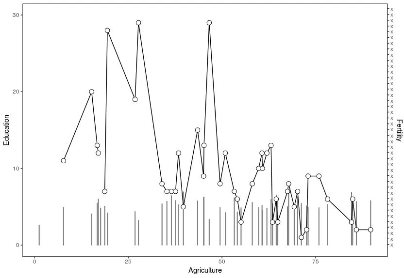
更改标签:
swiss %>>% ggplot() +
  geom_bar(mapping = aes(x = Agriculture, y = Fertility * 30 / 400), stat = "identity", colour = gray(0.5), fill = gray(0.5)) +
  geom_line(mapping = aes(x = Agriculture, y = Education)) +
  geom_point(mapping = aes(x = Agriculture, y = Education), size = 3, shape = 21, fill = "white") +
  scale_x_continuous() +
  scale_y_continuous(
    name = expression("Education"),
    sec.axis = sec_axis(~ . * 400 / 30 , name = "Fertility", breaks = seq(1,1000,10), labels=rep("x",length(seq(1,1000,10)))),
    limits = c(0, 30)) +
  theme_bw() +
  theme(
    panel.grid.major = element_blank(),
    panel.grid.minor = element_blank()
  )
有用的链接: https://whatalnk.github.io/r-tips/ggplot2-secondary-y-axis.nb.html