如何在双 y 轴 ggplot 中使用 facets

33

我一直在尝试扩展我的方案,从这里开始,以利用facets(特别是facet_grid())。

我看到了这个例子,但是我似乎无法让它适用于我的geom_bar()geom_point()组合。我尝试使用来自示例的代码,只是将其从facet_wrap更改为facet_grid,这似乎也使第一层未显示。

当涉及到网格和grobs时,我非常菜鸟,所以如果有人可以指导如何使P1显示在左y轴上,P2显示在右y轴上,那就太好了。

数据

library(ggplot2)
library(gtable)
library(grid)
library(data.table)
library(scales)

grid.newpage()

dt.diamonds <- as.data.table(diamonds)

d1 <- dt.diamonds[,list(revenue = sum(price),
                        stones = length(price)),
                  by=c("clarity","cut")]

setkey(d1, clarity,cut)
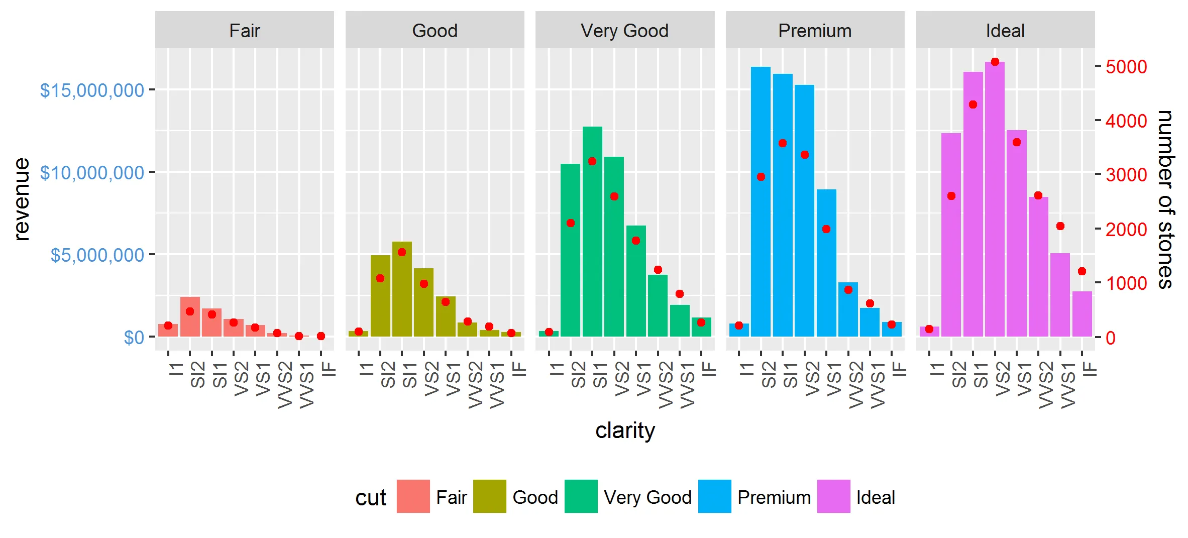
p1 & p2

p1 <- ggplot(d1, aes(x=clarity,y=revenue, fill=cut)) +
  geom_bar(stat="identity") +
  labs(x="clarity", y="revenue") +
  facet_grid(. ~ cut) +
  scale_y_continuous(labels=dollar, expand=c(0,0)) + 
  theme(axis.text.x = element_text(angle = 90, hjust = 1),
        axis.text.y = element_text(colour="#4B92DB"), 
        legend.position="bottom")

p2 <- ggplot(d1, aes(x=clarity, y=stones, colour="red")) +
  geom_point(size=6) + 
  labs(x="", y="number of stones") + expand_limits(y=0) +
  scale_y_continuous(labels=comma, expand=c(0,0)) +
  scale_colour_manual(name = '',values =c("red","green"), labels = c("Number of Stones"))+
  facet_grid(. ~ cut) +
  theme(axis.text.y = element_text(colour = "red")) +
  theme(panel.background = element_rect(fill = NA),
        panel.grid.major = element_blank(),
        panel.grid.minor = element_blank(),
        panel.border = element_rect(fill=NA,colour="grey50"),
        legend.position="bottom")

尝试结合(基于上面链接的示例) 这在第一个for循环中失败,我怀疑是由于硬编码的geom_point.points,但我不知道如何使其适合我的图表(或足够流畅以适应各种图表)

# extract gtable
g1 <- ggplot_gtable(ggplot_build(p1))
g2 <- ggplot_gtable(ggplot_build(p2))

combo_grob <- g2
pos <- length(combo_grob) - 1
combo_grob$grobs[[pos]] <- cbind(g1$grobs[[pos]],
                                 g2$grobs[[pos]], size = 'first')

panel_num <- length(unique(d1$cut))
for (i in seq(panel_num))
{
   grid.ls(g1$grobs[[i + 1]])
  panel_grob <- getGrob(g1$grobs[[i + 1]], 'geom_point.points',
                        grep = TRUE, global = TRUE)
  combo_grob$grobs[[i + 1]] <- addGrob(combo_grob$grobs[[i + 1]], 
                                       panel_grob)
}       


pos_a <- grep('axis_l', names(g1$grobs))
axis <- g1$grobs[pos_a]
for (i in seq(along = axis))
{
  if (i %in% c(2, 4))
  {
    pp <- c(subset(g1$layout, name == paste0('panel-', i), se = t:r))

    ax <- axis[[1]]$children[[2]]
    ax$widths <- rev(ax$widths)
    ax$grobs <- rev(ax$grobs)
    ax$grobs[[1]]$x <- ax$grobs[[1]]$x - unit(1, "npc") + unit(0.5, "cm")
    ax$grobs[[2]]$x <- ax$grobs[[2]]$x - unit(1, "npc") + unit(0.8, "cm")
    combo_grob <- gtable_add_cols(combo_grob, g2$widths[g2$layout[pos_a[i],]$l], length(combo_grob$widths) - 1)
    combo_grob <- gtable_add_grob(combo_grob, ax,  pp$t, length(combo_grob$widths) - 1, pp$b)
  }
}

pp <- c(subset(g1$layout, name == 'ylab', se = t:r))

ia <- which(g1$layout$name == "ylab")
ga <- g1$grobs[[ia]]
ga$rot <- 270
ga$x <- ga$x - unit(1, "npc") + unit(1.5, "cm")

combo_grob <- gtable_add_cols(combo_grob, g2$widths[g2$layout[ia,]$l], length(combo_grob$widths) - 1)
combo_grob <- gtable_add_grob(combo_grob, ga, pp$t, length(combo_grob$widths) - 1, pp$b)
combo_grob$layout$clip <- "off"

grid.draw(combo_grob)
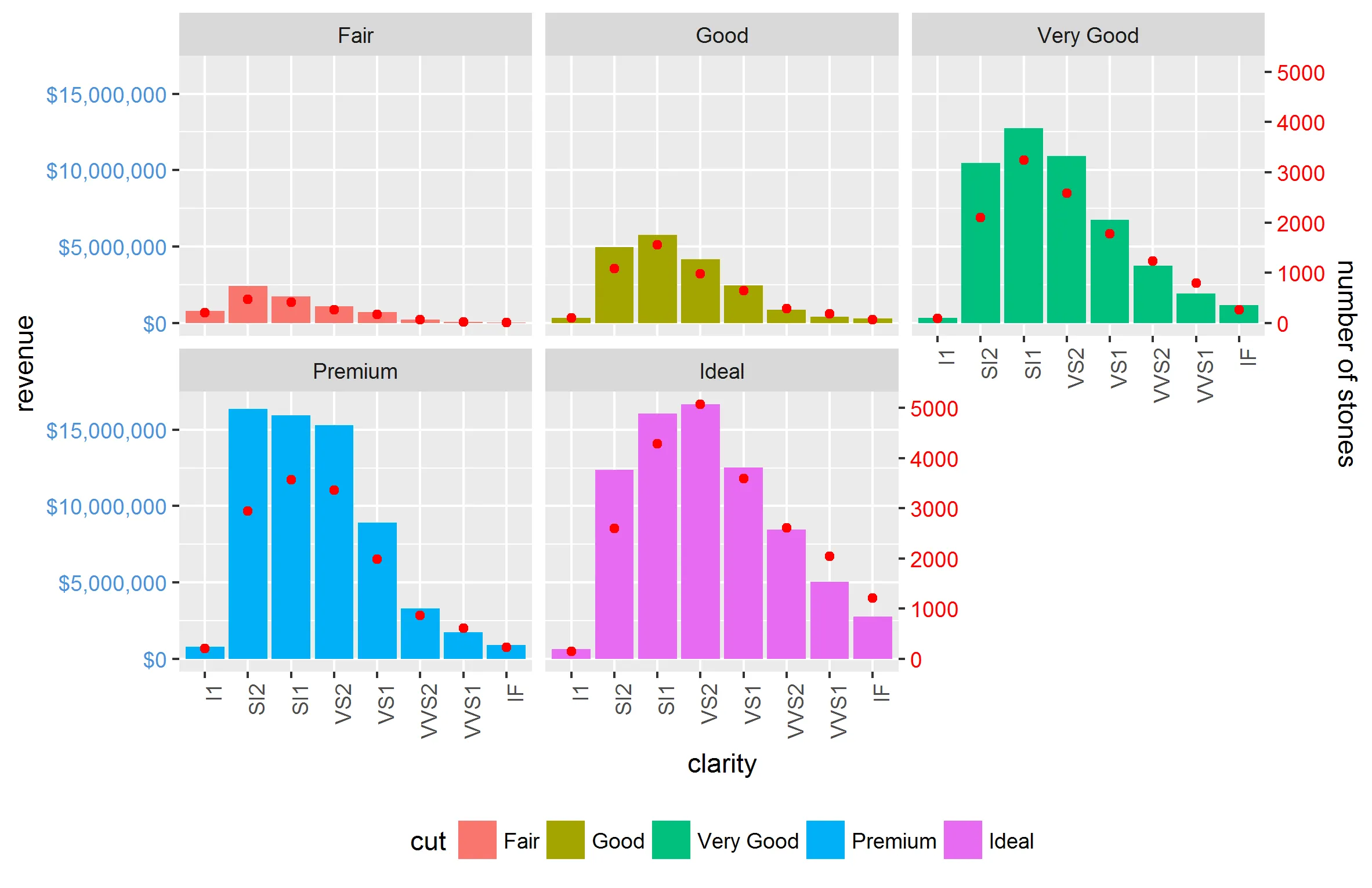
修改以尝试适用于facet_wrap

以下代码仍适用于使用ggplot2 2.0.0facet_grid

g1 <- ggplot_gtable(ggplot_build(p1))
g2 <- ggplot_gtable(ggplot_build(p2))

pp <- c(subset(g1$layout, name == "panel", se = t:r))
g <- gtable_add_grob(g1, g2$grobs[which(g2$layout$name == "panel")], pp$t,
                     pp$l, pp$b, pp$l)
# axis tweaks
ia <- which(g2$layout$name == "axis-l")
ga <- g2$grobs[[ia]]
ax <- ga$children[[2]]
ax$widths <- rev(ax$widths)
ax$grobs <- rev(ax$grobs)
ax$grobs[[1]]$x <- ax$grobs[[1]]$x - unit(1, "npc") + unit(0.15, "cm")
g <- gtable_add_cols(g, g2$widths[g2$layout[ia, ]$l], length(g$widths) - 1)
g <- gtable_add_grob(g, ax, unique(pp$t), length(g$widths) - 1)

# Add second y-axis title
ia <- which(g2$layout$name == "ylab")
ax <- g2$grobs[[ia]]
# str(ax) # you can change features (size, colour etc for these -
# change rotation below
ax$rot <- 90
g <- gtable_add_cols(g, g2$widths[g2$layout[ia, ]$l], length(g$widths) - 1)
g <- gtable_add_grob(g, ax, unique(pp$t), length(g$widths) - 1)

# Add legend to the code
leg1 <- g1$grobs[[which(g1$layout$name == "guide-box")]]
leg2 <- g2$grobs[[which(g2$layout$name == "guide-box")]]

g$grobs[[which(g$layout$name == "guide-box")]] <-
  gtable:::cbind_gtable(leg1, leg2, "first")

grid.draw(g)

3
你是不是只希望在右手边增加一个额外的轴,而不是在每个小面板之间增加?你可以直接使用之前问题中的代码(第一个链接),只需要进行一些微小的修改:提取小面板时将“[[”改为“[”,例如 
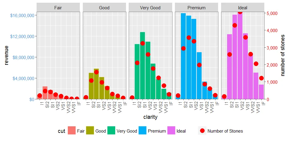
g <- gtable_add_grob(g1, g2$grobs[which(g2$layout$name == "panel")], pp$t, pp$l, pp$b, pp$l),然后继续之前的步骤直到倒数第二行 - 将其改为 g <- gtable_add_grob(g, ax, unique(pp$t), length(g$widths) - 1) - user20650
你的理解和回答再次完美。请随意发布为答案。 - Dan
很高兴它能够正常工作,@Dan,请写下来,谢谢。 - user20650
@user20650,你有没有想过如何让这个代码在“facet_wrap”中继续工作?目前当我使用你评论中的代码来识别面板时,会出现以下错误:“Error in data.frame(t = t, l = l, b = b, r = r, z = z, clip = clip, name = name, : arguments imply differing number of rows: 0, 1”。 - Dan
当然。我遇到的困难是,包装通常是奇数个面板,而且我很难理解网格和图形对象的详细工作原理。 - Dan
1
@user20650 我已经检查过这段代码在ggplot 2.0中的工作情况,并编辑了可以在facet_grid中使用的代码,但不能在facet_wrap中使用。 - Dan
2个回答

36

现在 ggplot2 支持次要轴,这在许多情况下(但不是全部)变得更加容易。不需要进行 grob 操作。

尽管它只允许对相同数据进行简单的线性变换,例如不同的测量尺度,但我们可以先手动重新缩放其中一个变量,以至少从该属性中获得更多内容。

library(tidyverse)

max_stones <- max(d1$stones)
max_revenue <- max(d1$revenue)

d2 <- gather(d1, 'var', 'val', stones:revenue) %>% 
  mutate(val = if_else(var == 'revenue', as.double(val), val / (max_stones / max_revenue)))

ggplot(mapping = aes(clarity, val)) +
  geom_bar(aes(fill = cut), filter(d2, var == 'revenue'), stat = 'identity') +
  geom_point(data = filter(d2, var == 'stones'), col = 'red') +
  facet_grid(~cut) +
  scale_y_continuous(sec.axis = sec_axis(trans = ~ . * (max_stones / max_revenue),
                                         name = 'number of stones'),
                     labels = dollar) +
  theme(axis.text.x = element_text(angle = 90, hjust = 1),
        axis.text.y = element_text(color = "#4B92DB"),
        axis.text.y.right = element_text(color = "red"),
        legend.position="bottom") +
  ylab('revenue')

在此输入图片描述

同时也可以很好地与facet_wrap搭配使用:

在此输入图片描述

其他复杂的情况,例如scales = 'free'space = 'free'也可以轻松解决。唯一的限制是所有分面之间两个轴之间的关系必须相等。


@Axeman,这确实简化了事情,但是如何添加石头数量的图例标签呢? - Dan
我想通了。将颜色移至geom_point()aes()内部,然后使用scale_colour_manual()提供颜色、标签等。我还学会了可以设置图例块的顺序。 - Dan
我认为对于一系列数据集(如diamonds),scales ='free'会起作用,但是我已经尝试了一个反映我的一些真实世界数据的样本集,但我无法使y-left适当地缩放。 有什么想法吗? d1 <- data.table(Group = c(rep("A", 4), rep("B", 4)), xaxis = c("a","b","c","d"), yleft = c(100,90,50,40, 40,35,30,10), yright = c(.2,.08,.02,.02, .25,.1,.03,.02)) - Dan
1
提出了一个新问题 http://stackoverflow.com/questions/40837588/ggplot2-with-dual-axis - Dan
2
非常好的回答,我给你点了赞。但是赏金还是给了第一个回答,因为那种方法更加通用。 - Roland
1
这个SO答案可能对图例的精细控制有所帮助 https://dev59.com/7J3ha4cB1Zd3GeqPZMLB#41452741 - Sathish

24

编辑: 更新至GGPLOT 2.2.0
但是ggplot2现在支持次要y轴,因此无需进行grob操作。请参见@Axeman的解决方案。

facet_gridfacet_wrap绘图会为绘图面板和左侧轴生成不同的名称集。您可以使用g1$layout检查名称,其中g1 <- ggplotGrob(p1),并且p1首先使用facet_grid()绘制,然后使用facet_wrap()。特别地,在facet_grid()中,所有绘图面板都被命名为“panel”,而在facet_wrap()中,它们具有不同的名称:“panel-1”、“panel-2”等。因此,像这样的命令:

pp <- c(subset(g1$layout, name == "panel", se = t:r))
g <- gtable_add_grob(g1, g2$grobs[which(g2$layout$name == "panel")], pp$t,
                     pp$l, pp$b, pp$l)

使用facet_wrap生成的图表将会失败。我建议使用正则表达式选择所有以“panel”开头的名称。"axis-l"也存在类似的问题。

此外,您的轴调整命令适用于旧版本的ggplot,但从2.1.0版本开始,刻度线与图表的右边缘不完全相遇,并且刻度线和刻度标签之间的距离太近。

以下是我的建议(借鉴了这里的代码,该代码又借鉴了这里cowplot包中的代码)。

# Packages
library(ggplot2)
library(gtable)
library(grid)
library(data.table)
library(scales)

# Data 
dt.diamonds <- as.data.table(diamonds)
d1 <- dt.diamonds[,list(revenue = sum(price),
                        stones = length(price)),
                  by=c("clarity", "cut")]
setkey(d1, clarity, cut)

# The facet_wrap plots
p1 <- ggplot(d1, aes(x = clarity, y = revenue, fill = cut)) +
  geom_bar(stat = "identity") +
  labs(x = "clarity", y = "revenue") +
  facet_wrap( ~ cut, nrow = 1) +
  scale_y_continuous(labels = dollar, expand = c(0, 0)) + 
  theme(axis.text.x = element_text(angle = 90, hjust = 1),
        axis.text.y = element_text(colour = "#4B92DB"), 
        legend.position = "bottom")

p2 <- ggplot(d1, aes(x = clarity, y = stones, colour = "red")) +
  geom_point(size = 4) + 
  labs(x = "", y = "number of stones") + expand_limits(y = 0) +
  scale_y_continuous(labels = comma, expand = c(0, 0)) +
  scale_colour_manual(name = '', values = c("red", "green"), labels = c("Number of Stones"))+
  facet_wrap( ~ cut, nrow = 1) +
  theme(axis.text.y = element_text(colour = "red")) +
  theme(panel.background = element_rect(fill = NA),
        panel.grid.major = element_blank(),
        panel.grid.minor = element_blank(),
        panel.border = element_rect(fill = NA, colour = "grey50"),
        legend.position = "bottom")


# Get the ggplot grobs
g1 <- ggplotGrob(p1)
g2 <- ggplotGrob(p2)

# Get the locations of the plot panels in g1.
pp <- c(subset(g1$layout, grepl("panel", g1$layout$name), se = t:r))

# Overlap panels for second plot on those of the first plot
g <- gtable_add_grob(g1, g2$grobs[grepl("panel", g1$layout$name)], 
      pp$t, pp$l, pp$b, pp$l)


# ggplot contains many labels that are themselves complex grob; 
# usually a text grob surrounded by margins.
# When moving the grobs from, say, the left to the right of a plot,
# Make sure the margins and the justifications are swapped around.
# The function below does the swapping.
# Taken from the cowplot package:
# https://github.com/wilkelab/cowplot/blob/master/R/switch_axis.R 

hinvert_title_grob <- function(grob){

  # Swap the widths
  widths <- grob$widths
  grob$widths[1] <- widths[3]
  grob$widths[3] <- widths[1]
  grob$vp[[1]]$layout$widths[1] <- widths[3]
  grob$vp[[1]]$layout$widths[3] <- widths[1]

  # Fix the justification
  grob$children[[1]]$hjust <- 1 - grob$children[[1]]$hjust 
  grob$children[[1]]$vjust <- 1 - grob$children[[1]]$vjust 
  grob$children[[1]]$x <- unit(1, "npc") - grob$children[[1]]$x
  grob
}

# Get the y axis title from g2
index <- which(g2$layout$name == "ylab-l") # Which grob contains the y axis title?   EDIT HERE
ylab <- g2$grobs[[index]]                # Extract that grob
ylab <- hinvert_title_grob(ylab)         # Swap margins and fix justifications

# Put the transformed label on the right side of g1
g <- gtable_add_cols(g, g2$widths[g2$layout[index, ]$l], max(pp$r))
g <- gtable_add_grob(g, ylab, max(pp$t), max(pp$r) + 1, max(pp$b), max(pp$r) + 1, clip = "off", name = "ylab-r")

# Get the y axis from g2 (axis line, tick marks, and tick mark labels)
index <- which(g2$layout$name == "axis-l-1-1")  # Which grob.    EDIT HERE
yaxis <- g2$grobs[[index]]                    # Extract the grob

# yaxis is a complex of grobs containing the axis line, the tick marks, and the tick mark labels.
# The relevant grobs are contained in axis$children:
#   axis$children[[1]] contains the axis line;
#   axis$children[[2]] contains the tick marks and tick mark labels.

# First, move the axis line to the left
# But not needed here
# yaxis$children[[1]]$x <- unit.c(unit(0, "npc"), unit(0, "npc"))

# Second, swap tick marks and tick mark labels
ticks <- yaxis$children[[2]]
ticks$widths <- rev(ticks$widths)
ticks$grobs <- rev(ticks$grobs)

# Third, move the tick marks
# Tick mark lengths can change. 
# A function to get the original tick mark length
# Taken from the cowplot package:
# https://github.com/wilkelab/cowplot/blob/master/R/switch_axis.R 
plot_theme <- function(p) {
  plyr::defaults(p$theme, theme_get())
}

tml <- plot_theme(p1)$axis.ticks.length   # Tick mark length
ticks$grobs[[1]]$x <- ticks$grobs[[1]]$x - unit(1, "npc") + tml

# Fourth, swap margins and fix justifications for the tick mark labels
ticks$grobs[[2]] <- hinvert_title_grob(ticks$grobs[[2]])

# Fifth, put ticks back into yaxis
yaxis$children[[2]] <- ticks

# Put the transformed yaxis on the right side of g1
g <- gtable_add_cols(g, g2$widths[g2$layout[index, ]$l], max(pp$r))
g <- gtable_add_grob(g, yaxis, max(pp$t), max(pp$r) + 1, max(pp$b), max(pp$r) + 1, 
   clip = "off", name = "axis-r")

# Get the legends
leg1 <- g1$grobs[[which(g1$layout$name == "guide-box")]]
leg2 <- g2$grobs[[which(g2$layout$name == "guide-box")]]

# Combine the legends
g$grobs[[which(g$layout$name == "guide-box")]] <-
    gtable:::cbind_gtable(leg1, leg2, "first")

# Draw it
grid.newpage()
grid.draw(g)

enter image description here


1
一些引人注目的变化移动到ggplot 2.1。我正在使用版本2.1.0.9001,现在所有东西都会崩溃,因为添加了新功能,可以将轴标签放置在顶部或右侧,或者具有左右轴。请参见https://blog.rstudio.org/2016/09/30/ggplot2-2-2-0-coming-soon/获取详细信息。 - Dan
1
是的,但幸运的是,上面的代码只需要进行两个更改。它们与新版本的ggplot2命名grobs的方式有关。我已经编辑了代码并指出了修改。现在应该会生成所示的图表。 - Sandy Muspratt
我假设这仅适用于单行...如果我们开始查看多行或类似facet_grid(x ~ y)的内容,我想它会变得更加复杂。 - Dan
通过轻微修改,它可以适用于多行。请参见此处,尽管该答案适用于facet_wrap图。facet_grid使用略有不同的面板和轴名称。使用g$layout获取绘图对象的名称。 - Sandy Muspratt
1
请注意,现在您可以使用ggplot2将y轴放置在右侧,这使得切换刻度线和标签变得不必要。顺便说一句,答案的那部分现在已经无效了,因为ggplot2内部已经发生了改变。 - Roland
@Roland 您提到的第一个点——我认为我在我的回答评论(已编辑过)中提到了。您提到的第二个点——这段代码在我这里可以工作,我使用的是最新的 CRAN 版本 ggplot2(v2.2.1)。您能指出代码出错的地方吗? - Sandy Muspratt

网页内容由stack overflow 提供, 点击上面的
可以查看英文原文,
原文链接